Create and Troubleshoot Metrics (Retired)
Retirement of legacy metrics
This article is about Tableau's legacy metrics feature, which was retired in Tableau Cloud in February 2024 and in Tableau Server version 2024.2. In October 2023, Tableau retired the ability to embed legacy metrics in Tableau Cloud and in Tableau Server version 2023.3.
Tableau Pulse introduces a new way to track metrics. With Tableau Pulse, the metrics you create are used to generate insights about your data. These data insights are sent directly to users who follow the metrics, so they can learn about changes to their data in their flow of work. For more information, see Create Metrics with Tableau Pulse.
If you have legacy metrics that you want to keep, note the data source, measure, and time dimension for those metrics and recreate them in Tableau Pulse. Legacy metrics won't be automatically migrated to Tableau Pulse.
Metrics provide a fast way to stay informed about your data. Because metrics update automatically and display their current value in the grid and list view of your content, you can check all the key numbers you care about in seconds.

At their most basic level, metrics show the value of an aggregate measure, like the sum of sales. More complex metrics can include timelines, comparisons, and statuses that provide an easy to understand indicator of how you’re performing relative to a prior point in time or a value you have defined.
If you have a set of dashboards that you regularly check, create metrics for the numbers that you want to monitor, then track them in one place by adding them to your favorites or a collection, or by creating them in the same project. That way, you don’t need to load and filter the dashboards unless you want to dig deeper into your data.
Find metrics on your site
There are a few ways to find metrics on your Tableau site. To browse all the metrics that you have permission to view, navigate to the Explore page, then select All Metrics from the content type menu.
If you’re looking for metrics related to a particular view or workbook, check the connected metrics for that content. To see connected metrics for a view, open the view, then click Watch > Metrics in the view toolbar. The metrics displayed are ordered from the newest creation date to the oldest.

To see connected metrics for all the views in a workbook, navigate to the workbook, then click the Connected Metrics tab. You can sort these metrics using the Sort By menu.

Components of a metric
The only data required to define a metric is an aggregate measure. Metrics are created from a mark in a view, and the measure associated with that mark defines the metric. The measure must be aggregated, because an unaggregated mark will not change over time. For information about dimensions and measures in Tableau, see Dimensions and Measures, Blue and Green.
A metric can optionally be defined by a date dimension, and you can configure a comparison and a status for your metric. Each of these components will add context to the data presented on the metric card.
Metrics that have only a measure defining them will appear as a single number. This number will update when the data updates, but there will be no timeline on the card.

Timeline
When you select a mark to define a metric, if the mark has a date dimension associated with it, that dimension becomes part of the metric definition. Metrics with a date dimension show a timeline, and you can configure the historical comparison for the metric. By default, the historical comparison is to the previous mark.
When you open a metric’s details page, the timeline shows the value of the measure based on the granularity of the date dimension, for example, daily sales or monthly users. Hover over the points on the timeline to see historical values.

Comparison
There are two types of comparisons that you can configure for metrics: historical comparisons and constant comparisons. You can configure a historical comparison only if a metric has a date dimension associated with it, but constant comparisons can be added for any type of metric.
A historical comparison is a relative comparison between the current value and a specified number of hours, days, or other unit of time previous. For example, you could set a comparison between the current value for monthly sales and the value from 12 months ago. Every time data is added to a metric, the historical comparison will adjust relative to the date or time of the new data.

Constant comparisons are to a single value that doesn’t change as new data is added. You might set a comparison to represent a threshold to stay above, for example, if you need to maintain a 90% on-time delivery rate. Or you might define a cumulative goal you are working toward, for example, a monthly sales target.

Status
For metrics with a constant comparison, you can define whether being above, below, or at the comparison value is good, bad, or neutral. A metric with a “good” status will display a check mark next to the comparison value, and the metric card will have a green band at the top. A metric with a “bad” status will display an X next to the comparison value, and the metric card will have a red band at the top. Metrics with a “neutral” status appear the same as metrics without a status indicator; there is no icon or color applied to the card.

Create a metric from a view
If you have a site role of Creator or Explorer (can publish), and you have the Create/Refresh Metric capability on the relevant workbook, you can create metrics on Tableau Cloud or Tableau Server.
Before you create a metric, check the connected metrics for the view to make sure that the metric you are planning to create doesn’t already exist. Instead of creating a duplicate metric, open the existing metric and add it as a favorite.
Select the mark to define your metric
-
Navigate to the view that you want to create a metric from.
-
On the view toolbar, select Watch > Metrics.

The metrics pane opens.
-
If the pane shows connected metrics, select the Create button to enter authoring mode.
-
Select a mark. If you encounter an error, see When you can’t create a metric.

The measure associated with this mark defines your metric. Any filters you apply to the mark are applied to your metric. If this mark has a date dimension associated with it, that date dimension also defines your metric, and your metric will display a timeline.
The metrics pane shows a preview of your metric. The value in the preview is the most recent value for the metric, which may differ from the value of the mark you selected if it was not the most recent in the time series. The preview updates as you try different configurations.

Describe and configure your metric
The options available to configure your metric depend on the mark you select and on the type of comparison you choose.
-
The Name field is pre-populated based on the mark you select. You can give the metric a different name. A metric must have a unique name within the project it belongs to.
-
Under Description, enter an optional message to help others understand your metric. For example, describe filters applied to the metric or indicate the data source used by the metric.
-
For the Date Range (only for metrics with a date dimension), select one of the default options, or set a custom range. If your metric has a large number of marks, limiting the date range can make it easier to read the timeline.
-
Select the Comparison Type for the metric: historical or constant.
-
For Historical comparisons:
- Enter how far prior you want to compare against. The unit of time for the comparison is the same as the granularity of your data, such as hours or months.
- Select Show Comparison Line to include a second line for the comparison period on the timeline.
-
For Constant comparisons:
- Enter the value to compare against. Don’t include commas or symbols in this field. To enter a percentage, simply type the number without the percent sign, for example, enter 25 instead of 0.25 for a target of 25%. When you enter a valid target value, the preview updates to show how far above or below the target the current value is.
- Set the Status for the comparison to indicate whether being above, at, or below the value is good, bad, or neutral. By default, the status is set to neutral. Check the metric preview to see how different statuses affect your metric.
-
Under Definition > Measure, select the measure to use for your definition from the drop-down. This option appears only if the mark you select has more than one measure associated with it.

Finalize your metric
-
Under Project, select Change Location to choose a different project for the metric. By default, your metric will be added to the same project that the view belongs to.
Every metric in a project must have a unique name. Because a metric’s name and project are initially set based on the mark you select, you might run into a conflict when you try to save your metric, if another user has already created a metric from that mark. Either choose a different project or name for your metric or, if you want to overwrite the existing metric, see Overwrite a metric.
-
Click the Create button.
A message appears with a link to the metric in the project you added it to.

-
Verify that the permissions for your metric are correct, following the guidance in Set permissions.
By default, a metric inherits the permissions of the project it is created in. Anyone with access to your metric will be able to see the metric's data, even if they don’t have permission to access the connected view or data source.
Now that you’ve created a metric, you can manage the metric the same way you manage other independent pieces of content on your Tableau site. Though metrics are created from a view, they exist independently of that view, unlike data driven alerts or subscriptions. You can move the metric to a different project without moving the connected view. For information about managing content on your Tableau site, see Manage Web Content.
Overwrite a metric
Once a metric is created, you can change the name, description, and configuration of the metric, but you can’t change how the metric is defined. If you want to change the data that the metric uses, you must overwrite it. In order to overwrite a metric, you need to be the metric owner or be granted the correct permission capability.
-
To overwrite a metric, create a metric with the same name in the same project as the metric you want to overwrite.
The Overwrite Metric dialog appears.
-
Click the Overwrite button.
When you overwrite a metric, the metric continues to appear for those who have added it to their favorites, and any changes made to permissions for the previous metric will apply to the new metric.
When you can’t create a metric
If you select a mark on a chart that doesn’t support metrics, you’ll get an error message explaining why you can’t create a metric. The table below summarizes these scenarios.
| Reason | Scenarios |
|---|---|
| You don’t have the correct permissions. |
|
| You can’t access the complete data. |
|
| The password for the workbook’s data source is not embedded or is no longer valid. |
|
| The data isn’t at the correct level of granularity. |
|
| The date dimension is not supported. |
|
Edit a metric's configuration
Starting in 2022.2, you can change the configuration for a metric. A metric's configuration includes the comparison, date range, and status indicator. The configuration options available depend on the type of metric. Metrics with a timeline allow you to set a historical comparison or a constant comparison. Single number metric support only a constant comparison.
A metric's configuration does not include the metric definition (the measure and date dimension that generate the metric value). If you want to change the definition, overwrite the metric with a new metric.
To edit a metric's configuration, you must have the overwrite capability for the metric.
- Open the metric details page for the metric you want to edit.
- Mouse over the configuration section. Click anywhere on the section to enter editing mode.

- For a timeline metric, set the date range to display on the metric card and details.
- Select the comparison type. For a constant comparison, set a comparison value and status. For a historical comparison, set how far prior you want to compare against and choose whether to show a comparison line on the timeline.
- Click Save. Your configuration changes will appear to anyone who views the metric.
How metrics refresh
When a metric refreshes, it checks the connected view (the view the metric was created from) for new data. A refresh doesn’t necessarily update the value of a metric, because there may be no changes to the data.
Metrics refresh at a frequency either based on an extract’s refresh schedule or, for live data, every 60 minutes. The time of the last refresh is displayed on the metric.
Fix failing refreshes
If a metric isn’t able to access the connected view or its underlying data, the refresh will fail. If the refresh for your metric fails, you’ll receive a notification, which notes the time of the failure and the affected metric.
Metric refreshes may fail for one of the following reasons.
- The connected view was deleted or modified.
- Permissions changed for the connected view.
- The password for the data source is no longer embedded or is no longer valid.
- The metric owner doesn’t have the required site role to refresh the metric. A site role of Creator or Explorer (can publish) is required.
- There was a temporary connectivity issue, which will resolve itself.
To identify the cause of the failure, look at the metric details. Make sure that the metric owner has the required site role to refresh the metric. Then inspect the Connected View.

If the connected view is still listed
Open the view to investigate the cause of the failure.
If the view loads, check that the measure and (optional) date dimension that define the metric are still present in the view.
-
If the view appears to be unchanged, you might no longer have permission to refresh metrics from it. The content owner or a Tableau administrator can change the Create/Refresh Metric permission capability. For more information, see Permissions.
-
If the measure is no longer present, the view has been modified so the metric can't connect to the data needed to refresh. The content owner or a Tableau administrator can check the revision history and restore previous versions. For more information, see View Revision History.
If the view doesn’t load, but instead prompts for a password or displays an error when connecting to the data source, the password for the data source is not embedded or is no longer valid. The content owner or a Tableau administrator can edit the data source connection to embed the password. For more information, see Edit Connections.
If there is no connected view listed
The view was deleted or you no longer have permission to access the view. Contact your Tableau administrator for assistance.
Resume suspended refreshes
If a refresh fails enough times, the refresh is suspended. You’ll receive a notification if the refresh for your metric is suspended.
When a metric refresh is suspended, Tableau no longer attempts to get new data for the metric. Metrics with suspended refreshes continue to present historical data.
If the cause of the failure is fixed, you can resume the refresh.
- Open the affected metric.
- On the warning message, click Resume refresh.
Tableau attempts to perform the refresh. If this attempt succeeds, you’ll receive a notification, and the refresh will resume on schedule. If the attempt doesn’t succeed, your refresh remains suspended.
Try overwriting the metric if the connected view is still available. For more information, see Overwrite a metric. Otherwise, you can keep the metric to reference past data or delete the metric.
Note: If the metric refresh is suspended because you don’t have the required site role for it to refresh, you won’t be able to resume the refresh or delete the metric.
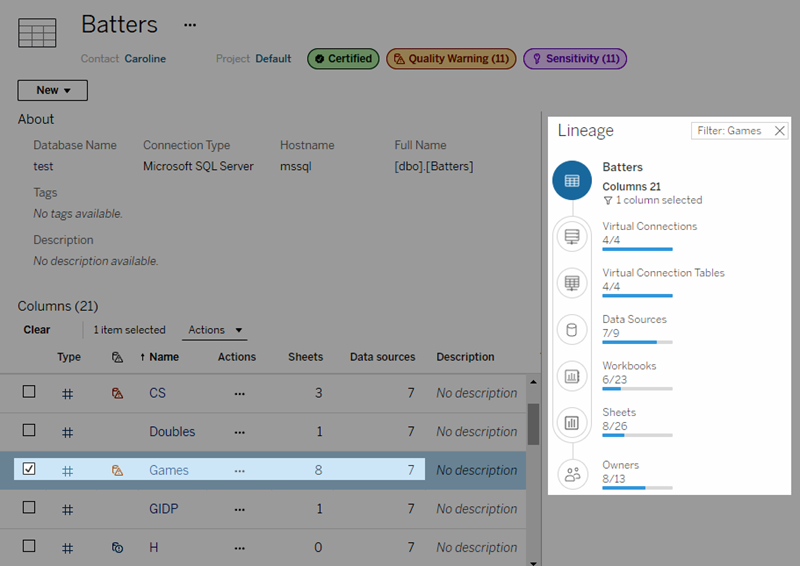
Metrics appear in Tableau Catalog
Starting in 2019.3, Tableau Catalog is available with Data Management in Tableau Cloud and Tableau Server. When the Tableau Catalog is enabled in your environment, you can see metrics in the Catalog lineage tool, and metrics affected by data quality warnings display those warnings. For more information about Tableau Catalog, see "About Tableau Catalog" in the Tableau Server(Link opens in a new window) or Tableau Cloud(Link opens in a new window) Help.
When you have metrics defined for the numbers you want to monitor, it's important to know if the data that the metrics rely on are impacted in any way. You can use Catalog in a couple of ways to know this. First, data quality warnings set on the data your metric is based on show on the metric. These warnings appear when you open a metric in Tableau Mobile, and in Tableau Server and Tableau Cloud when you hover over a metric in grid view and on the metric details page, as shown below:

For more information, see "Set a Data Quality Warning" in the Tableau Server(Link opens in a new window) or Tableau Cloud(Link opens in a new window) Help.
You can also use the lineage tool in Tableau Catalog to see the upstream sources that your metric relies on. When doing an impact analysis, you can see which metrics are affected if a certain column or a table is changed or deprecated, or if certain workbooks are removed. Including metrics in the lineage means that Catalog gives a full picture of the impact changes can have on the assets in your environment.
For more information, see "Use Lineage for Impact Analysis" in the Tableau Server(Link opens in a new window) or Tableau Cloud(Link opens in a new window) Help.