Build a Basic View to Explore Your Data
This topic uses the Sample - Superstore data source to walk through how to create basic views and explore your data. It shows how your view of data in Tableau evolves through your process of exploration.
If you're using Tableau Cloud and Tableau Server to explore data and edit views, see Use Tableau on the Web.
Connect to your data
The first step is to connect to the data you want to explore. This example shows how to connect to Sample - Superstore data in Tableau Desktop.
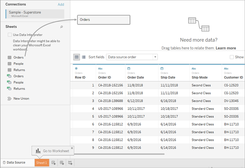
- Open Tableau. On the start page, under Connect, click Microsoft Excel. In the Open dialog box, navigate to the Sample - Superstore Excel file on your computer. Go to
/Documents/My Tableau Repository/Datasources/version number/[language]. Select Sample - Superstore, and then select Open. - After you connect to the Excel data, the Data Source page shows the sheets or tables in your data. Drag the "Orders" table to the canvas to start exploring that data.
Depending on how your data is structured, you might need to do more data preparation and integration before you start exploring it in Tableau. For more details on connecting to your data, see Connect to and Prepare Data and Tips for Working with Your Data.
- Select the sheet tab to go to the new worksheet and begin your analysis.
About the Data pane
In the worksheet, the columns from your data source are shown as fields on the left side in the Data pane. The Data pane contains a variety of fields organized by table. For each table or folder in a data source, dimension fields appear above the gray line and measure fields appear below the gray line. Dimension fields typically hold categorical data such as product types and dates, while measure fields hold numeric data such as sales and profit. Sometimes a table or folder will contain only dimensions, or only measures to start with. For more information, see Dimensions and Measures, Blue and Green.
If you have more than one data source in a workbook, click the data source connection name in the Data pane to select it for use. For more details, see Navigate Data Sources in the Data Pane.
Tip: For details on the many ways you can customize the fields in the data pane, see Organize and Customize Fields in the Data Pane, Edit Default Settings for Fields, and Work with Data Fields in the Data Pane.
If you have related dimension fields, sometimes you might want to group them in a folder, or as a hierarchy. For example, in this data source, Country, State, City, and Postal Code are grouped into a hierarchy named Location. You can drill down into a hierarchy by selecting the [+] sign in a field, or drill back up by selecting the [-] sign in a field.
Build the view
A view is a visualization or viz that you create in Tableau. A viz could be a chart, a graph, a map, a plot, or even a text table.
Before you start building a view, consider the question or questions you're hoping to answer with data. Every view that you build in Tableau should start with a question. What do you want to know?
Every time you drag a field into the view or onto a shelf, you're asking a question about the data. The question varies depending on the field you choose, where you place it, and the order in which you add it to the view.
For every question you ask, the view changes to represent the answer visually with marks represented by shapes, text, hierarchies, table structures, axes, color.
Different ways to start building a view
When you build a view, you add fields from the Data pane. You can do this in different ways.
For example:
- Drag fields from the Data pane and drop them onto the cards and shelves that are part of every Tableau worksheet.
- Double-click one or more fields in the Data pane.
- Select one or more fields in the Data pane and then choose a chart type from Show Me, which identifies the chart types that are appropriate for the fields you selected. For details, see Use Show Me to Start a View .
- To start creating a tabular view, drop a field on the Drop field here grid.

For more details on building visualizations with fields, see Start Building a Visualization by Dragging Fields to the View.
As you start exploring data in Tableau, you'll find there are many ways to build a view. Tableau is extremely flexible, and also very forgiving. As you build a view, if you ever take a path that isn't answering your question, you can always undo to a previous point in your exploration.
- To undo or redo, select undo
 or redo
  on the toolbar.
You can undo all the way back to the last time you opened the workbook. You can undo or redo an unlimited number of times.
- To undo or redo, select undo
Build a view from scratch
These steps show how to build a basic view that shows year-by-year profit.
-
From the Dimensions area in the Data pane, drag the Order Date field to the Columns shelf. You might need to expand the Order hierarchy to see Order Date.
When you drag a field over a shelf, a plus sign indicates that the shelf can accept the field.

The resulting table has four columns and one row. Each column header represents a member of the Order Date field (the default date level is YEAR). Each cell contains a placeholder "Abc" label, which indicates that the current mark type for this view is text.

Notice that the field is colored blue, which indicates that it's discrete. For more information, see Dimensions and Measures, Blue and Green.
The default date level is determined by the highest level that contains more than one distinct value (for example, multiple years and multiple months). That means that if [Order Date] contained data for only one year but had multiple months, the default level would be month. You can change the date level using the field menu.

If you're wondering why there are two sets of date levels (from Year down to Day), the first set of options uses date parts (discrete labels, so "May" is the same value whether its of 2024 or 2034) and the second set of options uses date truncations (continuous values, so May of 2024 is a different value than May of 2034). For more information, see Change Date Levels.
Tip: To hide the title on the sheet, select the drop-down to the right of the title (Sheet 1), and select Hide Title.
-
From the Data pane, drag the Profit field to the Rows shelf.

The Profit field is colored green on the Rows shelf, indicating that it's continuous. Also, the field name changes to SUM(Profit). That’s because measures are automatically aggregated when you add them to the view, and the default aggregation for this measure is SUM. For more information on what happens when you add a measure to a view—and why—see Dimensions and Measures, Blue and Green.
Tableau transforms the table into a line chart and creates a vertical axis (along the left side) for the measure.
A line chart is a great way to compare data over time and identify trends effectively.
This line chart shows profit over time. Each point along the line shows the sum of profit for the corresponding year.

The next step is to drill a little deeper into the time dimension.
Drill into the data
This step shows how you can modify the view to show quarters in addition to years. As you drill down into the hierarchy, the view changes to become a nested table.
You can show [Order Date] by quarters using either of the following methods:
- Select the plus button
 on the left side of the field YEAR(Order Date) field on Columns.

- Drag the Order Date field (again) from the Data pane and drop it on the Columns shelf to the right of Year(Order Date).
The new dimension divides the view into separate panes for each year. Each pane, in turn, has columns for quarters. This view is called a nested table because it displays multiple headers, with quarters nested within years. The word "headers" is a little misleading in this example because the year headers are displayed at the top of the chart, while the quarter headers are displayed at the bottom.

Increase the level of detail with small multiples
This step shows how you can modify the nested table view to add customer segment. It creates what we call a small multiples view.
Drag the Segment dimension from the Data pane, and then drop it just to the left of SUM(Profit) on Rows.

The field is added to the Rows shelf and row headers are created. Each header represents a member of the Segment field.
Optionally, you can achieve the same result by dropping Segment just to the left of the Profit axis in the view (shown in the image below). Tableau often supports multiple ways to add fields to the view.

Note: Tableau doesn't allow you to place a dimension to the right of a measure on either the Rows or Columns shelves because that visual structure doesn't make sense in the view.
The new dimension divides the view into 12 panes, one for each combination of year and segment. This view is a more complex example of a nested table. Any view that contains this sort of grid of individual charts is referred to as a small multiples view.

This could be the right amount of granularity for the view. Another option at this point would be to filter some of the data out of the view to simplify it.
Filter the view to focus your exploration
This section shows how you can focus your exploration by only showing a subset of the data, such as modifying the view to show only data for orders in 2018 and 2019.
- Drag the Order Date measure from the Data pane and drop it on the Filters shelf.

- In the Filter Field dialog box, choose the date level you want to filter on—Years. Then click Next.
- In the next pane, clear any two years that you don't want to include in the view, here 2021 and 2022.
- When you are finished, select OK.
The view updates to only show data rows where Order Date is 2023 or 2024. Tableau can now allocate more space to the data that interests you.

Next, you'll increase the detail in your data exploration by dragging a field to the Color property on the Marks card.
Use the Marks card to add depth to your analysis
This step shows how you can modify the view to color the marks based on the region.
- Drag the Region dimension from the Data
pane and drop it on Color.
Placing a dimension on Color separates the marks according to the members in the dimension, and assigns a unique color to each member. The color legend displays each member name and its associated color.

Each pane now has four lines, one for each region. The viz is now showing profit data summarized the Region level of detail.
The view now shows profit for each customer segment and region for 2018 and 2019.

For more information on the Marks card and level of detail, see Shelves and Cards Reference, Marks, and How dimensions affect the level of detail in the view. Also see Understanding the grain in your data(Link opens in a new window) from Tableau Tim.
- Select the plus button
More resources
For related topics and sites, also see:
- In-depth Tableau Desktop tutorial: Get Started with Tableau Desktop(Link opens in a new window)
- On-demand webinars: Secrets of Visual Analytics (Link opens in a new window)
- Build basic chart types: Build Common Chart Types in Data Views and Choose the Right Chart Type for Your Data
- Build maps: Maps and Geographic Data Analysis in Tableau
- Use Tableau Cloud and Tableau Server to explore data and edit views: Use Tableau on the Web
Watch a video: You can see many Tableau concepts and product features discussed and demonstrated on the Tableau Tim website(Link opens in a new window) and YouTube channel(Link opens in a new window).