Shelves and Cards Reference
Every worksheet in Tableau contains shelves and cards, such as Columns, Rows, Marks, Filters, Pages, Legends, and more.
By placing fields on shelves or cards, you:
-
Build the structure of your visualization.
-
Increase the level of detail and control the number of marks in the view by including or excluding data.
-
Add context to the visualization by encoding marks with color, size, shape, text, and detail.
Experiment with placing fields on different shelves and cards to find the optimal way to look at your data.
Options for starting a view
If you aren't sure where to place a field, you can get let Tableau help you determine the best way to display the data.
-
You can drag fields from the Data pane and drop them onto the cards and shelves that are part of every Tableau worksheet.
-
You can double-click one or more fields in the Data pane.
-
You can select one or more fields in the Data pane and then choose a chart type from Show Me, which identifies the chart types that are appropriate for the fields you selected. For details, see Use Show Me to Start a View .
-
You can drop a field on the Drop field here grid, to start creating a view from a tabular perspective.

Columns and Rows shelves
Drag fields from the Data pane to create the structure for your visualizations.
The Columns shelf creates the columns of a table, while the Rows shelf creates the rows of a table. You can place any number of fields on these shelves.
When you place a dimension on the Rows or Columns shelves, headers for the members of that dimension are created. When you place a measure on the Rows or Columns shelf, quantitative axes for that measure are created. As you add more fields to the view, additional headers and axes are included in the table and you get an increasingly detailed picture of your data.
In the view shown below, the members of the Segment dimension are displayed as column headers, while the Profit measure is displayed as a vertical axis.

Tableau displays data using marks, where every mark corresponds to a row (or a group of rows) in your data source. The inner fields on the Rows and Columns shelves determine the default mark type. For example, if the inner fields are a measure and a dimension, the default mark type is a bar. You can manually select a different mark type using the Marks card drop-down menu. For more information, see Change the Type of Mark in the View.
Adding more fields to the Rows and Columns shelves adds more rows, columns, and panes to the table.

Hide rows and columns
Generally you will add dimensions and measures to create the rows and columns of the table and you’ll either include all data or add filters to only show a subset. However, when you filter data it is also excluded from calculations and other computations performed on the summarized data in the table. Instead of filtering the data, you can hide the row or column so it doesn't display in the view but it is still included in calculations.
Tip: Hiding columns is especially useful when using table calculations that compare to a previous or next date value. In these cases, there will be a row or column that doesn’t show data because there is no data to be compared to. Hide the empty column to keep the table calculation intact. For more details on table calculations, see Table Calculation Types.
For example, when calculating year-over-year growth, the first year wouldn't have a previous year to compare to, so the column is left blank. Filtering the first year would remove it from the view but it would also remove it from the calculation (the second year then doesn't have a previous year to compare to and is left blank). Instead of filtering, hiding the blank column keeps the calculation intact.
To hide a row or column:
Right-click (control-click on Mac) the row or column you want to hide, and then select Hide.

To show hidden data:
Open the field menu for a field that has hidden columns or rows and select Show Hidden Data.

Marks card
The Marks card is a key element for visual analysis in Tableau. As you drag fields to different properties in the Marks card, you add context and detail to the marks in the view.
You use the Marks card to set the mark type (see Change the Type of Mark in the View), and to encode your data with color, size, shape, text, and detail. To change the mark settings, see Control the Appearance of Marks in the View.
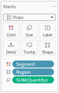
In this example, three different fields have been dragged to different properties in the Marks card. Segment is on Color, Region is on Shape, and Quantity is on Size.
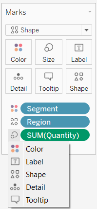
After you add a field to the Marks card, you can click the icon next to the field to change the property it is using. You can also click the property buttons in the Marks card to change those settings.
Many properties can have multiple fields. For example, you can add multiple fields to Label, Detail, Tooltip, and Color. Size and Shape can only have one field at a time. For more details, see Control the Appearance of Marks in the View.
Note: By default, dragging a new field to Color replaces the existing fields. To add a new field to color without replacing the existing field, hold the SHIFT key on your keyboard while dragging a new field to Color on the Marks card.
Filters shelf
The Filters shelf allows you to specify which data to include and exclude. For example, you might want to analyze the profit for each customer segment, but only for certain shipping containers and delivery times. By placing fields on the Filters shelf, you can create such a view.
Note: This section presents a brief overview of filtering. For more information on filtering, see Filter Data from Your Views.
You can filter data using measures, dimensions, or both at the same time. Additionally, you can filter data based on the fields that make up the columns and rows of the table. This is called an internal filter. You can also filter data using fields that don’t contribute headers or axes to the table. This is called an external filter. All filtered fields display on the Filters shelf.
To illustrate the basic concepts of filtering, consider the following view.
Suppose you are not interested in the Home Office data. You can remove this column from the view by filtering the Segment dimension. To do so, select Filter on the field menu or drag the Segment dimension to the Filters shelf. The Filter dialog box opens. By default all members are selected. Clear the check box for Home Office to exclude it from the view. All selected members will be included.

As shown below, the view updates and the Home Office column is removed. The filter is indicated by the Segment field on the Filters shelf.

Suppose you want to only view profit for a category of the products. Even though the Category field is not used on the Rows and Columns shelves or on the Marks card, you can still add a filter. Drag the Category dimension to the Filters shelf. This is an example of an external filter because Category is not part of the view.
The Filter dialog box automatically opens. By default, none of the members are selected. Select the members you want to keep as part of the view. All cleared members are excluded. In this example, Office Supplies is selected.
The modified data view is shown below. The mark label shows that the sum of the profit for the Consumer segment has decreased to $56,330. This number is derived by summing all the rows in the data source that are associated with the Corporate market and are part of the Office Supplies category.

The order of fields placed on the Filters shelf does not affect the data view because the filters are independent. In other words, the result of filtering by customer segment, and then by container is the same as filtering by container and then by customer segment. For more information about the filtering order of operations, see Filter Data from Your Views(Link opens in a new window).
Pages shelf
The Pages shelf lets you break a view into a series of pages so you can better analyze how a specific field affects the rest of the data in a view. When you place a dimension on the Pages shelf you are adding a new row for each member in the dimension. When you place a measure on the Pages shelf, Tableau automatically converts the measure into a discrete measure.
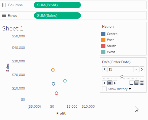
The Pages shelf creates a set of pages, with a different view on each page. Each view is based on a member of the field you placed on the Pages shelf. You can easily flip through the views and compare them on a common axis, using the controls that get added to the view when you move a field to the Pages shelf. For example, the view below shows the Profit vs. Sales by Region for each day throughout the month. The image below shows days 1, 2, 3, and 4. You would have to scroll down to see other days in the month.

To make this view more user-friendly, move DAY(Order Date) to the Pages shelf and use the associated control to flip through the pages (one for each day). You can quickly discover hidden insights. In this example, it is interesting that the 19th is an especially big day in terms of sales and profit in the Western region.

When you add a field to the Pages shelf, a page control is automatically added to the right of your view.
Use this control to navigate through the pages. There are three ways to navigate through the pages in a view:
-
Jump to a specific page
-
Manually advance through the pages
-
Automatically advance through pages
Jump to a specific page
Select the member or value you want to view from the drop-down list to display a specific page.
Manually advance through the pages
You can manually advance through the sequence of pages by doing any of the following:
-
Use the forward and back buttons on either side of the drop-down list to navigate through the pages one at a time.
-
Use the Page Slider to quickly scroll forward and backward in the sequence of pages.
-
Use any of the following keyboard shortcuts to scroll forward and backward in the sequence of pages.
F4 Starts and stops forward playback SHIFT + F4 Starts and stops backward playback CTRL + . Skip forward one page CTRL + , Skip backward one page On a Mac, these are the equivalent keyboard shortcuts.
F4 Starts and stops forward playback Shift-F4 Starts and stops backward playback Command-period Skip forward one page Command-comma Skip backward one page
Automatically advance through pages
Use the playback controls to watch a slide show of the pages in the view. You can play forward or backward, and stop the playback at any time. You can control the speed of playback with the speed controls in the bottom right corner of the control. The smallest bar indicates the slowest playback speed.

Show the Page history
Show page history using the Show History check box. With page history, marks from previous pages are shown on the current page.
In Tableau Desktop only: Open the drop-down control for history to specify what marks to show and when to show them.

The history drop-down control has the following options:
-
Marks to show history for – select whether you want to show history for just selected marks, highlighted marks, marks that you’ve manually selected to show history for, or all marks. To manually show history for marks, right-click (control-click on Mac) the mark in the view and select an option on the Page History menu.
-
Length – select the number of pages to show in the history.
-
Show – specify whether to show the historical marks, a line tracing through the previous values (trails), or both.
-
Marks – format the historical marks including the color and how much to fade them if the color is set to automatic, the marks will either use the default mark color or the color encoding on the Color shelf.
-
Trails – format the lines that are drawn through the historical marks. This option is only available if Trails is selected in the Show options.
Page trails may not display if there are multiple marks per color on a page. Make sure that the level of detail for the view is less than or equal to the level of detail on the Pages shelf and on the Color target. Also, trails are only supported for discrete mark types such as squares, circles, or shapes. They are not supported when the mark type is Automatic.
Pages on dashboards (Tableau Desktop only)
When a dashboard contains multiple views that use the same field on the Pages shelf, you can control all of the views with a single page control by selecting the Synchronized option. This option is only available on the page control shown on a dashboard.

Additional Shelves, Legends, Cards, and Controls
Some shelves, legends, cards, or controls are only displayed as a result of things that you do as you work with views. For example, the Color legend is only displayed when there is a field on Color.

Tableau provides controls for moving or otherwise customizing these elements of the view.
The following list describes each such shelf, legend, card, or control.
-
Measure Values Shelf– Measure Values is a special field that always appears in the Data pane and contains all the measures of your data collected into one field. Tableau automatically adds Measure Values to the view when multiple measures are sharing the same axis. When Measure Values is in the view, Tableau displays a Measure Values shelf that shows which measures are being included. You can add measures to or remove measures from this card. For more information, see Measure Values and Measure Names.
-
Color Legend – Shows how colors are allocated when there is a field on Color.
-
Shape Legend – Shows how shapes are allocated when there is a field on Shape.
-
Size Legend – Shows how sizes are allocated when there is a field on Size.
-
Map Legend – Shows the legend for the symbols and patterns on a map. The map legend is not available for all map providers.
-
Parameter Controls – A separate parameter control is available for every parameter in the workbook. For more information, see Create Parameters.
-
Title – A title is displayed by default for every view. The default title is the sheet name. Double-click a title (Control-click on a Mac) to edit it.
-
Caption – Choose Show caption from the Worksheet menu to display a caption for the view.
-
Summary Card – Choose Show summary from the Worksheet menu to display a summary card for the view. For more information, see Summary Card.
-
Page Control – Provides options for navigating through pages when there is a field on the Pages shelf.