Build Accessible Dashboards
You can use Tableau to create dashboards that conform to the Web Content Accessibility guidelines (WCAG 2.2 AA). This is useful if you want to make your dashboards accessible to as many people as possible, or if your work is subject to US Section 508 requirements or other accessibility-related laws and regulations.
To make an accessible dashboard:
-
Create a dashboard in either Tableau Desktop or in web authoring on Tableau Server or Tableau Cloud
-
Publish and embed that dashboard into a web page that conforms to Web Content Accessibility guidelines (WCAG 2.2 AA)
This topic explains how screen readers help users to navigate dashboards, the order that objects or views in a dashboard are read, what items are accessible, and how to make an existing dashboard more accessible.
Dashboard keyboard navigation and focus order
Tableau contains keyboard shortcuts that help users navigate by using only a keyboard. For more information, see Keyboard Accessibility for Tableau on the Web.
When creating a dashboard, note that screen readers read views or objects in a dashboard in the order in which they were added. For example, if your dashboard contains a text object containing information that helps explain the dashboard, add this object to your dashboard first.
You can also edit the dashboard hierarchy directly by editing the XML directly. For more information, see the Tableau community post How can I set the focus order of the views and objects in a dashboard?(Link opens in a new window)
Create accessible dashboards
Many items and objects in the Tableau workspace support keyboard navigation and are compatible with assistive technologies like screen reading software. You can use the following items on a dashboard you want to be accessible:
-
Add dashboard objects and set their options
- Text objects
-
Web page objects
-
Button objects
-
Image objects
-
Toolbar
-
Dashboard titles
- Views, specifically:
Title
Workbook tabs
View Data window
Captions (when visible)
Categorical legends
Single and multi-value filters
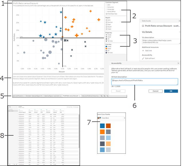
For more information about views, see Build Data Views for Accessibility
Note: Interactivity within a view (mark selection, tooltips, etc.) isn’t accessible.
Walkthrough: make existing dashboards more accessible
Here we start with a finished workbook and work backward to make it more accessible.

For this workbook to be more accessible, we will:
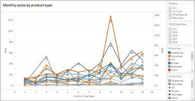
This dashboard is designed to show total sales for each sales region and product type. The line chart at the bottom shows monthly sales by product type. The author of this dashboard wanted to use color to brand the dashboard in the Superstore company's colors of green and gray.
Unfortunately, this dashboard has several features that pose accessibility problems for users, including the company color scheme. The steps that follow show a few ways to make this dashboard more accessible.
Format for accessibility at the dashboard and workbook level
The green text on a gray background doesn’t have a high enough contrast ratio to work for users with visual contrast sensitivity loss. To make the contrast ratio as high as possible, we're going to make the background white and change the text colors on our chart to black.
To update the dashboard shading color, change Dashboard Shading in the Format>Dashboard menu to None.

For text formatting changes, we could manually change the formatting on each worksheet. But that will take a long time. This dashboard only has two views, but dashboards often contain more.
To update the text on our dashboard to black, select Format>Workbook and change Fonts>All to Black.

This changes the font color in every sheet of our workbook to black, which is then applied to the views included in the dashboard. For external information on color contrast, see Color Contrast and Why You Should Rethink It.
| Less accessible - low contrast | More accessible - higher contrast |

|

|
For more information about adding background colors around items, see Add padding, borders, and background colors around items.
Aggregate and reduce marks
You might have a lot of information that you want to communicate with your dashboard or view. However, a dense view with many marks, like the bar chart at the top of our view, can be difficult to understand by using a screen reader or keyboard.
The top view in our dashboard shows over 5000 marks because each bar in the chart contains the name of each product in that category. If a view uses more than 1000 marks, the view is rendered on the server instead of the browser. Server-rendered views are not supported for WCAG conformance. Limit the number of marks to only those that emphasize the most important data points.
To make this view more accessible, make the stacked bar chart into a bar chart by removing Product Name from Details. This reduced the number of marks in the view from over 5000 to 68.
| Less accessible - too many marks | More accessible - aggregated view |
|---|---|

|

|
Users can also access the View Data window (enabled by default) to review the underlying data for the marks. Users can also download the data from that page to an accessible application to view it that way.
To reduce cognitive overload and reduce the numbers of marks in our field even further, we can create groups of related members in a field. To create a group of similar products:
- Right-click the field and select Create > Group.

- In the Create Group dialog box, select several members that you want to group, and then click Group.
For more information on grouping, see Group Your Data. Here's what the view looked like before grouping and aggregating, compared to after:
| Less accessible - too many marks | More accessible - aggregated and grouped view |
|---|---|
|
|

|
For information and examples about how to build this type of view, see Keep it simple in Author Views for Accessibility.
Eliminate redundant information
The aggregated and grouped bar chart reduces cognitive overload for users, but still uses color to convey meaning when color isn't necessary. Since the size of each bar represents sales, the sales field doesn't also need to be on Color in the Marks card. Removing color also removes the color legend that the screen reader reads.
| Less accessible - unnecessary marks | More accessible - unnecessary marks removed |
|---|---|
|
|

|
Use color and shape to differentiate marks
The line chart in this dashboard contains marks that are only distinguished by color, which makes it hard for people with color blindness to distinguish. The line path provides helpful position information, but the colors don’t provide clear distinction between the line marks.

Make this line chart more accessible by applying the Color Blind palette and adding shapes to reinforce what is being shown in color.
To apply the Color Blind palette:
-
Select Color on the Marks card.
-
Select Color Blind from the Color Palette menu.

-
Select Assign Palette and Apply to apply it to the view.
To add shapes in addition to color to your line chart, create a combination chart, or dual axis chart:
- Control-drag (command-drag on a Mac) the field in the Rows shelf to copy it and place it to the right of the first field. This creates two tabs in your Marks card, one for each field in the Rows shelf.
- On the marks card, select the bottom tab, titled [Field Name (2)]. Select Shape from the drop down menu in the Marks card.

- Select the Color mark to the right of the field name and select Shape.
-

This creates separate shapes for each of the marks in the field. At this point, there are two different charts; one a line chart of colors, another a scatter plot with shapes.
To merge these two charts together into a dual axis chart, in the Rows shelf, select the field on the right and select Dual Axis. For more information on combination charts, see Build a Combination Chart.
| Not easily accessible | More accessible - Color Blind palette and shapes |
|---|---|

|
|
The chart is improved, but the line colors and shapes have started repeating after the 10th mark applied. This makes the view look busy and hard to make sense of, leading to cognitive overload. Let's fix it by adding filters and legends.
Use filters to reduce the number of marks in a view
Using filters helps to focus the number of marks in the view to only what you want users to see.
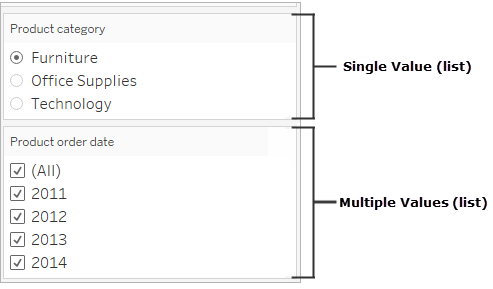
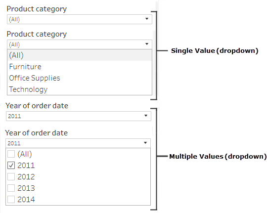
You can show the following filter modes to allow users to control what data is in the view. The filter modes that Tableau currently supports for WCAG conformance are:
-
Single Value (list): a filter with radio buttons. Only one item can be selected at a time. Giving your users single-value filters is a great way to reduce the number of marks in the view.
-
Multiple Values (list): a filter with a list of items (with checkboxes) that can be selected at the same time. Multiple-value filters will allow more marks to be shown at the same time.
-
Single Value (drop-down): a filter with a drop-down list of items. Only one item can be selected at a time. Giving your users single-value filters is a great way to reduce the number of marks in the view.
-
Multiple Values (drop-down): a filter with a drop-down list of items that can be selected at the same time. Multiple-value filters will allow more marks to be shown at the same time.
To show a filter, right-click the field you want to use as a filter, and then select Show Filter.
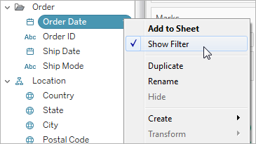
To select the filter mode, in the filter drop-down menu, select Single Value (list), Single Value (drop-down), Multiple Values (list), or Multiple Values (drop-down).
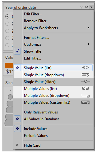
Because the line chart is a Single Value list, we can remove the All option from the filter. In the drop-down menu for the filter, select Customize and then clear the Show "All" Value option.

This reduces the level of marks in the view to prevent cognitive overload for dashboard consumers.
| Less accessible - too many marks | More accessible - less marks in the view |
|---|---|
|
|

|
To learn more, see Use filters to reduce the number of marks in a view.
Another way to make the viz easier to consume is to
Add captions and legends
To add clarity for our users, we can add a Text object with a description of the dashboard and instructions about how to interact, including how to use the filters and legends. To add a text object:
- Grab Text from the Objects menu and drag it onto the dashboard.

- Use Edit Text window to add text that explains the dashboard's purpose and how to use it.
You can also add chart captions to the dashboard. The default caption text gives a summary of the view, but you can modify this text to provide better context. To do this, click on a chart in the dashboard and select Caption from the More Option drop-down menu.

Last, we can update the titles of our legends to reference their associated charts and reduce the amount of redundant text that screen readers consume. To do this, double-click on the legend title, or right-click and select Edit Title to add or edit text in the Edit Filter Title window.
The result is a dashboard that includes an explanation of the dashboard and chart captions and eliminates redundant text for users.

Publish and embed the dashboard
After you create your views, to make them WCAG-conformant, you must:
-
Publish views to Tableau Server or Tableau Cloud, and then embed the view in a WCAG-compliant web page. For information about how to publish a view, see Comprehensive Steps to Publish a Workbook.
-
Web editing is not supported in WCAG-conformant views, so Web Edit permissions must be turned off in the published workbook.
-
In the embedded views, hide the Custom Views, Subscriptions, and Alerts buttons in the toolbar.
-
Make sure users have permissions to access to the embedded views and are able to view the underlying data in the View Data window.
For information about each of these steps, see Publish and embed the view in Author Views for Accessibility.