Build a Combination Chart
Combination charts are views that use multiple mark types in the same visualization. For example, you may show sum of profit as bars with a line across the bars showing sum of sales. You can also use combination charts to show multiple levels of detail in the same view. For example, you can have a line chart with individual lines showing average sales over time for each customer segment, then you can have another line that shows the combined average across all customer segments.
To create a combination chart, follow the steps below:
- Connect to the Sample - Superstore data source (if necessary, you can download it from the Tableau Public sample data page).
- Navigate to a new worksheet.
- From the Data pane, drag Order Date to the Columns shelf.
- On the Columns shelf, right-click YEAR(Order Date) and select Month.

- From the Data pane, drag Sales to the Rows shelf.
- From the Data pane, drag Profit to the Rows shelf and place it to the right of SUM(Sales).
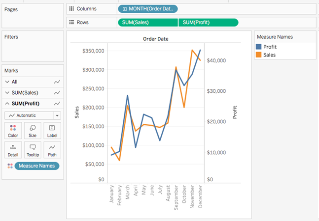
- On the Rows shelf, right-click SUM(Profit) and select Dual-Axis.

The view updates. Measure Names is added to Color on the Marks card to differentiate the lines.

Note: Some marks can be hidden behind others. To move the marks forward or backward, right-click one of the axes in the visualization and select Move Marks to Back or Move Marks to Front.
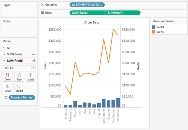
- On the SUM(Profit) Marks card, click the Mark Type drop-down and select Bar.

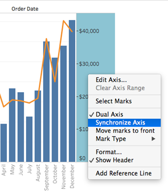
- In the visualization, right-click the Profit axis and select Synchronize Axis.

The view updates to look like this:

