Explore and Inspect Data in a View
When you are ready to explore and analyse your view, Tableau offers a selection of dynamic data inspection tools that help you isolate the data of interest. For example, if you have a dense data view, you can focus on a particular region, select a group of outliers, and view the underlying data source rows for each mark.
Select marks to highlight data points in the view
The simplest way to add highlighting to a view is to select the marks you want to highlight. When you manually select a mark in the view, all other marks are dimmed to draw attention to the selection. Your selection is saved with the workbook.
For more information on how to use selection tools, see Select marks(Link opens in a new window). Also see Legend Highlighting(Link opens in a new window), Highlight Data Points in Context(Link opens in a new window), Highlight Toolbar Button(Link opens in a new window), and Highlight Actions.
You can select multiple marks by holding down the Ctrl key on your keyboard (Command key on Mac) while you select each mark. You can also use one of the advanced selection tools to select marks within a specific shape.
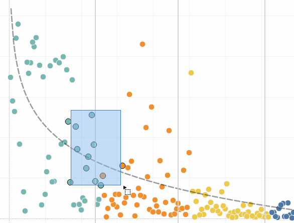
You can also select marks and headers to filter what is being displayed in the view. For more details, see Select to keep or exclude data points in your view and Select headers to filter data.
Analyse selected marks using tooltips
When you select one or multiple marks in a view, and then continue to hover in the same spot, several options for inspecting your data are available in the tooltip.
| Tableau Desktop version | Web version |
|
|


Tooltips provide additional information about the marks in your view, and provide the following data analysis options:
Keep only the selected marks in the view.

For more information, see Select to keep or exclude data points in your view(Link opens in a new window).
Exclude the selected marks from the view.

For more information, see Select to keep or exclude data points in your view(Link opens in a new window).
Create a group based on the selected marks.
 For more information, see Correct Data Errors or Combine Dimension Members by Grouping Your Data(Link opens in a new window).
Create a set that contains the selected marks (Tableau Desktop only).
 For more information, see Create Sets(Link opens in a new window).
View the underlying data of the marks selected.
 For more information, see View Underlying Data(Link opens in a new window).
For related information on Tooltips, see Tooltips.
For details on related analysis tools, see Zoom and Pan Views and Select Marks, Undo and Redo, and Drop Lines.
Highlight data by category in tooltips
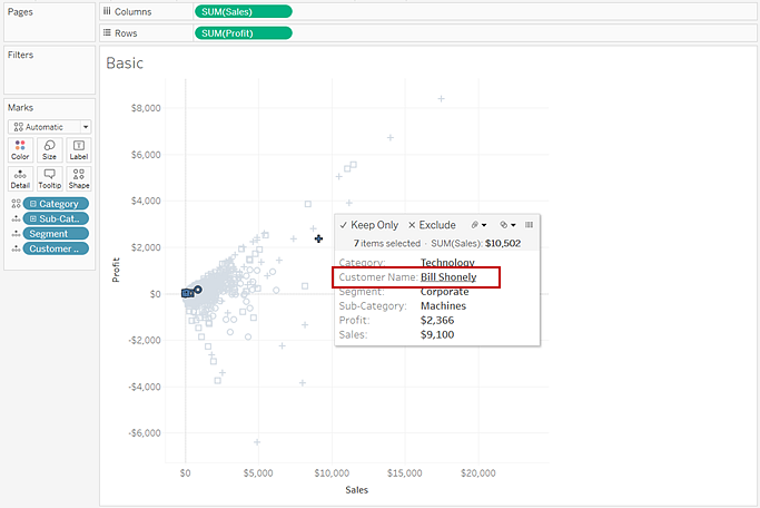
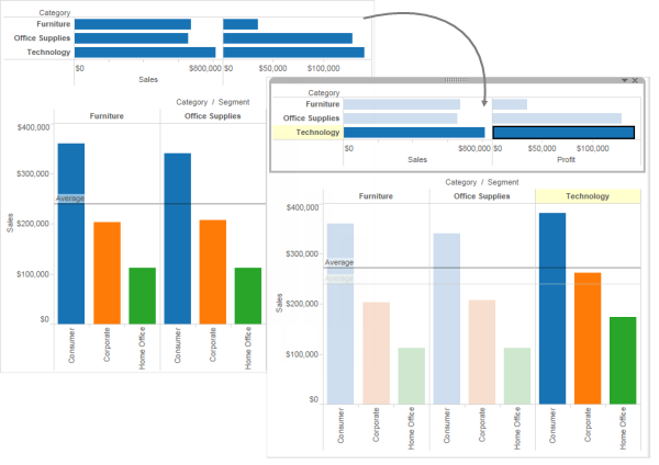
If you include discrete (categorical) dimensions or measures in your tooltip, you can use them to select marks in the view that have the same values. If Tooltip selection is turned on for your worksheet, then these fields show as underlined text when you mouse over them. Clicking on the tooltip selects all the marks in the view that have the same value.
In the example below, when you click on Bill Shonely (the value for Customer Name) in the tooltip, any mark in the view that also includes Bill Shonely as a customer is selected and all other marks are dimmed.
To turn this functionality off or on, select the Allow selection by category check box in the Edit Tooltips dialog box. For more information about setting tooltip properties, see Add tooltips to marks.
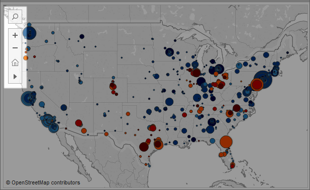
Explore data in maps
Tableau maps can help you quickly find locations and analyse data worldwide. There are many ways you can explore and interact with map views. You can zoom in and out, pan and select marks with the view toolbar, and even search for locations worldwide with map search.
For more details, see Explore Data in Maps, Search for Locations in Your Map, and Measure Distances Between Data Points and Locations on a Map.
Add analytics objects to the view (trend lines, forecasts, reference lines and bands)
Drag reference lines, box plots, trend lines forecasts and other items into your view from the Analytics pane, which appears on the left side of the workspace. Toggle between the Data pane and the Analytics pane by clicking the tabs at the top of the side bar. For more details, see Apply Advanced Analysis to a View (Analytics Pane).
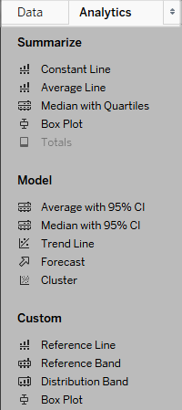
Tableau Desktop Analytics pane
In Tableau Desktop, options for adding Analytics objects to the view are available the Analytics pane or menu, or in context in the view. For example, reference lines and bands are available when you edit an axis, and trend lines and forecasts are available from the Analysis menu.
The Analytics pane provides drag-and-drop access for the various options.
On the web, most Analytics objects are available from the Analytics pane.
Compare marks data with recalculated lines
If there is an analytics object in your view, such as an average line, constant line, trend line, reference line or distribution line or band, selecting one or multiple marks in the view lets you instantly compare the analytical data for the selected marks to all data in the view.
For example, selecting marks in a view that contains a trend line creates a second, recalculated trend line, the value of which is determined by the selected marks only, so you can compare that trend to the overall trend.
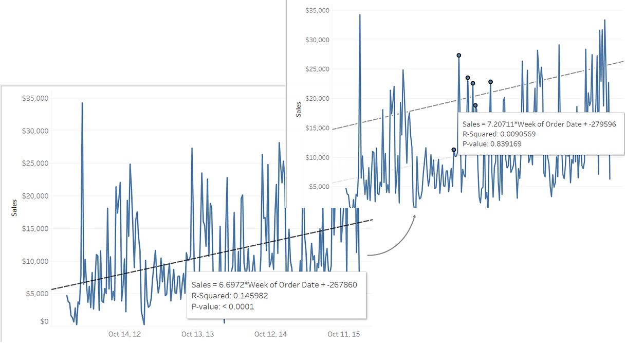
Recalculated lines are displayed by default when you select marks in a view that already contains analytics objects. In Tableau Desktop, if you don't want recalculated lines to be created you can turn them off.
Turn off recalculated lines (Tableau Desktop only):
Select an analytics object in the view, such as a trend line, and click Edit.
In the Edit dialog box, clear Show recalculated line for highlighted or selected data points.

Alternatively, you can right-click (control-click on Mac) an analytics object in the view and clear Show Recalculated Line.
When you return to the view and select or highlight marks, recalculated lines will not appear. For more information, see Highlight Actions(Link opens in a new window).
Recalculated lines and highlight actions
Recalculated lines also work with highlighting actions, both in worksheets and dashboards.
For example, if you create a highlight action in a dashboard, selecting marks in one sheet will highlight marks in the other sheets in the dashboard. If those other sheets have trend lines, reference lines, or other analytics objects, recalculated lines will appear as the views update.
Use Data Details to see visualisation information
Starting in 2019.3, Tableau Catalog is available as part of the Data Management offering for Tableau Server and Tableau Cloud. When the Tableau Catalogue is enabled in your environment, you can use the Data Details pane to see visualisation information. For more information about Tableau Catalog, see "About Tableau Catalog" in the Tableau Server or Tableau Cloud Help.
When you're looking at a published view and Tableau Catalogue is enabled in your environment, you can see information about the data used in the view by selecting Data Details in the toolbar above the view in workbooks and dashboards. Details include:
- A sparkline that shows the number of times a sheet or dashboard was viewed over the last 12 weeks.
- Information about the workbook (name, project, author, date modified, data quality warnings).
- The data sources used in the sheet or dashboard.
- A list of the fields in use. Select a field to see the field metadata, such as a description or calculation.
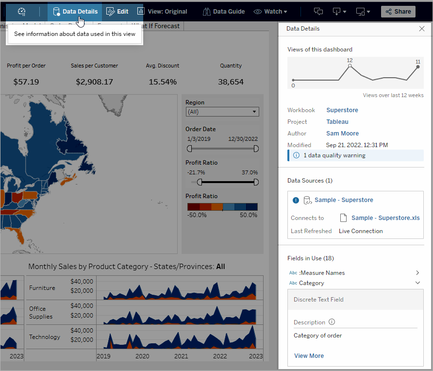
The links in the Data Details pane take you to that item, which opens in a separate window.
If there's a data quality warning in the lineage of any of the data used in a view, workbook or dashboard, the Data Details tab shows a blue circle with a white exclamation mark in it. Click the Data Details tab, then click the data quality warning to see the details of the warning.
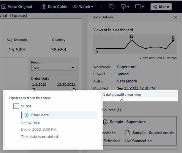
High visibility data quality warnings
When a data quality warning is tagged as important by, for example, the data item owner or an admin:
- A notification appears when anyone opens a published view that uses the affected data, with a link to the Data Details pane:

- On the Data Details pane (and elsewhere in Tableau), the warning's visibility is raised by using a yellow warning symbol:

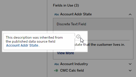
Fields can show upstream descriptions
If a field used in a view doesn’t have a description in the workbook, Catalogue can look up and display the description from the field or column upstream from it, if one exists. If a published data source is upstream and has a description for this field, the Data Details pane displays that field description. If not, this field shows the description from the column that the field references in the upstream table.
When a field get its description from an upstream source, an information icon appears next to Description, telling where the description came from.
Some fields, such as a calculated field, group field or set field, don't support showing a description from an upstream source. Also, workbooks and data sources don't support displaying upstream field or column descriptions.
For information about adding descriptions, see "Add or edit descriptions" in Manage Web Content.