Visual Best Practices
This content is part of Tableau Blueprint – a maturity framework allowing you to zoom in and improve how your organisation uses data to drive impact. To begin your journey, take our assessment(Link opens in a new window).
Visual best practices are key to developing informative visualisations that drive your audience to act. A dashboard is successful when people can easily use it to derive answers. Even a beautiful dashboard with an interesting data source could be rendered useless if your audience can’t use it to discover insights.
Think not just as an analyst but also as a designer and consumer. Dashboards should have interactive elements that are discoverable and predictable, follow a sensible, logical layout, and have a simplified design that makes complex decisions easier. It’s important not to assume that people automatically know what it takes to communicate clearly and effectively with data. Here are a few white paper links to share on your enablement intranet:
- Visual Analysis Guidebook
- Which Chart or Graph Is Right for You?
- Good Enough to Great
- Designing Efficient Workbooks
You can find a list of books by renowned data visualisation experts in the appendix. Adding these white papers and books to the resources of your analytics community can lead to a deeper understanding and internalisation of visual best practices.
Audience
The best visualisations have a clear purpose and work for their intended audience. It’s important to know what you are trying to say and who you are saying it to. Does your audience know this subject matter extremely well or will it be new to them? What kind of cues will they need? Thinking about these questions before you begin designing will help you create a successful dashboard. For example, you would present aggregated, summary-level data and KPIs to an executive audience rather than row-level transactions.
Context
Make sure your views include context. Titles, captions, units and commentary all help your audience to better understand your data view. Always strive to tell stories with your data and your visuals. Understand that good stories involve more than just data, and consider the following:
- Mind your aesthetics and know that what is effective is often affective. In other words, an effective view can create an emotional response and genuinely communicate something to your audience.
- Ensure that your views are stylistically consistent and pleasing to the eye. Your views are representative of who you are and what you care about.
- Use interactive elements that allow your audience to manipulate the data, ask and answer questions, and arrive at findings on their own. This helps to foster trust in your data.
- Make your views vivid and memorable. Pay attention to structure and context.
Chart choice
Chart choice should depend on the question you’re trying to answer or a specific insight you’re trying to communicate. There’s almost always a trade-off involved, with different chart types each having their own advantages and downsides. You should always ask yourself if your chosen chart type best conveys the message you’re trying to share and if it can be easily understood by your audience. This table explains the chart types in Tableau’s Show Me panel and when to use each. This should be published to your enablement intranet to educate new users.
Chart | Description |
|---|---|
| Line – View trends in data over time. Examples: Stock price change over a five-year period, website page views during a month, revenue growth by quarter. |
| Bar – Compare data across categories. Examples: Volume of shirts in different sizes, website traffic by origination site, percentage of spending by department. |
| Heat Map — Show the relationship between two factors. Examples: Segmentation analysis of target market, product adoption across regions, sales leads by individual rep. |
| Highlight Table – Provide detailed information on heat maps. Examples: The percentage of a market for different segments, sales numbers in a particular region, population of cities in different years. |
| Treemap – Show hierarchical data as a proportion of a whole. Examples: Storage usage across computer machines, managing the number and priority of technical support cases, comparing fiscal budgets between years. |
| Gantt – Show duration over time. Examples: Project timeline, duration of a machine’s use, availability of players on a team. |
| Bullet – Evaluate performance of a metric against a goal. Examples: Sales quota assessment, actual spending vs budget, performance spectrum (great/good/poor). |
| Scatterplot – Investigate the relationship between different variables. Examples: Male versus female likelihood of having lung cancer at different ages, technology early adopters’ and laggards’ purchase patterns of smart phones, shipping costs of different product categories to different regions. |
| Histogram – Understand the distribution of your data. Examples: Number of customers by company size, student performance on an exam, frequency of a product defect. |
| Symbol map – Use for totals rather than rates. Be careful, as small differences will be hard to see. Examples: Number of customers in different geographies. |
| Area map – Use for rates rather than totals. Use sensible base geography. Examples: Rates of internet-usage in certain geographies, house prices in different neighbourhoods. |
| Box-and-Whisker – Show the distribution of a set of a data. Examples: Understanding your data at a glance, seeing how data is skewed towards one end, identifying outliers in your data. |


Layout
How your audience “reads” your dashboard isn’t a trivial consideration. Your dashboard’s purpose is to help guide the reader’s eye through multiple views in coordination and tell the story of each insight. Your dashboard needs a sensible “flow” and a logical layout of different pieces of information. The more you employ better dashboard design, your users will discover what’s happening, why and what’s most important. Consider how you’re guiding their eyes across the dashboard. Are you showing the user where to look next?
Design theory gives us plenty of advice on how best to succeed. Layout is a key component of any successful dashboard design. Here are a few concepts you want to think about when building visualisations:
- Newspaper or Z-layout – The most important content is put either at the top or the left of a visualisation, as users move right and down for more specific content.
- White space – Using negative space (blank spots) and padding to delineate sections of your visualisation – don’t use thick “grid lines” as you would see in a table.
- Size – More important pieces of content (KPIs, summary visualisations and so on) should be larger than other items.
- Device type – With device-specific dashboards you can create the optimum viewing experience on desktop, laptop, tablet and phone.
Colour
Colour is one of the most powerful aesthetic features because it’s an attention-grabber. It’s the first thing we notice, and it can immediately highlight specific insights or identify outliers, but it isn’t an unlimited design resource.
Using colour effectively is critical for producing quality data visualisations – colour types (alerting vs highlighting), creating custom colour palettes and consistency – are key aspects to build into your standards.
The correct use of colour is critical for producing coherent and impactful data stories. The key factors that should be taken in to consideration for any successful dashboard are:
- Managing colour choices — The primary colour(s) that make up most of your design should be a neutral colour. Using techniques like greyscale, you maximise the possibility for contrast and visibility of your data-driven points. Your extended colours – accents, emphasis, and alerts – should reflect the brand. Any extended colour should be used sparingly to draw attention to key messages within the data.
- Colour types – Understand when to use sequential, diverging, categorical, highlighting or alerting colour motifs.
- Custom colour palettes – Build your own company palettes to bring a sense of uniformity and provide guide rails for new users.
- Consistency – Double-check your visualisations to make sure a colour (e.g. red) doesn’t mean three different things. Similar and repeated colours can imply a relationship where one doesn’t actually exist.
- Accessibility – Remember to account for colour blindness in the design process.
Titles & subtitles
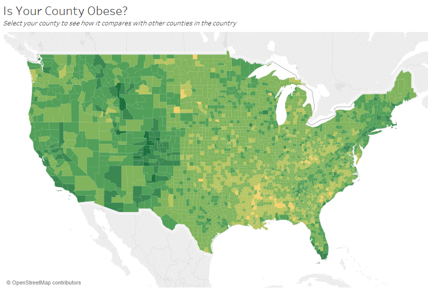
Titles are an easy way to make your dashboard more digestible for your audience. You add more context with subtitles that describe how to interact with the worksheet or dashboard. This is a powerful and simple way to make dashboards easier to navigate. In this example, the question pulls the audience in and then tells the audience how to answer the question using the dashboard.
Effective title and subtitle
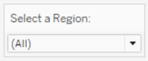
Similarly, by changing your filter title to something more intuitive, you guide viewers through how to interact with a dashboard.
Example of a filter
Tooltips
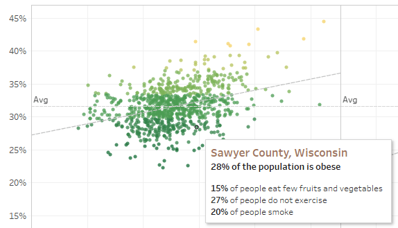
Tooltips guide the audience by highlighting important information. In this example, the County and State are highlighted through a bold effect and colour change, and we don’t have to partition our scatter plot further. We add important and related dimensions and measures in the tooltip. This helps save space and de-clutter the dashboard so our viewers can focus on gleaning insights instead of interpreting the visualisation.
Effective tooltip
If the viewer notices something interesting in the tooltip, they can interact directly with it and watch the rest of the visualisation come to life, highlighting related marks and outliers.
Fonts
Typography is important. It can be tempting to use many font types and sizes in a dashboard. Don’t do that; instead, define a clear hierarchy for your typography. In this example, there’s a top, mid and low-level font. The mid-level is blue to focus viewer attention. Colour draws the eye to the most important level (which needn’t necessarily be the top-level font).
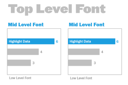
Top-, mid- and low-level fonts (courtesy of The Big Book of Dashboards)
Make sure that font selection is done to reinforce a visual hierarchy within your visualisation through size, boldness, colour and type.
- Size – Larger elements convey importance, as they catch the eye. Save your largest fonts for KPIs, titles and so on
- Boldness – Bolder elements convey importance as they catch the eye. You can vary boldness throughout your visualisation in conjunction with size. For example, your title and KPIs could both be 24pt font, but making your KPIs bold will “pop” them, allowing your audience to focus there first.
- Colour – Generally it’s good to stick with grey and black hues in your titles, text and KPIs. You can “pop” your KPIs by giving them a colour treatment, but you have to balance this with the other colours used in your visualisation. Darker colours will draw the eye, so it’s wise to lighten your titles so they don’t compete for visual attention.
Dashboard size
By default, Tableau dashboards are set to use a fixed size. If you keep this setting, be sure to construct your visualisation at the size which it will be viewed. You can also set the size to Automatic, so Tableau automatically adapts the overall dimensions of a visualisation based on screen size. This means that if you design a dashboard at 1300 x 700 pixels, Tableau will resize it for smaller displays – and sometimes this results in scrunched views or scrollbars. The Range sizing feature is helpful for avoiding this.
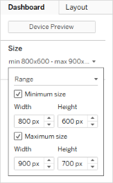
Dashboard size range
If you’re using Tableau Desktop to create dashboards, you can also design for specific device layouts, so that on tablets, for example, your dashboard contains one set of views and objects and on phones it shows another. See Create dashboard layouts for different device types for steps.
Dashboard interactivity
When designing a dashboard, you need to consider your audience and how you can communicate to them that they can interact with the dashboard. Skilled users know to click and experiment, but new users may not have the knowledge or confidence. Your job is to help them make these decisions consciously, not by accident.
It’s important to make any interactivity obvious to your audience – even by creating subtitles to instruct them to click or hover for more information. Add interactivity to your data using filters, tooltips and actions. Filters are the most obvious way to interact with a dashboard. Users can also interact with your visualisations by selecting marks and hovering to see tooltips. The actions you set up can respond with navigation and changes in the view. This table enumerates the ways to create interactivity in your dashboards.
Type | Description |
|---|---|
Highlighting & highlight actions |
|
Filtering & filter actions |
|
Parameters |
|
Sets & set actions |
|
Tooltips |
|
URL Actions |
|
Dashboard navigation |
|
When designing dashboards, consider how and why you incorporate interactivity into the dashboard. The following questions are helpful:
- Why does a viewer need to interact with the dashboard?
- What extra insight will be gained through the interactivity?
Designing for performance
When we talk about performance, we mean the speed with which you can work in Tableau. That might mean the speed of data analysis: for example, if you work in Tableau Desktop on a large corporate database that takes forever in real time when you access it remotely. Or it might mean simply the speed of loading views or dashboards that you access on your desktop, from Tableau Server or from Tableau Cloud.
Performance and efficiency should be treated as part of the design process, not as an afterthought. Responsiveness is an important success factor for end users when viewing reports and dashboards, so making your workbooks run as quickly as possible makes for happier users.
There are several factors that make a workbook “efficient”. Some of these factors are technical and some more user-focused but in general an efficient workbook is:
- Simple – Is it easy to create the workbook and will it be easy to maintain in the future? Does it take advantage of the principles of visual analysis to clearly communicate the message of the author and the data?
- Flexible – Can the workbook answer multiple questions the users want to ask, or just one? Does it engage the user in an interactive experience or is it simply a static report?
- Fast – Does the workbook respond quickly enough for the users? This may mean time to open, time to refresh or time to respond to interaction. This is a subjective measure, but in general we want workbooks to provide an initial display of information and to respond to user interactions within seconds.
The performance of a dashboard is affected by the following:
- The visual design at both the dashboard and worksheet levels, e.g. how many elements, how many data points, use of filters and actions and so on
- The calculations, e.g. what kind of calculation, where the calculation is performed, and so on
- The queries, e.g. how much data is returned, impact of custom SQL and so on
- The data connections and underlying data sources.
- Some differences between Tableau Desktop and Tableau Server or Tableau Cloud.
- Other environmental factors, such as hardware configuration and capacity for Tableau Server.
For more information, see Designing efficient workbooks.
Accessibility
To make your views accessible to as many people as possible – or if you work in an environment that is subject to US Section 508 requirements or other accessibility-related laws and regulations – you can use Tableau to build data views that conform to the Web Content Accessibility Guidelines (WCAG 2.0 AA). This includes building views that are accessible to users who use screen readers, Braille keyboards, keyboard-only navigation and so on. Refer to Build data views for accessibility for details. Additional resources are available on the “FAQ: Accessibility” post in the Tableau community forums.