Create Dashboard Layouts for Different Device Types
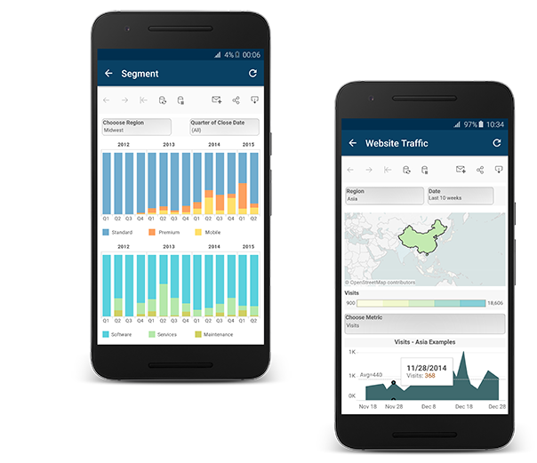
Dashboards can include layouts for different types of devices that span a wide range of screen sizes. When you publish these layouts to Tableau Server or Tableau Cloud, people viewing your dashboard experience a design optimised for their phone, tablet or desktop. As the author, you only have to create a single dashboard and deliver a single URL.
Tip: In addition to optimising layouts for mobile, Optimise Workbook Performance to better meets the needs of mobile users, who often have limited bandwidth and are in a hurry.
How the Default dashboard relates to device layouts
Device layouts appear on the Dashboard tab, under Default. Initially, each device layout contains every item in the Default dashboard and derives its size and layout from Default as well.
Think of the Default dashboard as the parent, and the device layouts (desktop, tablet, and phone) as its children. Any view, filter, action, legend or parameter that you want to add to a device layout must first exist in the Default dashboard.
Phone layouts and the Default dashboard
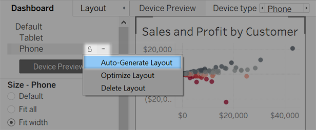
To save time with a unique Phone layout option that automatically reflects changes to the Default dashboard, either click the open lock icon  , or choose Auto-Generate Layout from the pop-up menu.
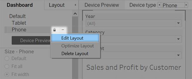
If you instead click the closed lock icon  or choose Edit Layout from the menu, the Phone layout becomes fully independent, so you'll need to manually add and arrange items to reflect changes to the Default dashboard.
Desktop and Tablet layouts and the Default dashboard
Unlike Phone layouts, you need to manually add Desktop and Tablet layouts to a dashboard. Desktop and Tablet layouts are always fully independent from the Default dashboard, so each device layout can contain a unique arrangement of objects.
Automatically add phone layouts
Two options let you automatically add phone layouts:
- To create phone layouts whenever you open old dashboards that lack them, choose Dashboard > Add Phone Layouts to Existing Dashboards
- To create phone layouts whenever you create a new dashboard, choose Dashboard > Add Phone Layouts to New Dashboards. (This option is on by default.)
Preview and manually add device layouts
Open a dashboard.
On the Dashboard tab on the left, click Device Preview.

In device preview mode, these options appear above the dashboard:

Take a moment to click through the Device types and Models and explore the different screen sizes. Then set these options:
To see how the dashboard will look in landscape vs. portrait mode, click
 . Usually, landscape is optimal for tablets and portrait is best for phones.
Select Tableau Mobile app to see how the dashboard will look with the app instead of the browser. This option is available for iOS or Android devices and shrinks the dashboard slightly, leaving space for the app controls.
Choose a Device type, such as Tablet.

In the upper-right corner, click the Add Layout button for the device type you selected (for example, Add Tablet Layout).

Add an additional layout by selecting a new Device type and clicking Add Layout.

Creating a layout for each device type gives you the most control over your users' experience as they view your dashboard from different devices. After you publish a dashboard with all three layouts, users won't see the default dashboard layout; instead, they'll always see the appropriate device-specific layout.

Note: If you make changes to a view, double-check related devices layouts to ensure that they look as you expect.
Customise a device layout
After you've added a device layout to your dashboard, you can start rearranging objects to create the look you want.
For Desktop and Tablet layouts, click Custom:

For Phone layouts, either click the lock icon
, or choose Edit Layout from the pop-up menu:Anything you can add to your layout is listed on the left, under Layout. If an item has a blue check mark, it means that it's part of the device layout that you're currently working on.

If you remove an item, it's only removed from the current device layout. It still exists on the default dashboard and can be added to the device layout again.

Click through the Device model options to see how the layout will appear on different models.

Ultimately, it's the size of the web browser that loads the dashboard that determines which layout appears on the device. For details, see Confirm which layout a device will display.
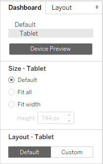
At left, explore the options under Size.

Default: The height and width of the device layout mimics whatever the default dashboard is using. For example, if you're creating a tablet layout and the default dashboard is set to a fixed size of Desktop Browser (1000 x 800), setting Size to Default for the tablet layout will make it use 1000 x 800 as well.
Fit all: All items are automatically resized to fit the device frame size. The device frame size is determined by the Device type, Model, and orientation (portrait or landscape) settings.
Fit width (recommended for phones): Items are automatically resized to fit the width of the device frame, but the height is fixed. This is a great option for phone layouts and vertical scrolling.
Optimise for phones
The small screens of mobile phones benefit from further optimisation. Try these techniques.
Optimise manual phone layouts
If you've chosen to edit a phone layout yourself, you can quickly optimise the placement of filters, remove white space and more. On the Dashboard tab, click the pop-up menu to the right of Phone, and select Optimise Layout.
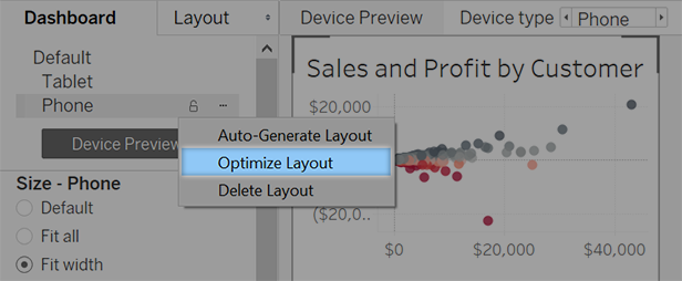
Be aware that this command only rearranges items currently in the phone layout. If you want to continuously update the phone layout to reflect all changes to the default dashboard, select Auto-Generate Layout.
Add links that trigger instant messages and phone calls
To let phone users quickly contact key people about dashboard content, add URL actions to objects that automatically trigger SMS messages and telephone calls. Use the link format sms:phone-number or tel:phone-number. Be sure to include country and area codes if necessary.
Create phone-specific versions of views
Create duplicates of certain views in the default dashboard – one optimised for desktop viewing and a second optimised for phones.
Go to the worksheet for a view, click its tab, and select Duplicate Sheet.

Customise the view for mobile viewing.
For maps for example, you may want to zoom in to a specific region by default, or you may want to disable panning, zooming, and other functionality. See Customise How People Interact with your Map.

Now add the new view to the default dashboard so that it can be available to the device layouts you're creating.
Shorten titles
Short titles work best for mobile viewing. To edit a title, double-click it.
Optimise white space
White space is another visual element to consider. While screen real estate on a phone is scarce and you want to make the most of it, you may also want to provide additional safe places for your users to tap or initiate scrolling, so they don't select filters and other items unintentionally.
To add white space, use padding or Blank objects. For more information, see Size and Lay Out Your Dashboard.
Publish the dashboard
Click Server > Publish Workbook. If you're not already signed in, you're prompted for your credentials.
In the Publish Workbook to Tableau Server dialog box, make sure the Show sheets as tabs check box is cleared.

When this check box is selected for device-specific dashboards, the tabs' sizing requirements interfere with the server's ability to correctly detect the size of the web browser and load the correct layout.
Click Publish.
Test the dashboard
After you publish the dashboard to Tableau Server or Tableau Cloud, test the dashboard by viewing it from different browser sizes.
Open the dashboard on Tableau Server or Tableau Cloud.
In the upper-right corner of the page, click Share and copy the contents of the Link text box.

Paste the string into a web browser URL. The string should include the following:
embed=yWith the embed code string as your browser URL, test the different layouts by changing the size of your web browser window and refreshing it.
Confirm which layout a device will display
The dashboard layout a device displays is based on the smallest dimension (height or width) of the iframe in which the Tableau view appears. This height or width is the iframe’s CSS pixel size not the device’s screen resolution, which might be larger than the pixel size. Sometimes Desktop, Tablet or Phone layouts may appear on other types of devices. For example, a Tablet layout may appear on a desktop computer if the display or browser window is small.
| If the smallest iframe dimension is... | This device layout appears... |
|---|---|
| 500 pixels or less | Phone |
| Between 501 and 800 pixels | Tablet |
| Greater than 800 pixels | Desktop |
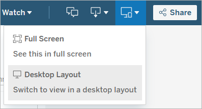
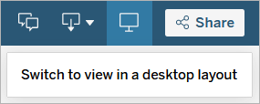
If Tableau Cloud and Tableau Server users find a Phone or Tablet layout too limiting, they can use the display settings button in the toolbar to view the Desktop layout. This button is a toggle that allows you to switch between Desktop and Mobile layouts. The button placement varies depending on the device you are viewing the dashboard on.