Size and Lay Out Your Dashboard
After you create a dashboard, you can resize and reorganise it to work better for your users.
To learn more about styling options for your dashboard objects, see Format Dashboard Objects.
Control overall dashboard size
A best practice is to start with setting the size so any layout work starts at the correct size.
Dashboard size options
 | Fixed size (default): The dashboard remains the same size, regardless of the size of the window used to display it. If the dashboard is larger than the window, it becomes scrollable. You can pick from a preset size or specify a custom size. Fixed size dashboards let you specify the exact location and position of the content on the dashboard, which can be useful if there are floating objects. Published dashboards that use a fixed size can load faster because they're more likely to use a cached version on the server. For other performance tips, see Optimise Workbook Performance. |
 | Range: The dashboard scales between the minimum and maximum sizes that you specify. If the window used to display the dashboard is smaller than the minimum size, scroll bars are displayed. If it's larger than the maximum size, white space is displayed. Use this setting when you're designing for two different display sizes that need the same content and have similar shapes – such as small- and medium-sized browser windows. Range also works well for mobile dashboards with vertical layouts. (The width is allowed to change for different mobile device widths, but the height is fixed for vertical scrolling.) |
 | Automatic: The dashboard automatically resizes to fill the window used to display it. Use this setting if you want Tableau to take care of any resizing. For best results, use a tiled (rather than floating) dashboard layout. Automatic sizing can lead to unpredictable results on different screens, so use this setting with caution if you don't know where the dashboard will be consumed. Dashboards with variable sizes must be freshly rendered for every browser request, which can have a performance impact. |
Tip: If you use Tableau Desktop, see Create Dashboard Layouts for Different Device Types to create unique layouts optimised for desktop computers, tablets and phones. In addition to adapting to different screen sizes, each device layout can contain different items.
Set overall dashboard size
Under Size on the Dashboard pane, select the dashboard's dimensions (such as Desktop Browser) or sizing behaviour (such as Fixed size).

Group items using layout containers
Layout containers let you group related dashboard items together so you can quickly position them. As you change the size and placement of items inside a container, other container items automatically adjust. Layout containers can also be used for formatting.
Layout container types
A horizontal layout container resizes the width of the views and objects it contains; a vertical layout container adjusts height.
Horizontal layout container The two views are arranged in a horizontal layout container. | Vertical layout container The three views are stacked in a vertical layout container. |


Add a layout container
Under Objects on the Dashboard pane, select Horizontal or Vertical.
Drag the container to the dashboard.

Add views and objects to the layout container.

Evenly distribute a layout container's items
Select the layout container. If you have trouble making the selection, select an individual item within the container and choose Select Container from its shortcut menu.
With the layout container selected, choose Distribute Evenly from its shortcut menu:

Items that are already within the layout container arrange themselves evenly; any items you add do the same.
Automatically resize sheets in layout containers
If you add multiple sheets with related data to a layout container, whenever marks are selected in one sheet, you can automatically resize related sheets.
In this example, when a mark is selected in the map, the bar chart updates to display profit and sales for that mark. When no marks are selected in the map, it automatically expands to fill the layout container.
| With mark selected | Without a selection |
 |  |
Add multiple sheets with related data to a layout container.
From the drop-down menu of the sheet you want to expand, choose Use as Filter.

Choose Dashboard > Actions, and double-click the generated filter you created.
In the Target Sheets section of the Edit Filter Action dialog box, select the other sheets in the layout container.
To control how target sheets resize when no marks are selected in the source sheet, select one of the following:
Show all values returns target sheets to their original size, showing all data.
Exclude all values collapses target sheets under their titles, hiding all data.
Remove a layout container to independently edit items it contains
Select the container either on the dashboard or in the Item hierarchy area of the Layout pane.
From the drop-down menu at the top of the container, select Remove Container.
Tile or float dashboard items
Tiled vs. floating layouts
Each object, layout container, and view that you place on a dashboard is either tiled (the default) or floating.
| Tiled layout | Floating layout |
| Tiled items don't overlap; they become part of a single-layer grid that resizes based on the overall dashboard size. | Floating items can be layered over other objects. In the example below, a map floats over tiled views. |
 |  |
| For best results, give floating objects and views a fixed size and position on a fixed size dashboard. |
Float or tile a new item
Under Objects in the Dashboard pane, click the layout option you want to use: Floating or Tiled.

Drag the view or object onto the dashboard on the right.
Tip: You can also assign a floating layout to an item by holding down Shift on your keyboard as you drag it onto the dashboard.
Switch an existing item from tiled to floating
Select the item in the dashboard.
In the item's shortcut menu, select Floating:

Size, position, reorder and rename individual dashboard items
Set an item's size and position
If you want a high degree of control over the placement, choose Fixed size then set each item's size and position using the Layout pane.
Select the dashboard item you want to position and size. In the Layout pane, the item's name appears under Selected item.

Tip: To quickly switch between the Dashboard and Layout panes, press the T key.
Define the item's position x and y position in pixels as an offset from the top-left corner of the dashboard. For example, to place an object in the top-left corner of the dashboard, specify x = 0 and y = 0.
The values you enter can be positive or negative but must be whole numbers.
To resize an item, click and drag it in the dashboard. You can also use the settings under Size.
To hide the title of the item you’ve selected, clear the Show title check box. (The similar Show dashboard title check box on the Dashboard pane controls the overall dashboard title.)
Tip: To quickly position floating items, press arrow keys to move 1 pixel, or Shift+arrow keys to move 10 pixels. To quickly resize items, add Alt (Windows) or Option (macOS) to these shortcuts.
Align items with a grid
To present a visually consistent design, arrange and size dashboard items over a grid.
Choose Dashboard > Show Grid.
To change the grid size, choose Dashboard > Grid Options.
Tip: To quickly switch the grid on and off, press the G key.
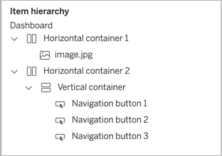
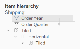
Reorder objects
The Item hierarchy area on the Layout pane lets you quickly change how objects are layered and grouped on your dashboard. Items at the top of the list appear in the front, while items at the bottom appear in back.
Reorder any object in Tableau Cloud or Tableau Server
In Tableau Cloud and Tableau Server, you can reorder both tiled and floating objects in the hierarchy. You can also drag items both within their current containers, and into other containers at any level. This lets you nest items with more flexibility than editing on the canvas, which limits you to placing objects in the innermost container.
Reorder floating objects in Tableau Desktop
In Tableau Desktop, you can drag floating items at the top level of the hierarchy to change how they layer over each other.
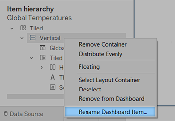
Rename items
To better distinguish between dashboard items, you can rename them.
In the Item hierarchy area of the Layout pane, right-click an item, and choose Rename Dashboard Item. On the dashboard itself, this command is also available from the drop-down menu for each object.
Visually integrate elements with transparency
Transparent elements create a seamless visual look for your dashboards, revealing underlying objects and images.
Tip: To create a background image that shows through floating transparent elements, add an image object as the only tiled item. Fixed-size dashboards ensure that the floating elements maintain a consistent visual relationship with the image, regardless of screen size.
Make worksheet backgrounds transparent
In your dashboard, select the sheet.
Choose Format > Shading, click the Worksheet menu, and choose None for the background colour.
If the sheet appears opaque, change the background colour to None for the underlying dashboard, object or layout container. You can quickly adjust these items on the Layout tab for the dashboard.
To smoothly integrate the transparent sheet with other dashboard items, choose Format > Borders and Format > Lines, and either remove borders and lines or change their colours.
More steps for transparent maps
Choose Format > Shading, click the Pane menu, and choose None for the colour.
Choose Map > Map Layers, and deselect the opaque Base layer. Then, to make transparent maps more distinct when zoomed out, select the Coastline layer.
Depending on the map style, you may also need to experiment with turning other layers on or off.
Make a sheet partially transparent
In the Layout pane for the dashboard, select the sheet.
Click the Background colour, and set the colour and opacity.
Float transparent legends, filters, highlighters and parameters
To visually connect filters, parameters and highlighters to related data, float these items, which are transparent by default. Text always remains fully opaque, maintaining legibility.
If a floating object continues to display a colour, check these object- and worksheet-level settings:
Select the object, and on the Layout tab, click the Background colour, and choose None.
Click the Format menu, and then choose Legends, Filters, Highlighters, or Parameters. Then, in the Format pane at left, choose Shading > None.

For more information, see Format at the Worksheet Level.