Format at the Worksheet Level
You can format settings for fonts, alignment, shading, borders, lines and tooltips at the worksheet level. For example, you might want to remove all the borders in a text table, or add shading to every other column in a view.
When you make formatting changes at this level, they apply only to the view you are working on. See Format at the Workbook Level for how to make changes that apply to every view in your workbook.
Access worksheet formatting settings from Tableau Desktop
Are you formatting your worksheets on the web? See Access worksheet formatting settings from Tableau Cloud
Display a worksheet or dashboard.
From the Format menu, choose the part of the view that you want to format, such as Font, Borders, or Filters.
Format fonts
For a view, you can specify the font, style, size, and colour for either the pane text or header text, or both. For example, in the view below, the header text is set to use the Tableau Bold font.

If you have totals or grand totals in the view, you can specify special font settings to make these values stand out from the rest of the data. This is particularly useful when you are working with a text table. The view below shows a text table in which the grand totals are formatted to appear in dark red.

Format text alignment
Tableau uses visual best practices to determine how text is aligned in a view, but you can also customise text. For example, you can change the direction of header text so that it is horizontal (normal) instead of vertical (up).
Note: Tableau adheres to regional standards when determining when to begin or end line breaks.

Click the image to replay it.
For each text area, you can specify the following alignment options:
Horizontal – Controls whether text aligns to the left, right or centre.
Vertical Alignment – Controls whether text aligns to the top, middle or bottom.
Direction - Rotates text so that it runs horizontally (normal), top-to-bottom (up), or bottom-to-top (down).
Wrap - Controls whether long headers wrap to the next line or are abbreviated, but does not control text marks.
Note: If cells are not large enough to show more than one row of text, turning on wrapping will have no visible effect. If this happens, you can hover the cursor over a cell until a double-sided arrow appears, and then click and drag down to expand the cell size.
Format shading
Shading settings control the background colour of the pane and headers for totals, grand totals, as well as for the worksheet areas outside those areas.
You can also use shading to add banding, alternating colour from row to row or column to column. Banding is useful for text tables because the alternating shading helps the eye distinguish between consecutive rows or columns.

Click the image to replay it.
For row and column banding, you can use the following options:
Pane and Header- The colour the bands use.
Band Size - The thickness of the bands.
Level – If you have nested tables with multiple fields on the rows and columns shelves, this option allows you to add banding at a particular level.
Format borders
Borders are the lines that surround the table, pane, cells, and headers in a view. You can specify the border style, width, and colour for the cell, pane, and header areas. Additionally, you can format the row and column dividers. For example, in this view the Row Divider borders are formatted to use an orange colour:

Row and column dividers serve to visually break up a view and are most commonly used in nested text tables. You can modify the style, width, colour, and level of the borders that divide each row or each column using the row and column divider drop-downs. The level refers to the header level you want to divide by.
Format lines
You can control the appearance of the lines that are part of the view, such as grid lines and zero lines, as well as lines that help you inspect data, such as trend lines, reference lines, and drop lines.
For example, you can set trend lines to use a red colour and an increased thickness:

Format highlighters
The highlighter on your worksheet can be formatted to use a different font, style, colour, background colour, font size, and border. Formatting highlighters allows you to better integrate them into your dashboard or worksheet style. You can also edit the title that displays on each highlighter that shows in the view.
For more information about using highlighters, see Highlight Data Points in Context.
Format a filter card
Filter cards contain controls that let users interact with your view. You can change filter cards to use custom formatting. For example, the body text in the filters below is formatted to use the Tableau Bold font, in aqua.

Note: For filters and parameters, title formatting appears only on dashboards or in views published to the web.
Format a parameter control card
Parameter controls are similar to filter cards in that they contain controls that let users modify the view. If you create a parameter control, you can customise how it looks. For example, in the view below, the Sales Range parameter is formatted so that the sales amount appears in orange.

Copy and paste worksheet formatting (Tableau Desktop only)
Once you have formatted a worksheet, you can copy its formatting settings and paste them into other worksheets. The settings that you can copy are anything you can set in the Format pane, with the exception of reference lines and annotations. Adjustments like manual sizing and level of zoom are not copied.
Select the worksheet from which you want to copy formatting.
Right-click (control-click on Mac) the worksheet tab and select Copy Formatting.
Select the worksheet you want to paste the formatting into.
Right-click (control-click on Mac) the worksheet tab and select Paste Formatting.
Access worksheet formatting settings from Tableau Cloud
Are you formatting your worksheets on Tableau Desktop? See Access worksheet formatting settings from Tableau Desktop.
- Display a worksheet.
- From the toolbar, click Format > Worksheet, and then choose the part of the view that you want to format, such as Font, Lines, or Borders and Dividers.
Format fonts
For a view, you can specify the font, style, size, and colour for your worksheet, pane, header (columns and rows together or separate) and title. In this example, the pane is set to use Tableau Bold, the row header is set to Tableau Medium, the column header is set to Tableau Regular and the title is set to the Tableau Light font.
Rotate labels
Tableau uses visual best practices to determine how label text is aligned in a view, but you can also customise your alignment. For example, you can change the direction of label text so that it’s horizontal (left to right) or vertical (up and down).
To rotate your labels, right-click (control-click on Mac) on a label and select Rotate Labels.
Note: Tableau adheres to regional standards when determining when to begin or end line breaks.
Format shading
Shading settings control the background colour of the worksheet, pane and headers.
To access these settings, to go Format > Worksheet > Shading.
You can also add banding, alternating color from row to row or column to column. Banding is useful for text tables because the alternating shading helps the eye distinguish between consecutive rows or columns.
Click the image to replay it.
For row and column banding, you can use the following options:
Pane and Header- The colour the bands use.
Band Size - The thickness of the bands.
Level – If you have nested tables with multiple fields on the rows and columns shelves, this option allows you to add banding at a particular level.
Format lines
You can control the appearance of the lines that are part of the view, such as grid lines and zero lines. You can turn the lines on or off and format the line type (for example, solid, dotted or dashed) and the thickness of the times. You can also format the colour and the opacity of the lines.
For example, you can turn on grid lines to help give quantitative cues to the viewer. In this example, grey dotted grid lines have been added to the viz.
You can also format trend lines, reference lines and reference bands on the web. You can access these formatting settings by clicking the tooltip on the line, or by clicking on the line while the format pane is open. In this example, the trend line has been formatted to be a solid green line.
Format interactive controls
You can format all of your interactive controls, including legends, filters, highlighters and parameters at the same time using the Interactive Controls section of the worksheet format pane.
To access these settings, go to Format > Worksheet > Interactive Controls.
If you'd like these controls to have consistent formatting, formatting at this level will save you time.
Alternatively, you can format each interactive control individually.
Format legends
If you have a legend on your worksheet, you can customise how it looks. For example, in this example, the Sales above Budget legend is formatted so that the title is in bold and the background is light grey.
You can access legends formatting by either going into Format > Legends, or by clicking into the menu on the legend and selecting Format Legends. You can also edit the colours for each of the items in the legend, edit the title or choose to hide the title or legend through this menu.
Format filters
Filter cards contain controls that let users interact with your view. You can change filter cards to use custom formatting. For example, the body text in the filter shown is set to Tableau Medium, the title text is set to Tableau Semibold, the background is set to green with 50% opacity and a black border has been added.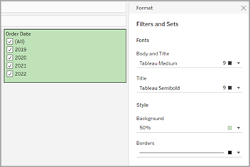
You can access Filters and Sets formatting by either going into Format > Filters and Sets, or by clicking into the menu on the Filter card and selecting Format Filters and Sets.
Format highlighters
The highlighter on your worksheet can be formatted to customise your font, background colour and border. Formatting highlighters allows you to better integrate them into your dashboard or worksheet style. You can also edit the title that displays on each highlighter that shows in the view.
You can access highlighter formatting by either going into Format > Highlighters, or by clicking into the menu on the Highlighter card and selecting Format Highlighters.
For more information about using highlighters, see Highlight Data Points in Context
Format parameters
Parameter controls are similar to filter cards in that they contain controls that let users modify the view. If you create a parameter control, you can customise how it looks. For example, in the view below, the New Business Growth parameter is formatted so that the growth percentage text appears in green.
You can access Parameters formatting by either going into Format > Parameters, or by clicking into the menu on the parameter card and selecting Format Parameters.
Format borders and dividers
Borders are the lines that surround the table, pane, and headers in a view. You can specify the border style, width and colour for the pane and header areas. Additionally, you can format the row and column dividers. For example, in this view the Row Divider borders are formatted to use a blue colour.
Row and column dividers serve to visually break up a view and are most commonly used in nested text tables. You can modify the style, width, colour, and level of the borders that divide each row or each column using the row and column divider drop-downs.
By default, the Pane and Header dividers are formatted simultaneously to save you time. If you'd like the pane and the headers to have different formatting, click the link icon to unlink the formatting and format each member separately.
You can also switch the formatting settings for Row and Column Dividers on or off to hide styling options you don't want to use. In this example, Row Dividers formatting is turned off, and the Column Dividers pane and header formatting is unlinked.
Row and column divider level settings
The level refers to the header level you want to divide by. For example, if you have two fields on your measures column, such as category and sub-category, you can choose to have row dividers just by category (level 1) or by category and sub-category (level 2).
In this example, the row divider is set at level 1.
In this example, the row divider is set at level 2.