Step 6: Build a dashboard to show your insights
You’ve created four worksheets, and they're communicating important information that your boss needs to know. Now you need a way to show the negative profits in Tennessee, North Carolina and Florida and explain some of the reasons why profits are low.
To do this, you can use dashboards to display multiple worksheets at once, and – if you want – make them interact with one another.
Set up your dashboard
You want to emphasise that certain items sold in certain places are doing poorly. Your bar graph view of profit and your map view demonstrate this point nicely.
Click the New dashboard button.

In the Dashboard pane on the left, you'll see the sheets that you created. Drag Sales in the South to your empty dashboard.
Drag Profit Map to your dashboard, and drop it above the Sales in the South view.
Your dashboard will update to look like this:
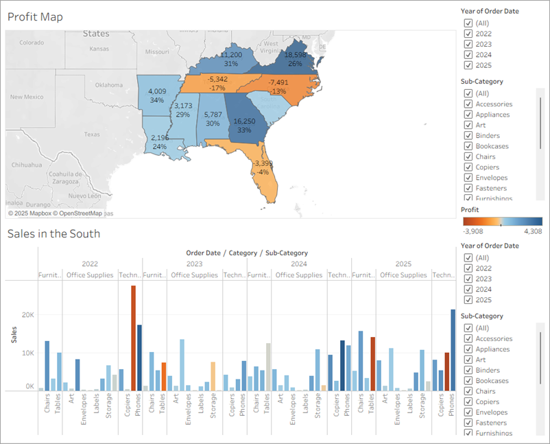
Now you can see both views at once!
But sadly, the bar chart is a bit squished, which isn’t helping your boss understand your data.
Arrange your dashboard
It's not easy to see details for each item under Sub-Category from your Sales in the South bar chart.
Resolving this issue will give you more room to communicate the information you need.
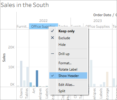
On Sales in the South, right-click on a value in the Category column header, and clear Show header.
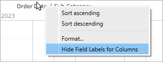
On Sales in the South, right-click on the header Order Date / Sub-Category and select Hide Field Labels for Columns.
You've now hidden unnecessary information from your dashboard while preserving the breakdown of your data. The extra space makes it easier to see data on your dashboard, but let's freshen things up even more.
Right-click the Profit Map title and select Hide Title.
The title Profit Map is hidden from the dashboard and even more space is created.
- Repeat this step for the Sales in the South view title.
Each time you brought out a sheet, its filters came too. This means there are duplicate filters showing. Select the first Sub-Category filter card on the right side of your view, and at the top of the card, click the Remove icon
 .
.Repeat this step for the second Sub-Category filter card and one of the Year of Order Date filter cards.
Click on the Profit colour legend and drag it from the right to below Sales in the South.
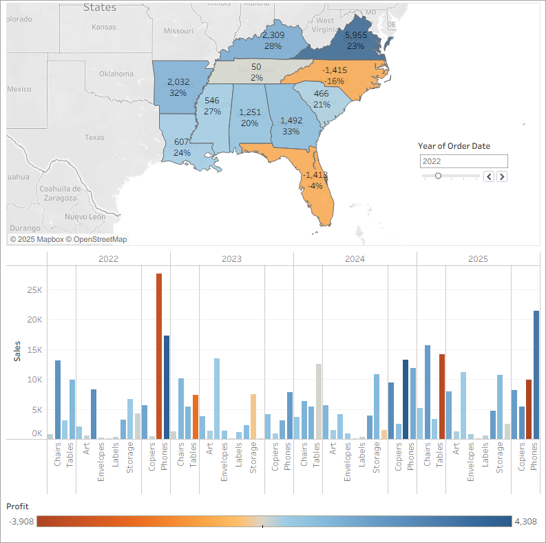
Finally, select the remaining Year of Order Date filter, click its drop-down arrow, and then select Floating. Move it to the white space in the map view. In this example, it is placed just off the East Coast, in the Atlantic Ocean.
- Click the drop-down arrow at the top of the Year of Order Date filter, and select Single Value (Slider).
Try selecting different years on the Year of Order Date filter. Your data is quickly filtered to show that state performance varies year by year. That's nice, but it could be made even easier to compare.
Your view updates to look like this:
Objects on a dashboard can be set to either Tiled or Floating.
Tiled items are automatically sized to the zone you drop them in. Floating items can be moved and sized freely from other objects on the dashboard. If you want, you can even have both floating and tiled items on the same dashboard.
More on Arranging your Dashboard in the Learning Library (in the top menu).
Now your dashboard is looking really good! Now, you can easily compare profit and sales by year. But that’s not so different from a couple pictures in a presentation – and you're using Tableau! Let's make your dashboard more engaging.
Click the image to replay it
Note: Details in this gif may not match exactly what's on your screen.
Add interactivity
Wouldn't it be great if you could view which sub-categories are profitable in specific states?
Select Profit Map in the dashboard, and click the Use as filter icon
 in the upper right corner.
Select a state within the Southern region of the map.
The Sales in the South bar chart automatically updates to show just the sub-category sales in the selected state. You can quickly see which sub-categories are profitable.
Click an area of the map other than the coloured Southern states to clear your selection.
Select the Year of Order Date filter, click its drop-down arrow, and select Apply to Worksheets > All Using This Data Source.
You also want viewers to be able to see the change in profits based on the order date.
Explore state performance by year with your new, interactive dashboard!
Here, we filter Sales in the South to only items sold in North Carolina, and then explore year by year profit.
Click the image to replay it
Note: Details in this gif may not match exactly what's on your screen.
Rename and go
You show your boss your dashboard, and she loves it. She's named it "Regional Sales and Profit," and you do the same by double-clicking the Dashboard 1 tab and typing Regional Sales and Profit.
In her investigations, your boss also finds that the decision to introduce machines in the North Carolina market in 2025 was a bad idea.
Your boss is glad she has this dashboard to explore, but she also wants you to present a clear action plan to the larger team. She asks you to create a presentation with your findings.
Good thing you know about stories in Tableau.