Step 7: Build a story to present
You want to share your findings with the larger team. Together, your team might re-evaluate selling machines in North Carolina.
Instead of having to guess which key insights your team is interested in and including them in a presentation, you decide to create a story in Tableau. That way, you can walk viewers through your data discovery process, and you have the option to interactively explore your data to answer any questions that come up during your presentation.
Create your first story point
Stories in Tableau are almost like slideshows. Each story point is essentially an independent slide in a presentation. And unlike a dashboard, each story point can show the same viz or dashboard with an independent state. Not sure what that means? Follow along with the directions below and it should become clear.
For the presentation, you'll start with an overview.
Click the New story button.
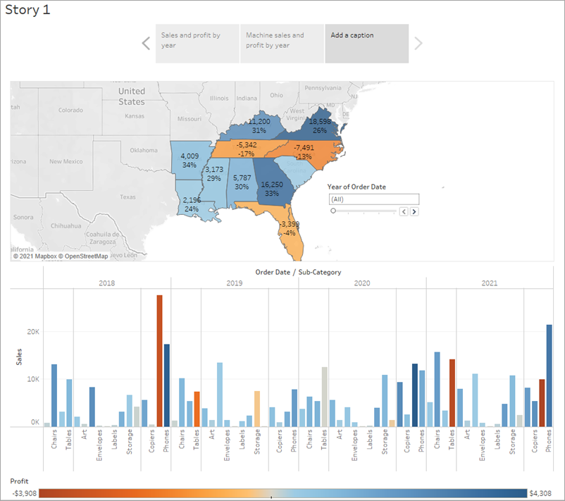
From the Story pane on the left, drag the Sales in the South worksheet onto your view.
Add a caption – maybe "Sales and profit by year” – by editing the text in the grey box above the worksheet.
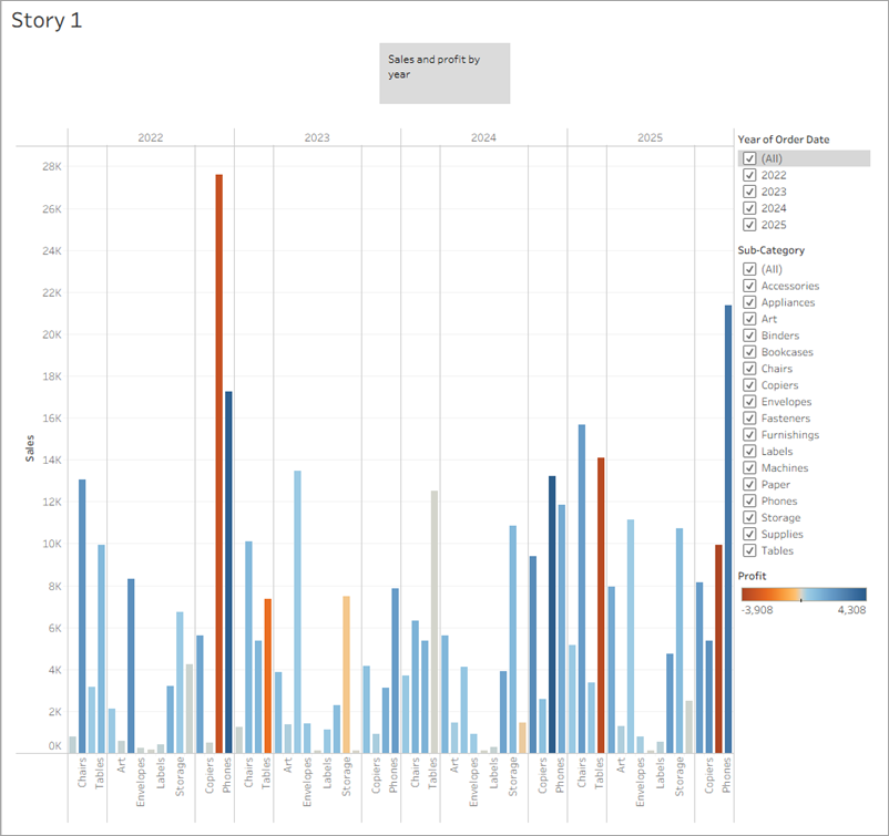
This brings up a blank workspace that reads, “Drag a sheet here”. This is where you'll create your first story point.
Blank stories look a lot like blank dashboards. And like a dashboard, you can drag worksheets over to present them. In a story, you can also drag dashboards into your presentation.
This story point is a useful way to acquaint viewers with your data.
But you want to tell a story about selling machines in North Carolina, so let's focus on that data.
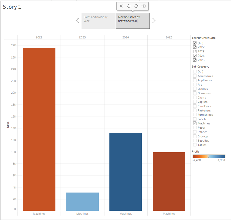
Highlight machine sales
To bring machines into the picture, you can leverage the Sub-Category filter included in your Sales in the South bar chart.
In the Story pane, under New story point, click Duplicate to duplicate the first story point.
Continue working where you left off, but know that your first story point will be exactly as you left it. In this new story point, you can change filters and other interactivity without changing the first story point or the underlying viz.
Since you know you’re telling a story about machines, on the Sub-Category filter, clear the selection for (All), then select Machines.
Now your viewers can quickly identify the sales and profit of machines by year.
Add a caption to underscore what your viewers see, for example, "Machine sales and profit by year."
You've successfully shifted the focus to machines, but you realise that something seems odd: in this view, you can't single out which state is contributing to the loss.
You'll address this in your next story point by introducing your map.
Learn more: What's this mini toolbar by your story point caption?The Story toolbar
 shows by the story point caption once you drag your first story point onto the canvas and mouse-over the navigator area. Use it to revert changes, apply updates to a story point, delete a story point or create a new story point out of the current, customised one. All of the options are available after you make a change to the story point. Otherwise only the delete option is available.
Click the image to replay it
Note: Details in this gif may not match exactly what's on your screen.
Make your point
The bottom line is that machines in North Carolina lose money for your company. You discovered that in the dashboard you created. Looking at overall sales and profit by year doesn't demonstrate this point alone, but regional profit can.
In the Story pane, select Blank to add a new blank story point. Then, drag your dashboard Regional Sales and Profit onto the canvas.
This gives viewers a new perspective on your data: Negative profit catches the eye.
Add a caption like, "Underperforming items in the South."
To narrow your results to just North Carolina, start with a duplicate story point.
Select Duplicate to create another story point with your Regional Profit dashboard.
Select North Carolina on the map and notice that the bar chart automatically updates.
Select All on the Year of Order Date filter card.
Add a caption, for example, “Profit in North Carolina, 2022-2025”.
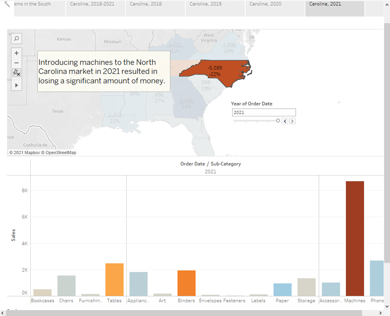
Now you can walk viewers through profit changes by year in North Carolina. To do this, you will create four story points:
Select Duplicate to begin with your Regional Profit dashboard focused on North Carolina.
On the Year of Order Date filter, click the right arrow button so that 2022 appears.
Add a caption, for example, “Profit in North Carolina, 2022”, and then click Duplicate.
Repeat steps 2 and 3 for years 2023, 2024 and 2025.
Now viewers will have an idea of which products were introduced to the North Carolina market when, and how poorly they performed.
Click the image to replay it
Note: Details in this gif may not match exactly what's on your screen.
Finishing touches
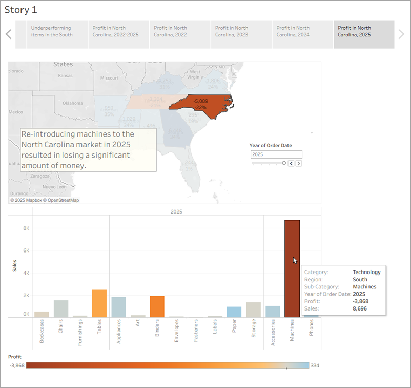
On this story point that focuses on data from 2025, you want to describe your findings. Let's add more detail than just a caption.
In the left pane, select Drag to add text and drag it onto your view.
Enter a description for your dashboard that emphasises the poor performance of machines in North Carolina, for example, “Re-introducing machines to the North Carolina market in 2025 resulted in losing a significant amount of money”.
For dramatic effect, you can hover over Machines on the Sales in the South bar chart while presenting to show a useful tooltip: the loss of nearly $4,000.
In the Story pane, click Blank.
From the Story pane, drag Negative Profit Bar Chart to the view.
In the Year of Order Date filter card, narrow the view down to 2025 only.
You can now easily see that the loss of machine profits was solely from Burlington, North Carolina.
In the view, right-click the Burlington mark (the bar) and select Annotate > Mark.
- In the Edit Annotation dialog box that appears, delete the filler text and type: “Machines in Burlington lost nearly $4,000 in 2025.”
Click OK.
In the view, click o the annotation and drag it to adjust where it appears.
Give this story point the caption: "Where are we losing machine profits in North Carolina?"
Double-click the Story 1tab and rename your story to "Improve Profits in the South".
Review your story by selecting Window > Presentation mode.
And now, for the final slide, you drill down into the details.
What are those scroll bars doing on the right side or the bottom of your dashboard story point while you're in presentation mode?
It seems like your dashboard doesn't fit the presentation well. That's irritating. Press the Esc key to exit your presentation, and then select the Regional Sales and Profit sheet at the bottom of your workbook.
In the left pane under Dashboard, change the Size drop-down selection to Fit to Improve Profits in the South. This will automatically size your dashboard for optimal story viewing.
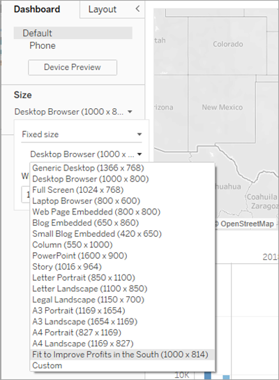
Select Fit to Improve Profits in the South and then enter Presentation mode again. Your dashboard fits nicely.
Click the image to replay it
Note: Details in this gif may not match exactly what's on your screen.
After you present
Your presentation went very well. The team is convinced that there is work to be done to increase profit in Burlington, North Carolina. And, they're curious to know why machines did so poorly in the first place. Your boss is thrilled – not only have you identified a way to address negative profit, you've got the team asking questions about their data.
To keep the lessons fresh in their minds, your boss asks you to email your team a document with your findings. It's a good thing that you know about sharing your visualisations with Tableau Server and Tableau Public.