Create a Pareto Chart
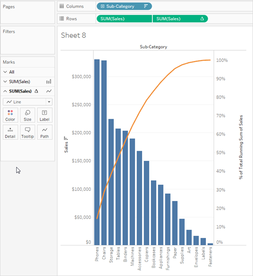
A Pareto chart is a type of chart that contains both bars and a line graph, where individual values are represented in descending order by bars, and the ascending cumulative total is represented by the line. It is named for Vilfredo Pareto, an Italian engineer, sociologist, economist, political scientist, and philosopher, who formulated what has become know as the Pareto principal. Pareto made the observation that 80% of land was typically owned by 20% of the population. Pareto extended his principle by observing that 20% of the peapods in his garden contained 80% of the peas. Eventually, the principal was further extrapolated by others to propose that for many events, roughly 80% of the effects come from 20% of the causes. In business, for example, 80% of profits not infrequently derive from 20% of the available products.
In Tableau, you can apply a table calculation to sales data to create a chart that shows the percentage of total sales that come from the top products, and thus identify the key segments of your customer base that are most important for your business's success.
The procedure uses the Sample - Superstore data source provided with Tableau Desktop.
Preparing for the analysis
Before starting your analysis, decide what questions you want answered. These questions determine the category (dimension) and number (measure) on which to base the analysis. In the example to follow, the question is which products (captured by the Sub-Category dimension) account for the most total sales.
At a high level, the process requires you to do the following:
-
Create a bar chart that shows Sales by Sub-Category, in descending order.
-
Add a line chart that also shows Sales by Sub-Category.
-
Add a table calculation to the line chart to show sales by Sub-Category as a Running Total, and as a Percent of Total.
The scenario uses the Sample - Superstore data source provided with Tableau Desktop
Create a bar chart that shows Sales by Sub-Category in descending order
-
Connect to the Sample - Superstore data source.
-
From the Data pane, drag Sub-Category to Columns, and then drag Sales to Rows.
-
Click Sub-Category on Columns and choose Sort.
In the Sort dialog box, do the following:
-
Under Sort order, choose Descending.
-
Under Sort by, choose Field.
-
Leave all other values unchanged, including Sales as the selected field and Sum as the selected aggregation.
-
Click OK to exit the Sort dialog box.
-
Products are now sorted from highest sales to lowest.
Add a line chart that also shows Sales by Sub-Category
-
From the Data pane, drag Sales to the far right of the view, until a dotted line appears.

Note: In Tableau 2020.2 and later, the Data pane no longer shows Dimensions and Measures as labels. Fields are listed by table or folder.
-
Drop Sales, to create a dual-axis view. It's a bit hard to see that there are two instances of the Sales bars at this point, because they are configured identically.
-
Select SUM(Sales) (2) on the Marks card, and change the mark type to Line.
This is what the view should look like at this point:

Add a table calculation to the line chart to show sales by Sub-Category as a running total, and as a percent of total
-
Click the second copy of SUM(Sales) on Rows and choose Add Table Calculation.
-
Add a primary table calculation to SUM(Sales) to present sales as a running total.
Choose Running Total as the Calculation Type.
Do not close the Table Calculation dialog box.
-
Add a secondary table calculation to present the data as a percent of total.
Click Add Secondary Calculation and choose Percent of Total as the Secondary Calculation Type.
This is what the Table Calculation dialog box should look like at this point:

-
Click the X in the upper-right corner of the Table Calculations dialog box to close it.
-
Click Color in the Marks card to change the color of the line.

The result is now a Pareto chart:

