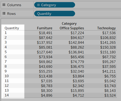
Convert a Measure to a Dimension
You can convert a field from a measure to a dimension in the current view. Or, if you want the change to affect all future uses of the field in the workbook, you can convert a field in the Data pane from a measure to a dimension. For more information on dimensions and measures, see Dimensions and Measures, Blue and Green(Link opens in a new window).
You can also Convert Fields between Discrete and Continuous.
Convert a measure in the view into a discrete dimension
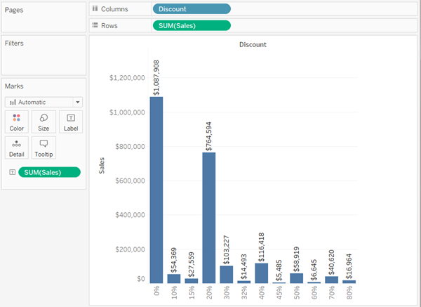
You can drag a measure field from the Data pane but then use it as a dimension in the view. For example, suppose you want to know the aggregated sales totals for each possible discount rate. The view you are aiming for looks like this:

The Discount field contains numeric data, so when you connect to the data source, Tableau assigns it to the Measures area in the Data pane. In the Sample - Superstore data source, which is included with Tableau Desktop, the values for Discount range from 0% to 80%.
Here are the steps to create the view shown above:
-
Drag Sales to Rows and Discount to Columns. Tableau shows you a scatter plot—this is the default chart type when you put one measure on Rows and another on Columns.

Tableau aggregates Discount as AVG, and Sales as SUM. The fields are both continuous, so along the bottom and left side of the view Tableau displays axes (and not column or row headers).
-
To treat Discount as a dimension, click the drop-down arrow on the field (on the Columns shelf) and select Dimension from the context menu. Tableau no longer aggregates the values for Discount, so what you see now is a line. But the values for Discount are still continuous, so Tableau still shows continuous axes for both fields:

-
To complete the process, click the drop-down arrow on the Discount again and select Discrete from the context menu. The transformation of Discount is now complete. You now see the bar chart as in the initial image at the beginning of this topic. Across the bottom, you now see column headers (0%, 10%, 20%, etc.) instead of an axis.
Let's review how we got to this point:
Action Result Convert Discount from a measure to a dimension... Sales values are no longer aggregated according to discount rate, resulting in a line chart instead of a scatter plot. Convert Discount from continuous to discrete... Tableau shows headers at the bottom of the view, instead of a continuous axis. The only thing left to do is to drag Sales to Label and then format the labels for readability.
The resulting chart is somewhat useful because there are only 12 unique values for Discount in the data source. Had there been a unique value for each row, which would not have been unusual for a numeric field, the number of individual bars in the resulting view would have been equal to the number of rows in the data source, which would probably not result in a useful visualization.
Converting a measure in the Data pane into a dimension
When you first connect to a data source, Tableau assigns most fields that contain quantitative, numerical information (that is, fields where the values are numbers) as measure fields in the Data pane. The exception is for fields where the name suggests the data type, such as Year or Month (which Tableau would identify as Date dimensions) or fields containing words like “ID” and “Key,” which Tableau would categorize as dimensions, even when they are numeric.
However, you might decide that some of these fields that Tableau has categorized as measures should actually be dimensions. Postal codes are a classic example—they often consist entirely of numbers, but the information is categorical and not continuous—you would never want to aggregate postal codes by adding or averaging them. Similarly, a field containing individuals' ages may be categorized as a measure by default in Tableau because it contains numeric data. In some cases you may want to add or average ages, but you might also want to look at each individual age as a bin or category, in which case you want Tableau to create headers for this field rather than an axis. If this is how you want to use age in your view, you can convert the field to a dimension.
To convert a measure to a dimension in the Data pane, do either of the following.
-
Click and drag the field from a measures area in the Data pane and drop it into a dimensions area (above the line).

-
Right-click (control-click on a Mac) the measure in the Data pane and select Convert to Dimension.
If you place a field that you converted from a measure to a dimension on a shelf, it now produces headers instead of an axis.

Use the Drop Field dialog
As a shortcut in some use cases, you can right-click+drag (Option+drag on a Mac) a field from the Data pane to the view. This opens the Drop Field dialog with various forms of the field. What options are available depend on the data type of the field being dragged. The primary purpose of this dialog is to choose the aggregation, but may offer options for changing from a dimension to a measure or choosing between continuous and discrete.

Select the option you want to use and click OK to complete the dragging action.
