Refine Your Dashboard
After you've created and laid out your dashboard, take a moment to step back and evaluate it. This topic lists some areas to check and refine.
Is everything in the right spot?
Confirm placement
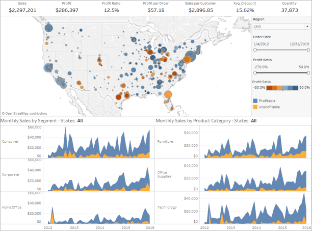
Make sure that the view with your key finding or main question spans or occupies the upper-left corner of your dashboard. In your views, the most important data should be on the X or Y axis and your less important data should be on color, size, or shape.
Check label orientation and readability
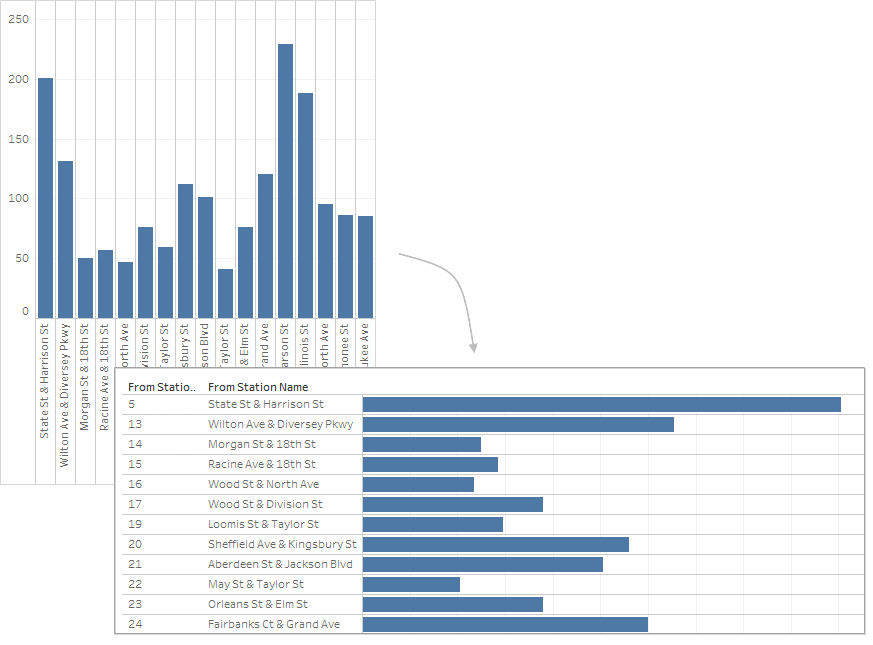
Important labels should be horizontal so that your viewers can easily read them.
Review sizing and layout
Test your work and adjust sizing
Once you finish your dashboard, it's a best practice to test it and experience it as your users will. For example, will they be using Tableau Reader on a laptop to view your dashboard, will the dashboard be published on Tableau Server, or will it be embedded in a web application and viewed from a tablet?
After you test your dashboard, you'll probably find some things to change—sizing and how and where items are positioned are usually among them.
Tableau dashboards are set to a fixed default size that's intended to work well on a typical desktop. However, when you publish (to the web, in a blog, for a presentation, etc.) you may find yourself more limited.
You can specify the overall size of the dashboard using the settings under Size in the Dashboard area on the left. Select a new size using the drop-down menu.
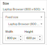
- Automatic - The dashboard automatically resizes to fill the window it's displayed in.
- Fixed size - The dashboard always remains a specific size. If the dashboard is larger than the window the dashboard becomes scrollable.
- Range - The dashboard scales between minimum and maximum sizes that you specify, after which scroll bars or white space display.
Customize image display (Tableau Desktop only)
When you add an Image object to a dashboard, you can customize how the image displays by selecting an option on the image's menu. For example, you can select whether to Fit Image, which scales the image to the size of image object on the dashboard.
By default, any high-resolution images that you use in a dashboard are displayed in standard resolution and will maintain the same size whether they're viewed on standard or Retina displays.
To take advantage of high-resolution images in a dashboard that are intended to be viewed on a Retina display, you can use the @2x naming convention:
- Navigate to the high-resolution image on your computer with Retina display.
- Rename your high-resolution image to include the @2x modifier by using <image-name>@2x<file-extension> format. For example, logo@2x.png.
- In your workbook, click and drag an Image object onto your dashboard.
- When you're prompted, select the image you just renamed using the @2x naming convention and then click Open.
Note: EMF image file formats are not compatible with Tableau Desktop on the Mac.
Use a layout container
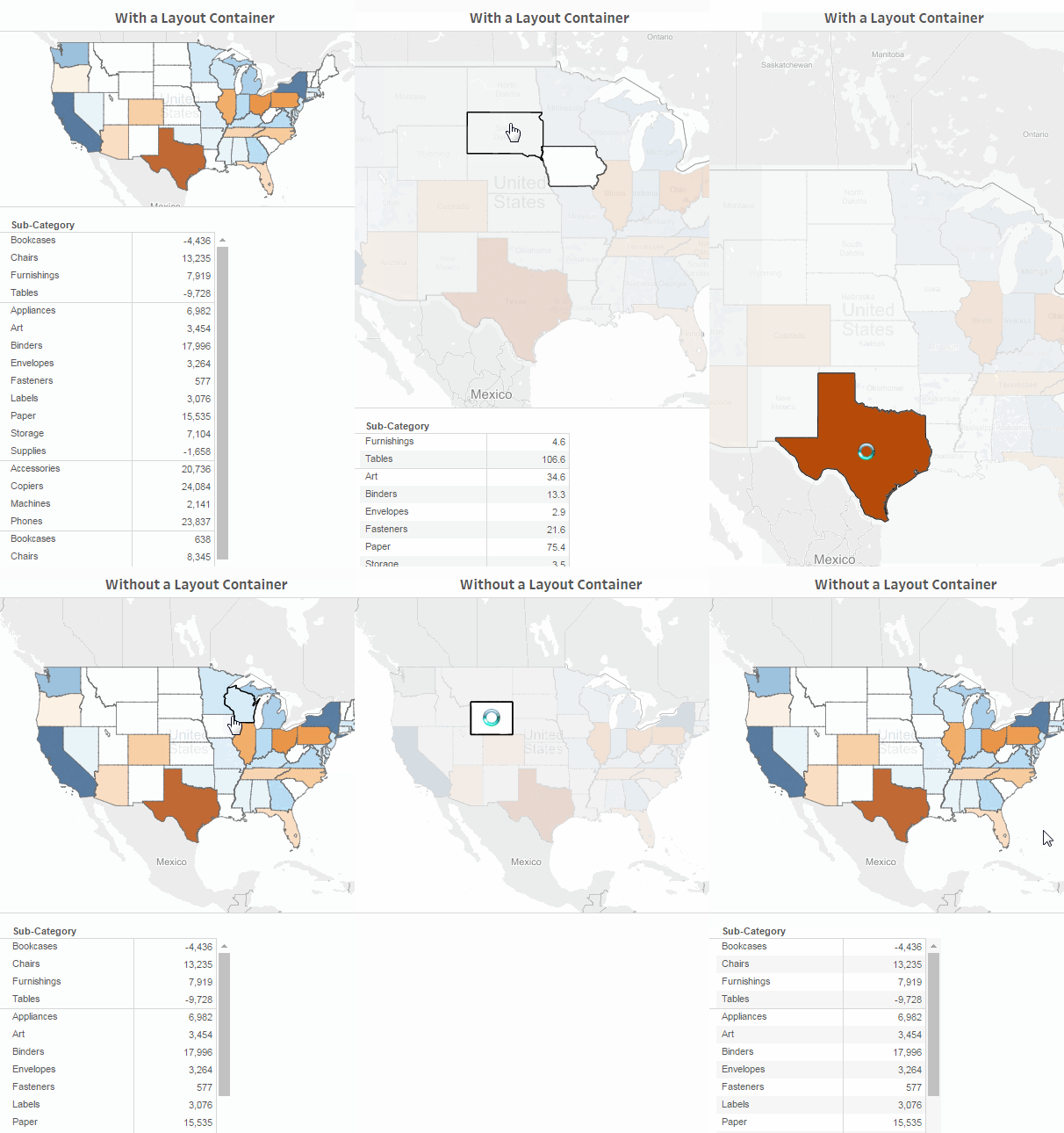
A layout container can create a smoother experience for your users by helping dashboard objects reposition and resize when one view is filtering another.
The image below shows how a dashboard behaves when two views are placed in a vertical layout container versus how they behave when they are not placed in a layout container. Notice how, in the dashboard that uses a layout container, the views adjust vertically as different filters are applied.
To add a layout container
-
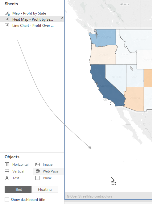
Drag a horizontal or vertical layout container to the dashboard.

-
Add sheets and objects to the layout container. As you hover over the layout container, a blue box indicates that the object is being added to the flow of the layout container.
-
To position items evenly, choose Distribute Evenly from the layout container's shortcut menu:

The Distribute Evenly command is only available for layout containers that you explicitly add to a dashboard. It's not available for layout containers that are automatically added when you add items.
Buy space with a floating layout
Tableau uses a tiled layout by default in dashboards, which means that each view, legend, and object is arranged in a single-layer grid, similar to a tiled floor.
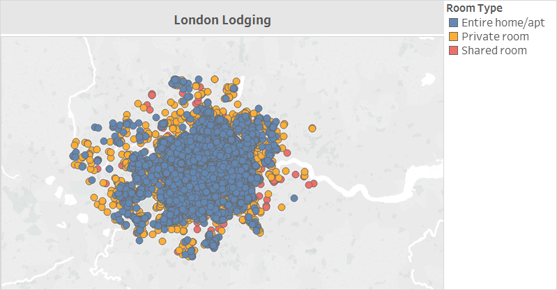
If you want an item to overlap another, you can use a Floating layout for one or more items instead:
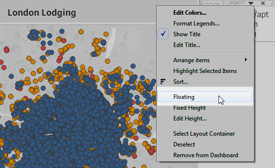
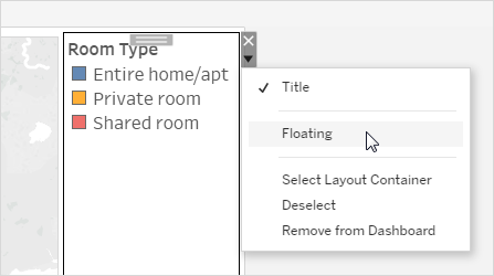
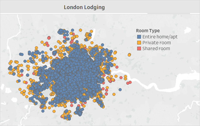
Legends can sometimes be floated over other items instead of remaining tiled.
See Size and Lay Out Your Dashboard for more details.
Tableau Desktop only: If you create device layouts for a dashboard, use a Tiled layout. It will give you the most control over where objects appear. See Create Dashboard Layouts for Different Device Types for steps.
Highlight the essentials
Show just what your users need
Legends, titles, captions, and filters can be helpful for your viewers. Make sure you give your users what they need and no more.
To change what's displayed for your users:
-
Select a view in the dashboard.
-
Click the drop-down menu in the upper-right corner of the selected view and select the items you want to show. For example, you can show the title, caption, legends, and a variety of filters.
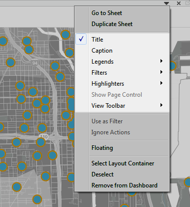
Alternatively, you can right-click an item in the Layout section of the Dashboard pane to access all of these same commands.
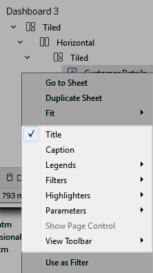
Note: Filters are only available for the fields used in the original view.
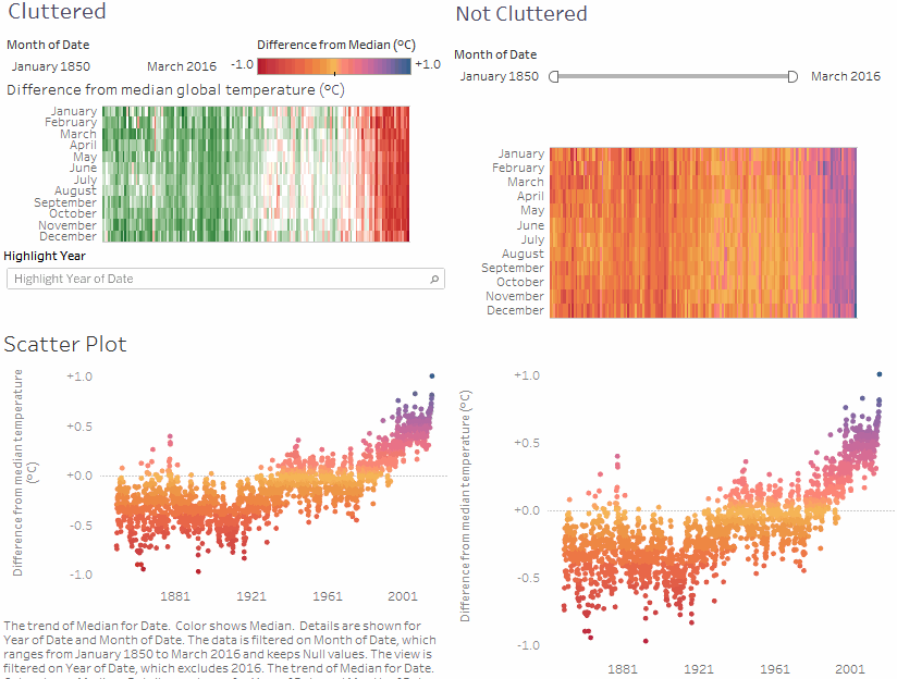
Eliminate clutter
In general, you should try to use no more than two color palettes in a single dashboard, and ideally, just one palette if your data is quantitative. Remove unnecessary text, lines, or shading that don't provide actionable information for your viewers. Make sure every legend you provide is really needed, remembering to take into account the final, published size of your dashboard.

