Build a Scatter Plot
Use scatter plots to visualize relationships between numerical variables.
In Tableau, you create a scatter plot by placing at least one measure on the Columns shelf and at least one measure on the Rows shelf. If these shelves contain both dimensions and measures, Tableau places the measures as the innermost fields, which means that measures are always to the right of any dimensions that you have also placed on these shelves. The word "innermost" in this case refers to the table structure.
| Creates Simple Scatter Plot | Creates Matrix of Scatter Plots |

|

|
A scatter plot can use several mark types. By default, Tableau uses the shape mark type. Depending on your data, you might want to use another mark type, such as a circle or a square. For more information, see Change the Type of Mark in the View.
To use scatter plots and trend lines to compare sales to profit, follow these steps:
- Open the Sample - Superstore data source (if necessary, you can download it from the Tableau Public sample data page(Link opens in a new window)).
- Drag the Sales measure to Columns.
Tableau aggregates the measure as a sum and creates a horizontal axis.
- Drag the Profitmeasure to Rows.
Tableau aggregates the measure as a sum and creates a vertical axis.
Measures can consist of continuous numerical data. When you plot one number against another, you are comparing two numbers; the resulting chart is analogous to a Cartesian chart, with x and y coordinates.
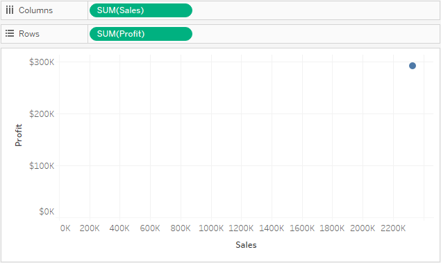
Now you have a one-mark scatter plot:
-
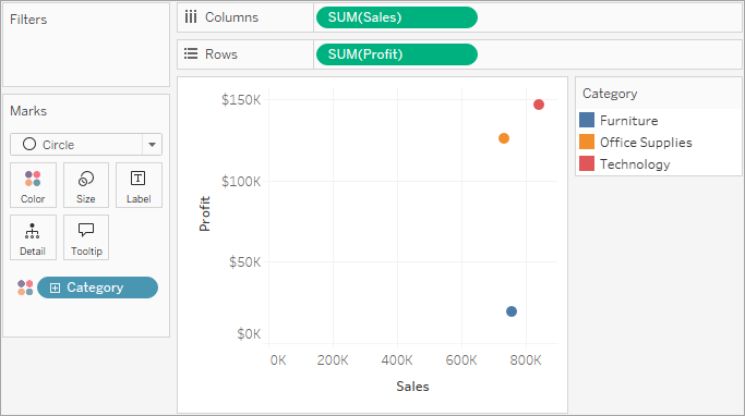
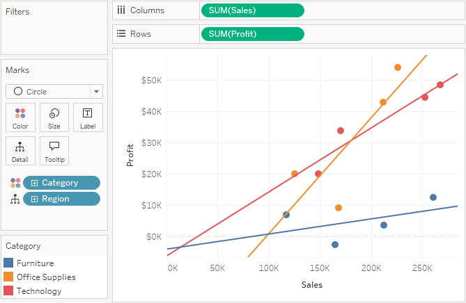
Drag the Category dimension to Color on the Marks card.
This separates the data into three marks—one for each dimension member—and encodes the marks using color.
-
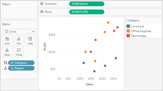
Drag the Region dimension to Detail on the Marks card.
Now there are many more marks in the view. The number of marks is equal to the number of distinct regions in the data source multiplied by the number of categories. (If you're curious, use the Undo button on the toolbar to see what happens if you drop the Region dimension on Shape instead of Detail.)
-
To add trend lines, from the Analytics pane, drag the Trend Line model to the view, and then drop it on the model type.
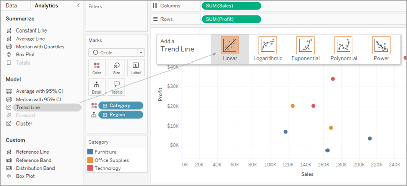
A trend line can provide a statistical definition of the relationship between two numerical values. To add trend lines to a view, both axes must contain a field that can be interpreted as a number—by definition, that is always the case with a scatter plot.
Tableau adds three linear trend lines—one for each color that you are using to distinguish the three categories.
-
Hover the cursor over the trend lines to see statistical information about the model that was used to create the line:

For more information, see Assess Trend Line Significance. You can also customize the trend line to use a different model type or to include confidence bands. For more information, see Add Trend Lines to a Visualization.
See Also
