Building Line Charts
Line charts connect individual data points in a view. They provide a simple way to visualize a sequence of values and are useful when you want to see trends over time, or to forecast future values. For more information about the line mark type, see Line mark.
Note: In views that use the line mark type, you can use the Path property in the Marks card to change the type of line mark (linear, step, or jump), or to encode data by connecting marks using a particular drawing order. For details, see Path properties in the Control the Appearance of Marks in the View
To create a view that displays the sum of sales and the sum of profit for all years, and then uses forecasting to determine a trend, follow these steps:
- Connect to the Sample - Superstore data source (if necessary, you can download it from the Tableau Public sample data page(Link opens in a new window)).
- Drag the Ship Date dimension to Columns. Tableau aggregates the date by year, and creates column headers.
- Drag the Sales measure to Rows. Tableau aggregates Sales as SUM and displays a simple line chart.
- Drag the Profit measure to Rows and drop it to the right of the Sales measure. Tableau creates separate axes along the left margin for Sales and Profit.
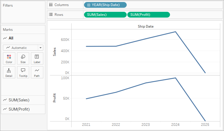
Notice that the scale of the two axes is different—the Sales axis scales from $0 to $700,000, whereas the Profit axis scales from $0 to $100,000. This can make it hard to see that sales values are much greater than profit values.
You can create a line chart with discrete or continuous dimensions.
-
Continuous dimensions visualize data with a linear, continuous axis. These charts are useful for displaying trends and proportional changes, especially when data points aren't evenly spaced.
-
Discrete dimensions visualize data with discrete, categorical headers. These charts are helpful for showing incremental data, such as fiscal periods.
To learn more about discrete and continuous data types, see Dimensions and Measures, Blue and Green.
When you are displaying multiple measures in a line chart, you can align or merge axes to make it easier for users to compare values.
- For more information about aligning the axes, see Compare two measures using dual axes.
- For more information about enforcing a single axis across multiple measures, see Blend axes for multiple measures into a single axis.
With either of these options, you can create a combination chart to change the mark type for one of your measures. For more information, see Create a combo chart (assign different mark types to measures).
-
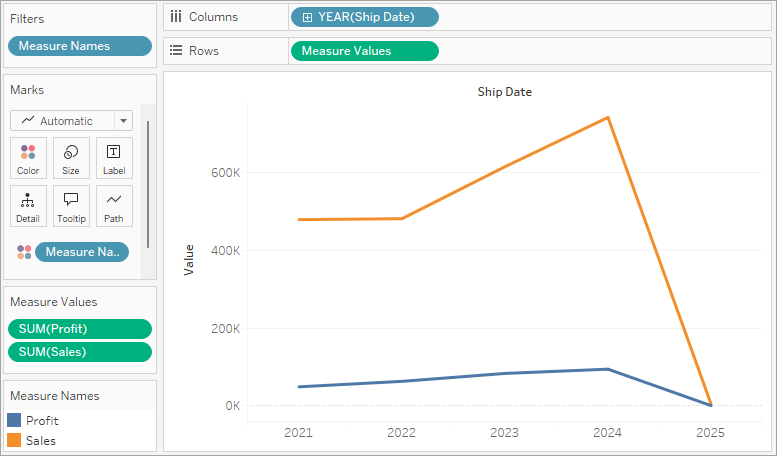
Drag the SUM(Profit) field from Rows to the Sales axis to create a blended axis. The two pale green parallel bars indicate that Profit and Sales will use a blended axis when you release the mouse button.

The view updates to look like this:
The view is rather sparse because we are looking at a summation of values on a per-year basis. Additionally, the trend seems to dip at the end because there is limited data for 2025.
-
Click the drop-down arrow in the YEAR([Ship Date]) field on the Columns shelf and select Month in the lower part of the context menu to see a continuous range of values over the four-year period.

The resulting view is a lot more detailed than the original view:
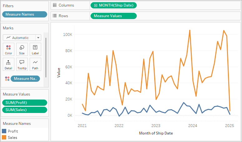
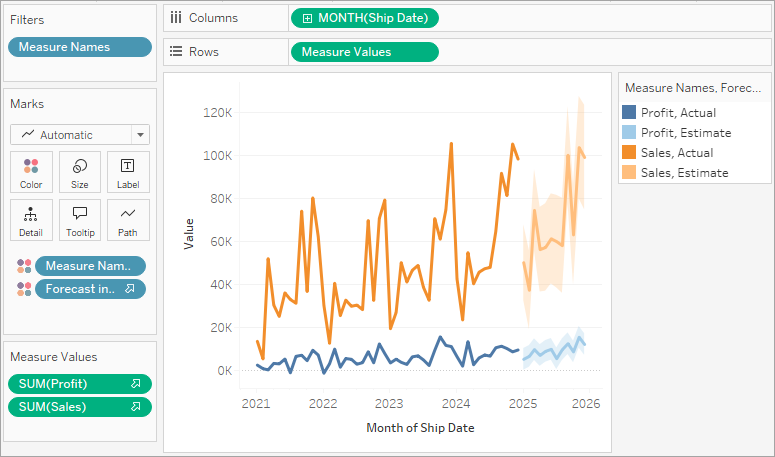
Notice that the values seem to go much higher just before the end of each year. A pattern like that is known as seasonality. If we turn on the forecasting feature in the view, we can see whether we should expect that the apparent seasonal trend will continue in the future.
-
To add a forecast, in the Analytics pane, drag the Forecast model to the view, and then drop it on Forecast.
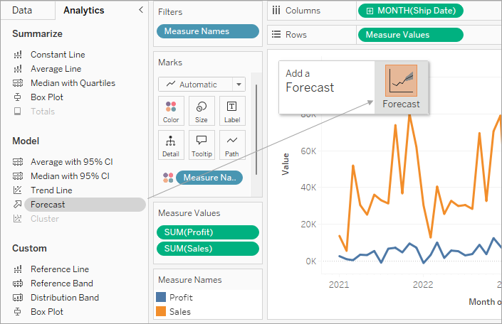
We then see that, according to Tableau forecasting, the seasonal trend does continue into the future: