Build with Density Marks (Heatmap)
Use density chart to visualize patterns or trends in dense data with many overlapping marks. Tableau does this by grouping overlaying marks, and color-coding them based on the number of marks in the group.
Density maps help you identify locations with greater or fewer numbers of data points.
In Tableau, you can create a chart using the density mark by placing at least one continuous measure on the Columns shelf, and at least one dimension or measure on the Rows shelf (or vice versa), and then adding a field to the Marks card.
Note: Density charts work best when used with data sources containing many data points.
The basic building blocks for a density chart are as follows:
- Mark type: Density
- Rows and Columns shelves: At least one continuous measure, and at least one measure or dimension
- Marks card: At least one continuous measure
Density charts use the Density mark type. By default, Tableau will use the automatic mark type.
To show how density charts can help make sense of overlapping marks in Tableau, we're going to start with a scatter plot with a large number of marks and re-create it as a density chart.
To use a density chart to see orders by date, follow these steps:
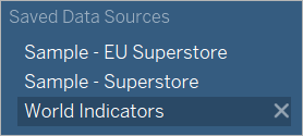
- Open the World Indicators data source from the Saved Data Sources section of the Start screen.
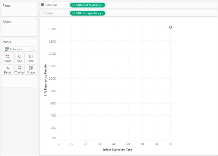
- From the Health folder, drag Infant Mortality Rate to the Columns shelf. Tableau aggregates the measure as a sum and creates a horizontal axis.
- Drag the Life Expectancy Female to the Rows shelf. Now you have a one-mark scatter plot.
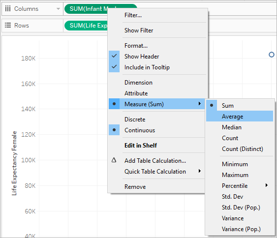
- Both Infant Mortality and Life Expectancy are aggregated as a Sum, rather than average. Right click on both of these measures and to change Measure (Sum) to Average.
- Drag the Country/Region dimension to Details on the Marks card.
Now there are many more marks in your view. The number of marks in your view is now equal to the number of distinct countries in this data set. If you hover over a mark, you can see the country name, female life expectancy, and infant mortality rate.
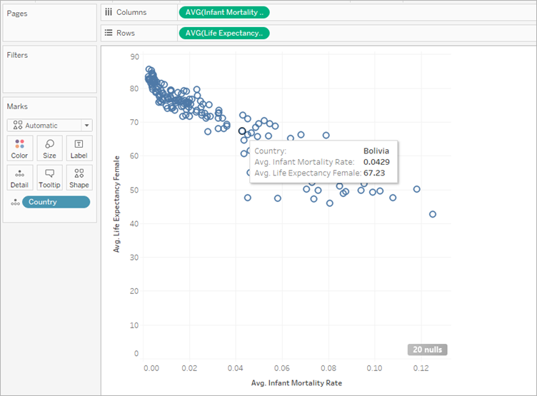
We've created a basic scatter plot, but there are lots of overlapping marks in the view and it's hard to see where the marks are most dense.
-
On the Marks card, select Density from the menu to change this scatter plot into a density chart.
Tableau created a density chart by overlaying marks, called kernels, and color-coding where those kernels overlap. The more overlapping data points, the more intense the color is.
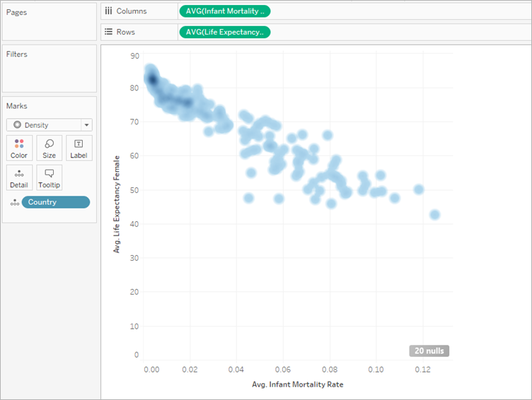
Tableau selected a blue color palette by default, but you can choose from ten density color palettes or any of the existing color palettes.
- Select Color from the Marks card and select Density Multi-color Light from the menu.
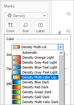
The names of the color palettes indicate whether they're designed for use on charts with dark or light backgrounds. Since our chart has a light background, we picked a "Light" palette. This changes the color palette on your chart. More concentrated areas will appear red, while areas without overlapping marks will appear green.
Note: Color legends are not available for density marks.
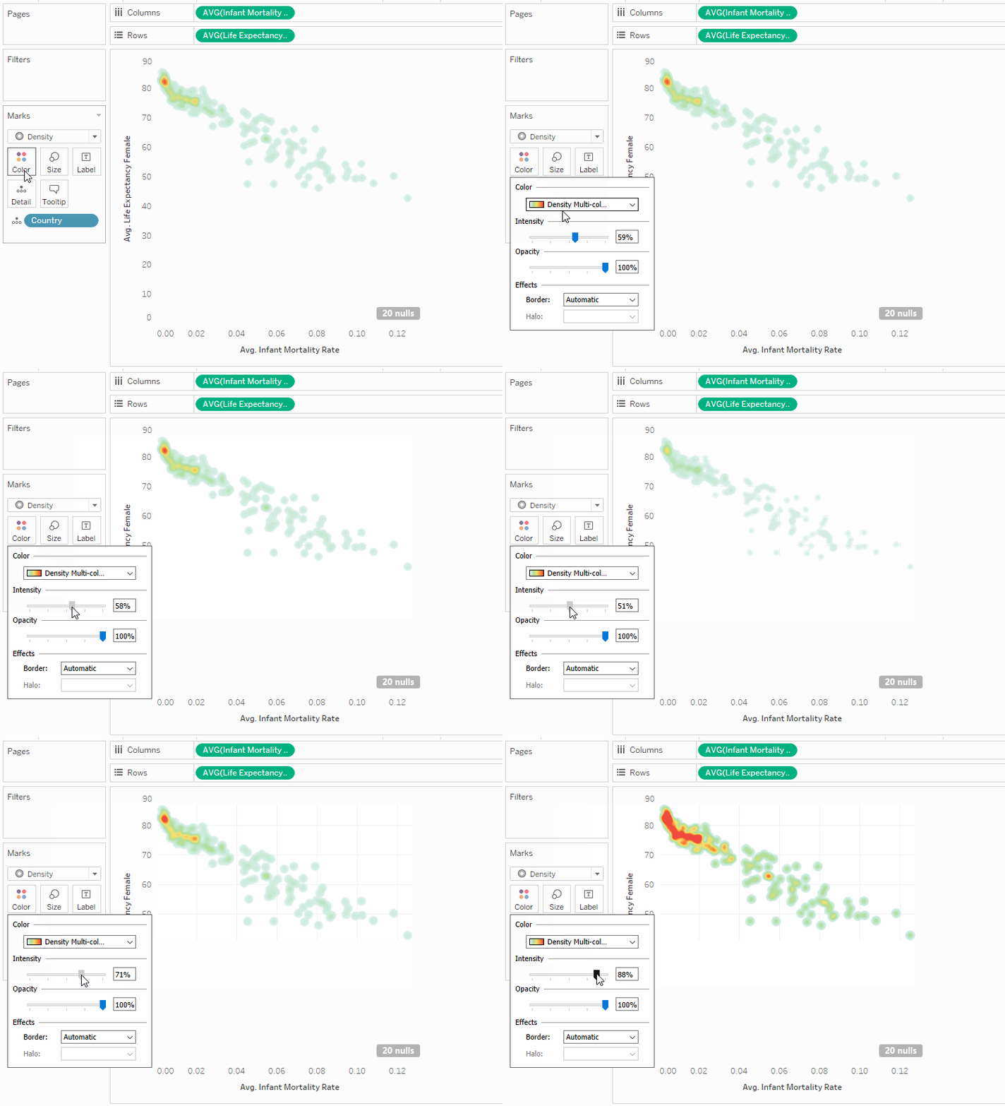
- In the Color menu, use the Intensity slider to increase or decrease the vividness of the density marks. For example, increasing intensity, or vividness, lowers the "max heat" spots in your data, so that more appear.
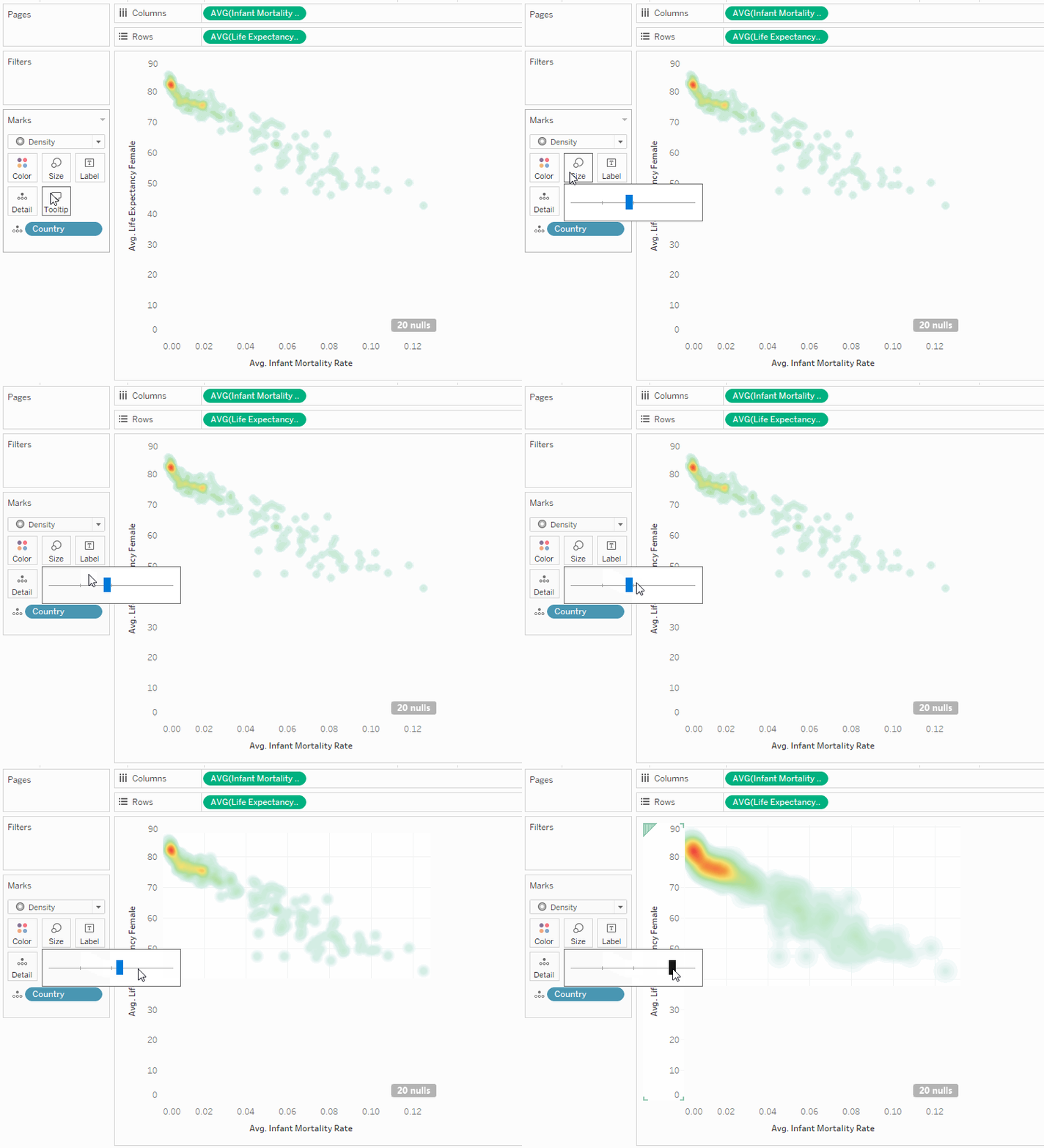
- Select Size from the Marks card to adjust the size of the density's kernel.
For more information, see Change the Type of Mark in the View and Create Heatmaps that Show Trends or Density in Tableau.
