Build a Bar Chart
Use bar charts to compare data across categories. You create a bar chart by placing a dimension on the Rows shelf and a measure on the Columns shelf, or vice versa.
A bar chart uses the Bar mark type. Tableau selects this mark type when the data view matches one of the two field arrangements shown later. You can add additional fields to these shelves. For more information about the Bar mark type, see Bar mark.
| Creates Vertical Bars | Creates Horizontal Bars |
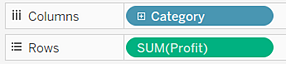
|
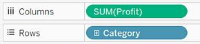
|
To create a bar chart that shows total sales over a four-year period, follow these steps:
Note: At the end of the procedure is an extra step you can take to show totals at the tops of the bars.
- Connect to the Sample - Superstore data source (if necessary, you can download it from the Tableau Public sample data page(Link opens in a new window)).
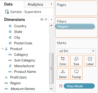
- Drag the Order Date dimension to Columns and drag the Sales measure to Rows.
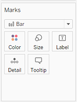
- On the Marks card, select Bar from the drop-down list.
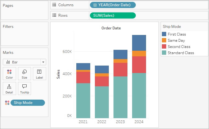
- Drag the Ship Mode dimension to Color on the Marks card.
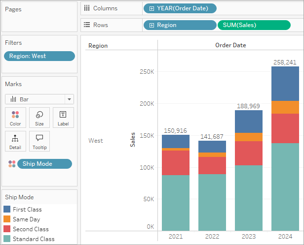
- Drag the Region dimension to Rows, and drop it to the left of Sales to produce multiple axes for sales by region.
- To view data in the West region only, you can filter out the other regions. To do this, drag the Region dimension again, this time from the Data pane to the Filters shelf.
- In the Filter [Region] dialog box, clear the Central, East, and South checkboxes, and then click OK.
Notice that the data is aggregated by year and column headers appear. The Sales measure is aggregated as a sum and an axis is created, while the column headers move to the bottom of the view. Tableau uses Line as the mark type because you added the date dimension.
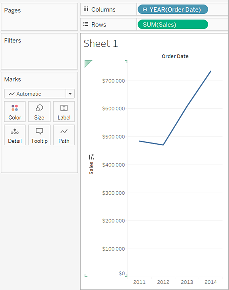
The view changes to a bar chart.
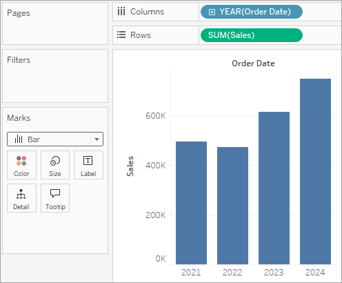
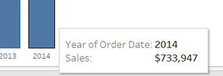
The marks (which are bars in this case) are vertical because the axis is vertical. The length of each mark represents the sum of the sales for that year. The actual numbers you see here might not match the numbers you see—the sample data changes from time to time.
The view shows how different shipping modes have contributed to total sales over time. The ratios look consistent from year to year.
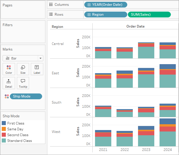
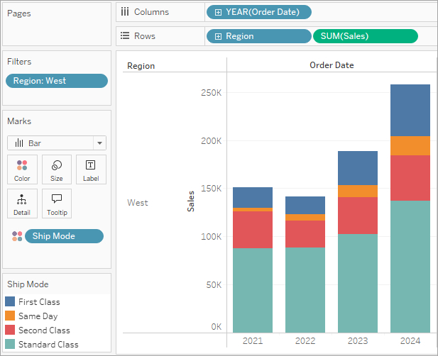
This view gives you insight into your data—for example, how the ship mode changed in the West over the four-year period.
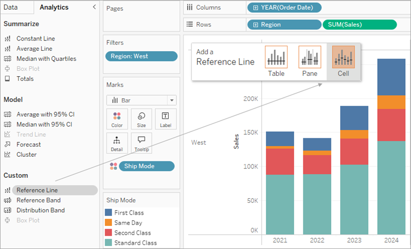
One Step Further: Add Totals To Stacked Bars
Adding totals to the tops of bars in a chart is sometimes as simple as clicking the Show Mark Labels icon in the toolbar. But when the bars are broken down by color or size, each individual segment would labeled, rather than the total for the bar. With a few steps, you can add a total label at the top of every bar even when the bars are subdivided. In the next procedure you’ll technically be adding a reference line. But by configuring that "line" in a certain way, you end up with the labels you want.
-
From the Analytics pane, drag a Reference Line into the view and drop it on Cell.
-
In the dialog, set the aggregation for SUM(Sales) to Sum, set Label to Value, and set Line under Formatting to None:
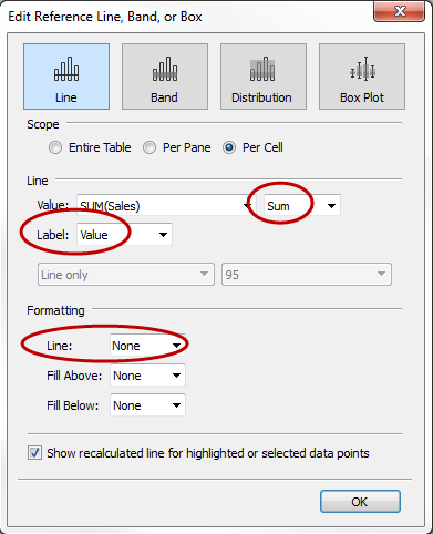
Then click OK to close the Edit Reference Line, Band, or Box dialog box.
-
Right-click any of the totals on the bar chart and select Format.
-
In the Format window, in the Reference Line Label area, open the Alignment control and select the Center option for Horizontal alignment:
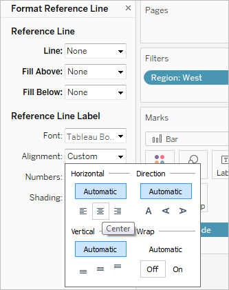
Your view now has currency totals at the top of each bar.
You may need to adjust the view to make it look just right. If the bars are too narrow, the numbers are truncated; to fix this, press Ctrl + Right on the keyboard to make the bars wider. Or if you want to center the totals over the bars—by default, they’re left-aligned. Do the following:
Other resources
Creation of a Grouped Bar Chart(Link opens in a new window): A knowledge base article with embedded videos that describes how to create grouped bar charts, also known as side-by-side bar charts.