Start Building a Visualisation by Dragging Fields to the View
The basic structure for every view is made of dimension and measure fields placed on the Rows and Columns shelves, and on different properties in the Marks card.
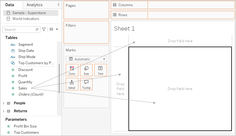
You build visualisations by adding fields from the Data pane to the view. As you build a visualisation, you can add as many fields as necessary to different areas of the view, and then move those fields around as you explore your data.
Different ways to start building a view
When you build a view, you add fields from the Data pane. You can do this in different ways. For example:
- Drag fields from the Data pane and drop them onto the cards and shelves that are part of every Tableau worksheet.
- Double-click one or more fields in the Data pane.
- Select one or more fields in the Data pane and then choose a chart type from Show Me, which identifies the chart types that are appropriate for the fields you selected. For details, see Use Show Me to Start a View.
- Drop a field on the Drop field here grid, to start creating a view from a tabular perspective.

As you start exploring data in Tableau, you will find there are many ways to build a view. Tableau is extremely flexible, and also very forgiving. As you build a view, if you ever take a path that isn't answering your question, you can always undo to a previous point in your exploration.
- To undo or redo, click undo
 or redo
  on the toolbar.
You can undo all the way back to the last time you opened the workbook. You can undo or redo an unlimited number of times.
Dragging basics
When you begin creating a new data view on a blank worksheet, you can drag a field from the Data pane and drop it directly into the view, rather than to a shelf.
In Tableau Desktop, while dragging fields, you can hover over the different areas in the view to see how the field will be incorporated into the structure of the view. For example, dimensions typically add a row and column headers to the view, while measures add continuous axes. Below are some examples of how fields can be added to the view:
- Dimensions add headers and have a blue drop area
- Measures add axes and have a green drop area
- Show Me automatically adds the field according to best practices

For a more advanced discussion of dimensions and measures, see Dimensions and Measures, Blue and Green.
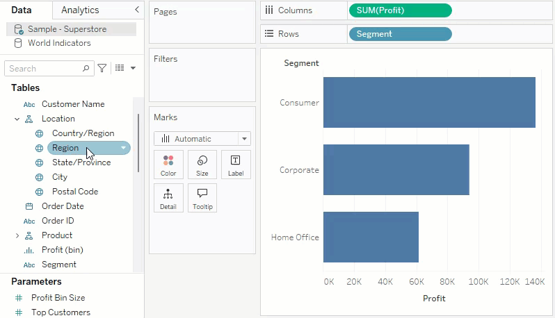
When you drop a field on one of the active areas in the view, the field is added to the view and also to one of the shelves or cards. For example, in the view below, the Segment dimension was added to the Rows shelf and the Profit measure was added to the Columns shelf – and automatically aggregated so that the values in the data are summed.

You can, of course, also drag fields directly to the shelves instead of to the active areas in the view. You can also drag fields from one shelf to another shelf. To remove a field from a shelf, drag it off the worksheet or select Remove from the field's menu (available when you right-click (control-click on Mac) a field in the view. In Tableau Desktop, you can also quickly remove multiple fields from a shelf by right-clicking (control-click on Mac) the shelf and selecting Clear Shelf.
Add headers
You can add headers to a view by dragging a discrete (blue) dimension and dropping it to either side of an existing header, or to the left of an axis. For example, in the view below, you can add the Region dimension by dragging it and dropping it in various places.
As you hover over the view, a dotted black line indicates active areas where you can add headers.
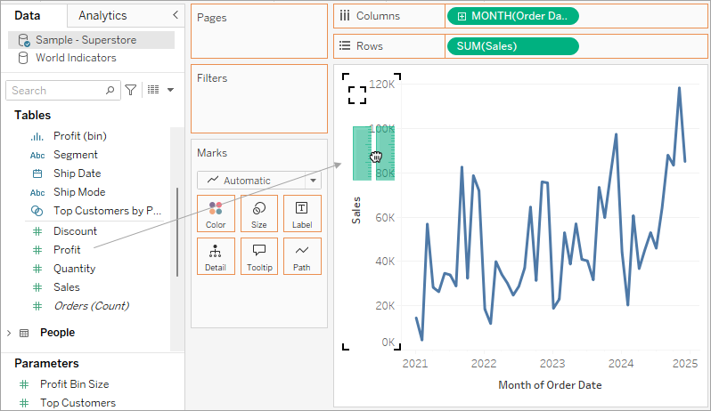
Add axes
You can add axes by dragging a continuous (green) measure and dropping it on an active area in the view. If an axis already exists in the view you can replace the existing axis, blend the new measure with the existing axis, or add a secondary axis.
Replace the existing axis
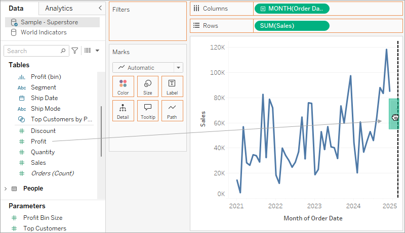
Drag the new measure to the top left portion of the axis in the view. A small square drop zone appears and a single axis icon displays to indicate that a single axis will be left when you drop the measure. In this case you are replacing one measure (Sales) with another (Profit).

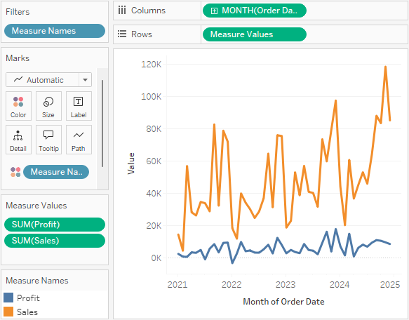
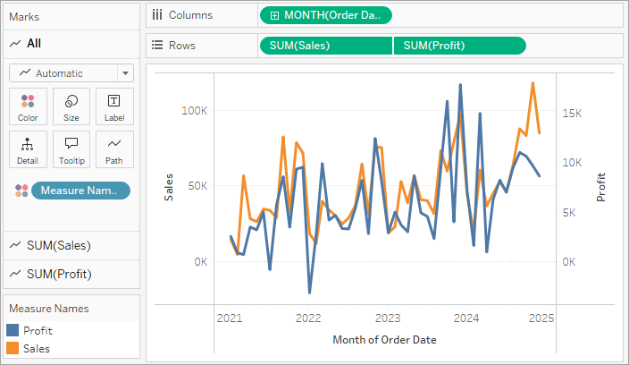
Blend the measures on single axis
You can show multiple measures on a single axis by dragging the new measure directly on top of the existing axis. Blending measures uses the Measure Names and Measure Values fields. For more information, see Measure Values and Measure Names.
In the image below you are adding a second measure (Profit) to the existing measure (Sales) on the axis.
The result is a view with both measures plotted along a single axis. In this case, Sales is shown in orange and Profit is shown in blue.
Add a dual axis
Drag the field to the right side of the view to add the measure as a dual axis. Dual Axes are useful when you want to compare two fields that have different scales. In this case, blending the two axes would distort the view. Instead you can add a dual axis.
The result is a dual axis view where the Profit axis corresponds to the blue line and the Sales axis corresponds to the orange line.
Use dual axes
- You can add up to four axes to the view: two on the Columns shelf and two on the Rows shelf.
- To turn a measure into a dual axis, right-click (control-click on Mac) a field on the Rows or Columns shelf and select Dual Axis.
- To synchronise dual axes (keeping both vertical axes but syncing their scales), right-click on the right-hand axis (in this case, Profit) and select Synchronise Axis.
- To change the order of how the marks are stacked, right-click on either axis and select either Move marks to front or Move marks to back.
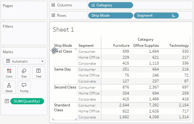
Rearrange rows and columns
You can rearrange the rows and columns in the view by changing the order of the fields in the Rows and Columns shelves, or by dragging the selection border for headers or an axis.
Automatically add fields to the view with double-click
Tableau supports an additional method for automatically generating views of data called Automatic Double-Click. To use this method, double-click fields in the Data pane you are interested in. Tableau automatically adds each field to the view. That is, each double-click results in an additional field added to a shelf in an intelligent way. Like Show Me, this function leverages Tableau’s ability to make an intelligent ‘best guess’ of how the data should be displayed. Double-clicking sometimes creates a view that you can use without further modification. More often, it can provide a starting point, which you can then modify to get the ideal result.
- Double-clicking the Profit measure in the Data pane automatically adds that field to the view in an intelligent way.

- Double-clicking the Category dimension in the Data pane automatically adds that field to the view based on the fact that Profit is already on the Rows shelf.

- Double-clicking the Order Date dimension in the Data pane automatically adds that field to the Columns shelf based on the placement of other fields in the view. As you double-click fields they are successively added to the view. The order in which you click fields determines the type of view created.

The following table describes some of the rules used in creating automatic views by double-clicking fields in the Data pane.
| Text Table | Adding a dimension first produces a text table (or cross-tab). All subsequent clicks on fields result in refinement of the text table. |
| Bars | Adding a measure first and then a dimension produces a bar view. All subsequent clicks result in refinement of the bar view, unless a date dimension is added, at which time the view is changed to a line. |
| Line | Adding a measure and then a date dimension produces a line view. All subsequent clicks result in refinement of the line view. |
| Continuous Line | Adding a continuous dimension and then a measure produces a continuous line view. Subsequent dimensions result in refinement of the continuous line view. Subsequent measures add quantitative axes to the view. |
| Scatter | Adding a measure and then another measure produces a scatter view. Subsequent dimensions result in refinement to the scatter view. Subsequent measures will create a scatter matrix. |
| Maps | Adding a geographic field produces a map view with latitude and longitude as axes and the geographic field on the Level of Detail shelf. Subsequent dimensions add rows to the view while subsequent measures further refine the map by adding size and colour encoding. |