Use Show Me to Start a View
Show Me creates a view based on the fields already used in the view and any fields you’ve selected in the Data pane. Open Show Me by clicking Show Me on the toolbar  .
.
Start a view based on fields that you select
To use Show Me, select the fields you want to analyse in the Data pane, and then select the viz type you want to create in the Show Me pane. Tableau automatically evaluates the selected fields and gives you the option of several types of views that would be appropriate for those fields.
- In the Data pane, select the fields that you want to analyse. Hold the Ctrl key (Command key on a Mac) to make multiple selections.

- Click Show Me on the toolbar and then select the type of view you want to create.

As you hover over each viz type, you'll see a description showing the minimum requirements for each viz type. In this example, we've selected stacked bars.
- Tableau automatically creates a view of the data.

Start a view based on fields from your data source
Starting in version 25.2, Tableau can help build your viz using fields from your data source, even if you have little to no data on your worksheet. Just be sure that your data source is selected in the Data pane.
Select the viz type that you'd like to make and then select Choose for me.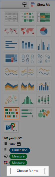
Tableau automatically creates a viz using the fields from your data source. You can drag fields onto the viz to further refine the view.
Create a line chart with Show Me
In this example, you use Show Me to create a line chart that displays profit as a function of time.
- In the Data pane, select [Order Date] and Profit. Hold down the Ctrl key (or the command key on a Mac) as you select the fields.
- Click Show Me on the toolbar to display the Show Me card, if it isn't already displayed.
- In the Show Me pane, see what type of view Tableau suggests with an orange outline.

Because a date dimension and a measure are selected, Tableau suggests you build a line view. A line is often the optimal way to look at how measure values change over time.
The view below shows the resulting chart. Each point on the line represents the sum of profit for the corresponding year.

You can more easily see the points by clicking the Show Mark Labels button on the toolbar.

Create a scatter plot with Show Me
In this example, you use Show Me to build a scatter plot to show sales versus profit for each product and customer.
- In the Data pane, select the Customer Name and Product Name dimension fields and the Profit and Sales measure fields. To select multiple fields, hold down the Ctrl key (or the command key on a Mac) as you click fields.
- Click Show Me on the toolbar.
- Select the scatter plot chart type from Show Me.
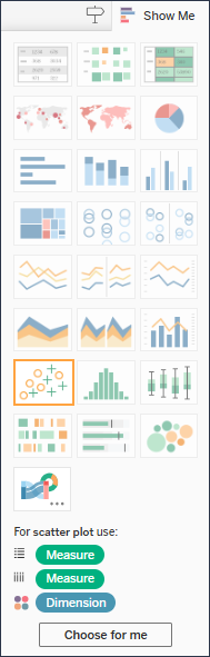
Tableau creates a scatter plot using the fields you selected. You can drag fields onto the viz to further refine the view.
