Step 3: Focus your results
You've created a view of product sales broken down by category and sub-category. You are starting to get somewhere, but that is a lot of data to sort through. You need to easily find the interesting data points and focus on specific results. Well, Tableau has some great options for that!
Filters and colors are ways you can add more focus to the details that interest you. After you add focus to your data, you can begin to use other Tableau Desktop features to interact with that data.
Add filters to your view
You can use filters to include or exclude values in your view. In this example, you decide to add two simple filters to your worksheet to make it easier to look at product sales by sub-category for a specific year.
-
In the Data pane, right-click Order Date and select Show Filter.
-
Repeat the step above for the Sub-Category field.
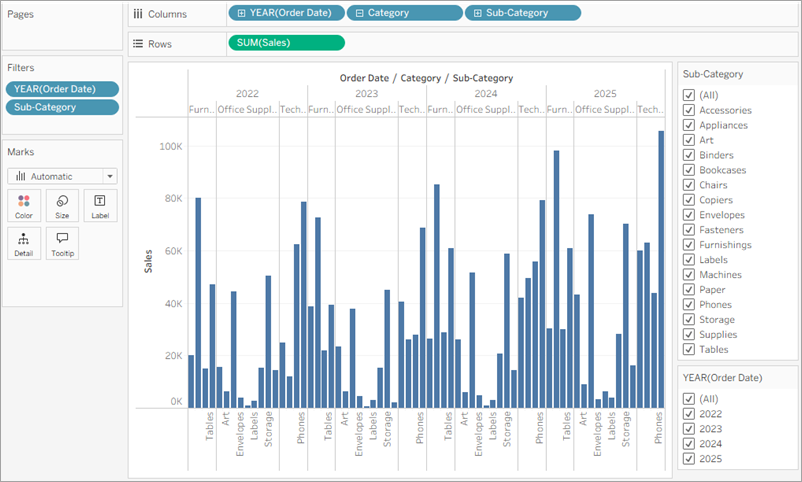
The filters are added to the right side of your view in the order that you selected them. Filters are card types and can be moved around on the canvas by clicking on the filter and dragging it to another location in the view. As you drag the filter, a line appears that shows you where you can drop the filter to move it.
Note: The Get Started tutorial uses the default position of the filter cards.
More on Filtering in the Learning Library (in the top menu).
Click the image to replay it
Note: Details in this gif may not match exactly what's on your screen.
Add color to your view
Adding filters helps you to sort through all of this data—but wow, that’s a lot of blue! It's time to do something about that.
Currently, you are looking at sales totals for your various products. You can see that some products have consistently low sales, and some products might be good candidates for reducing sales efforts for those product lines. But what does overall profitability look like for your different products? Drag Profit to color to see what happens.
From the Data pane, drag Profit to Color on the Marks card.
By dragging profit to color, you now see that you have negative profit in Tables, Bookcases, and even Machines. Another insight is revealed!
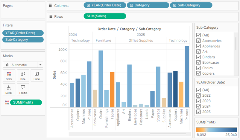
Note: Tableau automatically added a color legend and assigned a diverging color palette because your data includes both negative and positive values.
Adding color visually enhances your view, but it can also make interesting data stand out. Tableau uses a default color palette to assign colors to the products in your view, but you aren't limited to that color palette. You have choices!
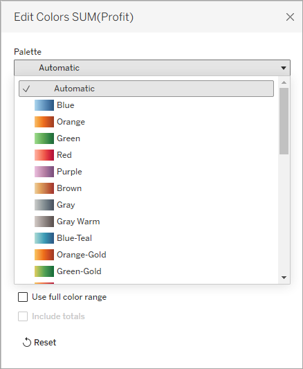
If you want to use different colors than the ones shown, you can change the colors or color palette at any time. Simply click Color on the Marks card, and then click Edit Colors. You can select a different color palette in the Edit Colors dialog box that opens.
Note: The Get Started tutorial uses the default color palette.
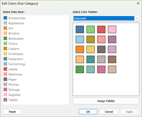
Depending on the data in your view, the Edit Colors dialog box might show you a diverging color palette versus a categorical color palette.
Diverging color palettes look like the image below. Diverging color palettes are generally assigned to continuous fields.
If you're using a legend, it might look like the image below. Categorical color palettes like this one are generally assigned to discrete fields.
Click the image to replay it
Note: Details in this gif may not match exactly what's on your screen.
Find key insights
As you've learned, you can explore your data as you build views with Tableau Desktop. Adding filters and colors helps you better visualize your data and can identify problems right away.
The next step is to interact with your view so that you can begin drawing conclusions.
Looking at your view, you saw that you had some unprofitable products, but now you want to see if these products have been unprofitable year over year.
It's time to use your filters to take a closer look.
-
In the view, in the Sub-Category filter card, clear all of the check boxes except Bookcases, Machines, and Tables.
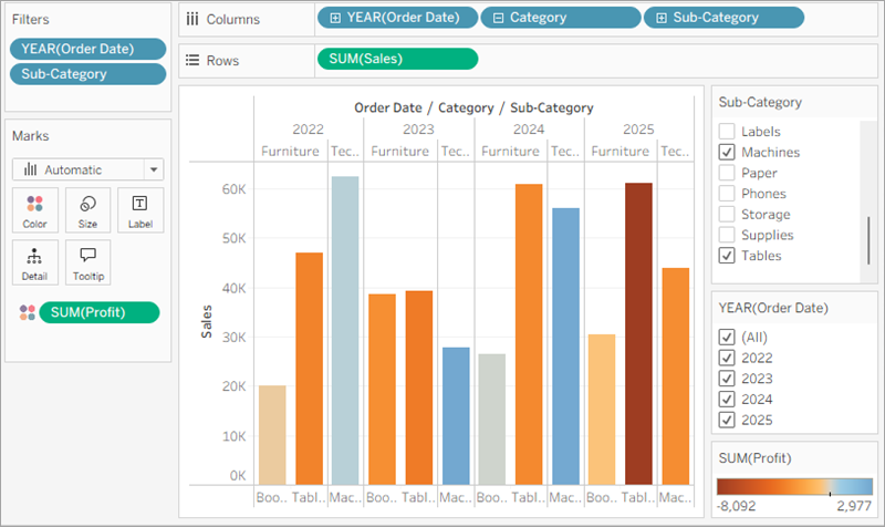
Now you can see that, in some years, Bookcases and Machines were profitable. However, recently Machines are unprofitable. While you've made an important discovery, you want to gather more information before proposing any action items to your boss.
On a hunch, you decide to break up your view by region:
-
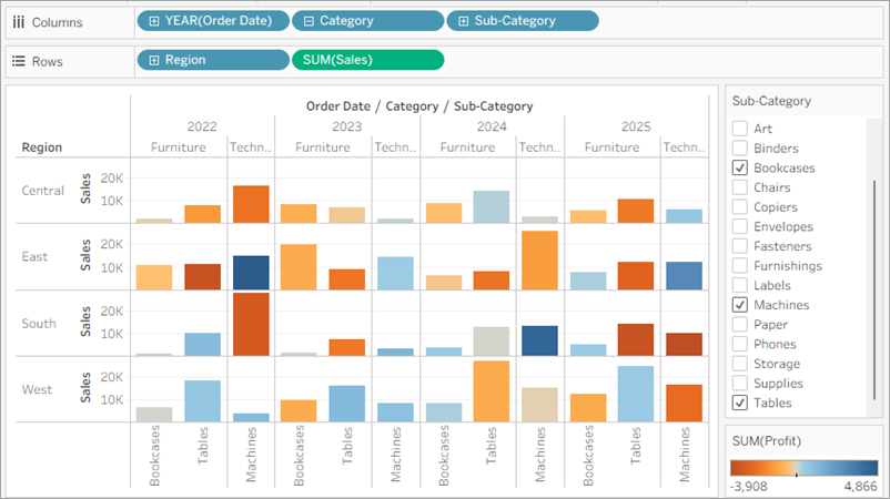
From the Data pane, drag Region to the Rows shelf and place it to the left of Sum(Sales).
Tableau creates a view with multiple axes broken down by region.
-
At the bottom-left of the workspace, double-click Sheet 1 and type Sales by Product/Region.
You choose to focus your analysis on the South, but you don't want to lose the view you've created. In Tableau Desktop, you can duplicate your worksheet to continue where you left off.
-
In your workbook, right-click the Sales by Product/Region sheet and select Duplicate.
-
Rename the duplicated sheet to Sales in the South.
-
In your new worksheet, from the Data pane, drag Region to the Filters shelf to add it as a filter in the view.
-
In the Filter Region dialog box, clear all check boxes except South and then click OK.
-
Right click on the Region pill on the Rows shelf and uncheck Show Header.
Now you see sales and profitability by product for each region. By adding region to the view and filtering the Sub-Category, you notice that machines in the South are reporting a higher negative profit overall than in your other regions. You've discovered a hidden insight!
This view best encapsulates your work so far. Select All in the Sub-Category filter card (if you changed your filter) to show all sub-categories again, name the worksheet, and add a title.
-
Save your work by selecting File > Save As. Give your workbook a name, such as Regional Sales and Profits.
Your view updates to look like the image below.
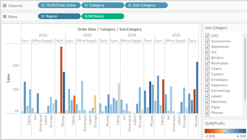
Now you can focus on sales and profit in the South. You immediately see that machine sales had negative profit in 2022 and again in 2025. This is definitely something to investigate!
When you install Tableau, it automatically creates a folder directory for you under Documents > My Documents > My Tableau Repository. My Tableau Repository contains multiple folders for data sources, saved workbooks, geocoding data, and more.
More on saving your workbook as different Tableau file types in the Learning Library (in the top menu).
Click the image to replay it
Note: Details in this gif may not match exactly what's on your screen.
Step summary
In this step you used filter and color to make working with your data a bit easier. You also learned about a few fun features that Tableau offers to help you answer key questions about your data. You learned how to:
-
Apply filters and color to make it easier to focus on the areas of your data that interest you the most.
-
Interact with your chart using the tools that Tableau provides.
-
Duplicate worksheets and save your changes to continue exploring your data in different ways without losing your work.
Having explored your data in Tableau Desktop, you've identified areas of concern. You know sales and profit in the South are a problem, but you don't yet have a solution. You want to look at other factors that might be contributing to these results. Next, you'll leverage another key feature in Tableau to work with geographic data.