Step 4: Explore your data geographically
You've built a great view that allows you to review sales and profits by product over several years. And after looking at product sales and profitability in the South, you decide to look for trends or patterns in that region.
Because you're looking at geographic data (the Region field), you have the option to build a map view. Map views are great for displaying and analyzing this kind of information. Plus, they're just cool!
For this example, Tableau has already assigned the proper geographic roles to the Country, State/Province, City, and Postal Code fields. That's because it recognized that each of those fields contained geographic data. You can get to work creating your map view right away.
Tableau recognizes a lot of common geographic data, such as state and city names. When Tableau recognizes this type of data, it automatically assigns fields appropriate geographic roles, so they become geographic fields.
Geographic fields have globe icons  next to them in the Data pane. If a field is assigned a geographic role, Tableau automatically creates a map view when you add the field to Detail on the Marks card. More on that later.
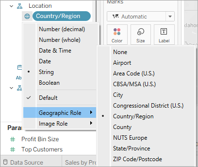
If Tableau doesn't recognize your data as geographic, you can manually assign a geographic role to each of the relevant fields.
There are several geographic roles to choose from:
- Airport
- Area Code (U.S.)
- CBSA/MSA (U.S.)
- City
- Congressional District (U.S.)
- Country/Region
- County
- NUTS Europe
- State/Province
- Zip Code/Postcode
Build a map view
Start fresh with a new worksheet.
-
Click the New worksheet icon at the bottom of the workspace.
-
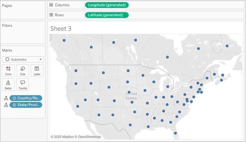
In the Data pane, double-click State/Province to add it to Detail on the Marks card.
-
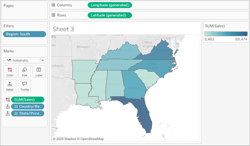
Drag Region to the Filters shelf, and then filter down to the South only. The map view zooms in to the South region, and there is a mark for each state (11 total).
-
Drag the Sales measure to Color on the Marks card.
-
Click Color on the Marks card and select Edit Colors.
-
In the Palette drop-down list, select Orange-Blue Diverging and close the dialog. This allows you to see quickly the low performers and the high performers.
-
Click the Undo icon
 in the toolbar to return to that nice, blue view.
 -
Drag Profit to Color on the Marks card to see if you can answer this question.

Tableau keeps your previous worksheet and creates a new one so that you can continue exploring your data without losing your work.
Now you’ve got a map view!
You can double-click fields to quickly add them to the view. When you double-click a geographic field, it's automatically added to Detail on the Marks card, and a map view is created with marks for each location listed in the field.
Because Tableau already knows that state names are geographic data and because the State/Province dimension is assigned the State/Province geographic role, Tableau automatically creates a map view.
There is a mark for each of the contiguous 48 US states and the Canadian provinces in your data source. (Sadly, Alaska and Hawaii aren't included in your data source, so they are not mapped.)
Notice that the Country field is also added to the view. This happens because the geographic fields in Sample - Superstore are part of a hierarchy. Higher levels in the hierarchy can be automatically added as a level of detail.
Additionally, generated Latitude and Longitude fields are added to the Columns and Rows shelves. You can think of these as X and Y fields. They're essential any time you want to create a map view, because each location in your data is assigned a latitudinal and longitudinal value. Sometimes these fields are generated by Tableau from geographic fields in your data. Or your data may contain its own latitude and longitude values. You can find resources to learn more about this in the Learning Library.
Now, having a cool map focused on the contiguous US and Canada is one thing, but you wanted to see what was happening in the South, remember?
Now you want to see more detailed data for this region, so you start to drag other fields to the Marks card:
The view automatically updates to a filled map, and colors each state based on its total sales. Because you're exploring product sales, you want your sales to appear in USD. Click the Sum(Sales) field on the Marks card, and select Format. For Numbers, select Currency.
Any time you add a continuous measure that contains positive numbers (like Sales) to Color on the Marks card, your filled map is colored blue. Negative values are assigned orange.
Sometimes you might not want your map to be blue. Maybe you prefer green, or your data isn’t something that should be represented with the color blue, like wildfires or traffic jams. That would just be confusing!
No need to worry, you can change the color palette just like you did before.
For this example, you want to see which states are doing well, and which states are doing poorly in sales.
Your view updates to look like this:
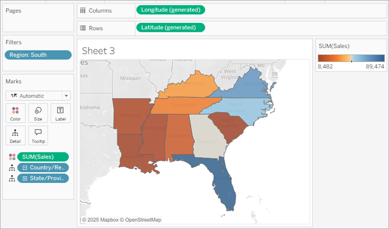
But wait. There's so much orange! What happened?
The data is accurate, and technically you can compare low performers with high performers, but is that really the whole story?
Are sales in those orange states really that terrible, or are there simply more people in Florida to buy your products? Maybe you have smaller or fewer stores in the states that appear orange. Or maybe there’s a higher population density in the states that appear blue, so there are just more people to buy your stuff.
Either way, there’s no way you want to show this view to your boss because you aren't confident the data is telling a useful story.
There’s still a color problem. Everything looks dandy—that’s the problem!
At first glance, it appears that Florida is performing the best. Hovering over its mark reveals a total of 89,474 USD in sales, as compared to South Carolina, for example, which has only 8,482 USD in sales. However, have any of the states in the South been profitable?
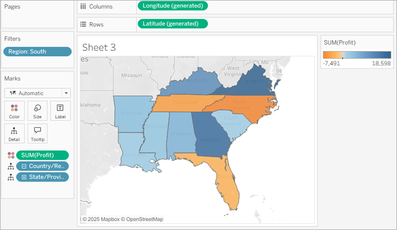
Now that’s better! Because profit often consists of both positive and negative values, Tableau automatically selects the Orange-Blue Diverging color palette to quickly show the states with negative profit and the states with positive profit.
It’s now clear that Tennessee, North Carolina, and Florida have negative profit, even though it appeared they were doing okay—even great—in Sales. But why? You'll answer that in the next step.
Click the image to replay it
Note: Details in this gif may not match exactly what's on your screen.