Step 2: Drag and drop to take a first look
Create a view
You set out to identify key areas for improvement, but where to start? With four years' worth of data, you decide to drill into the overall sales data to see what you find. Start by creating a simple chart.
| Term | Description |
| Aggregation vs Granularity | Aggregation is how row-level quantitative data is rolled up to a higher category, such as sum of sales or average profit. Tableau does this automatically so you can break data down to the level of detail that you want to work with. Granularity means how detailed the data is – for example, dates can have a granularity of days, months, years, etc. |
| Dimension vs Measure | Dimensions are qualitative data, such as a name or date. By default, Tableau automatically classifies data that contains qualitative or categorical information as a dimension, for example, any field with text or Boolean (true/false) values. These fields generally appear as column headers for rows of data, such as Customer Name or Order Date, and also define the level of granularity that shows in the view. Measures are quantitative numerical data. By default, Tableau treats any field containing this kind of data as a measure, for example, sales transactions or profit. Data that is classified as a measure can be aggregated based on a given dimension, for example, total sales by region, where sales is the measure, total (or sum) is the aggregation and region is the dimension. |
| Continuous vs. Discrete | Continuous fields can contain an infinite number of values. This can be a range of values such as sales within a specific date range or quantities. Continuous fields are coloured green in Tableau. Discrete fields contain a finite number of values such as country, county or customer name. Discrete fields are coloured blue in Tableau. |
More on Dimensions and Measures in the Learning Library.
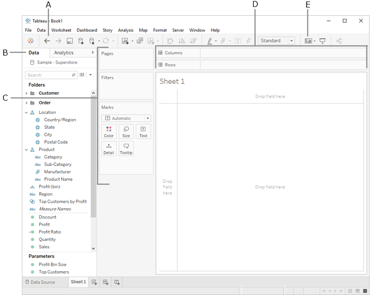
In this section, you'll drag fields to the Columns and Rows shelves, and you'll also work with the Marks card. The image below identifies some of the workspace controls and elements that you'll use.
| Element | Description |
A Undo | With Tableau, feel free to experiment with your data. You can always get back to where you started with the Undo button. Use this button to reverse the last action you performed in your workbook. You can undo an unlimited number of times, back to the last time you opened the workbook, even after you saved your work. |
B Data pane | Displays the name of the data source that is included in the view and the available fields. Fields can be grouped based on their source table or by folder. More on the Data Pane in the Learning Library. |
Cards are containers for the different controls that are available in Tableau. Shelves are a type of card control. When you drag fields from the Data pane to the Columns or Rows shelves, the data is added as a column or a row on the axes in your view. When you drag fields from the Data pane to the Marks card, you can control visual properties like type, colour, size, shape and more. Only the marks in your view are impacted by this action; axes do not change. More on Cards and Shelves in the Learning Library. | |
E Show/Hide Cards | Did you accidentally hide a card that you now need? No problem! Just about everything on the Tableau workspace can be turned on or off to provide the maximum amount of room for you to create your visualisations. To show or hide cards like Pages, Filters or Legends, click the drop-down arrow on the Show/Hide Cards You can even collapse the Data and Analytics pane to the lower left corner of the workspace by clicking the Minimise |
 button on the toolbar and clear or enable the check mark for the card.
 button at the top-right corner of the pane. Click the button again to restore the pane like it was.
From the Data pane, drag Order Date to the Columns shelf.
Note: When you drag Order Date to the Columns shelf, Tableau creates a column for each year in your data set. Under each column is an Abc indicator. This indicates that you can drag text or numerical data here, like what you might see in an Excel spreadsheet. If you were to drag Sales to this area, Tableau creates a crosstab (like a spreadsheet) and displays the sales totals for each year.
From the Data pane, drag Sales to the Rows shelf.
Tableau generates the following chart with sales rolled up as a sum (aggregated). You can see total aggregated sales for each year by order date.
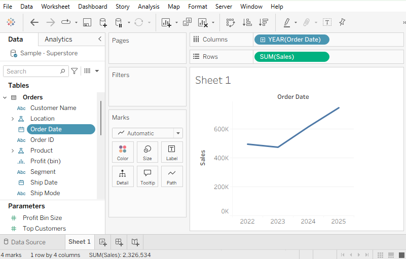
When you first create a view that includes time (in this case Order Date), Tableau automatically generates a line chart.
This line chart shows that sales look pretty good and seem to be increasing over time. This is good information, but it doesn't really tell you much about which products have the strongest sales and if there are some products that might be performing better than others. Since you just got started, you decide to explore further and see what else you can find out.
To quickly change the chart type, select the drop-down menu on the Marks card.
For example, for an area chart, you can select Area.
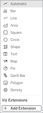
Tableau supports many different chart types, referred to as mark types. For more information, see More on Mark Types in the Learning Library.
Note: Before you continue the tutorial, make sure your chart type is set back to Automatic.
Click the image to replay it.
Note: Details in this gif may not match exactly what's on your screen.
Refine your view
To gain more insight into which products drive overall sales, try adding more data. Start by adding the product categories to look at sales totals in a different way.
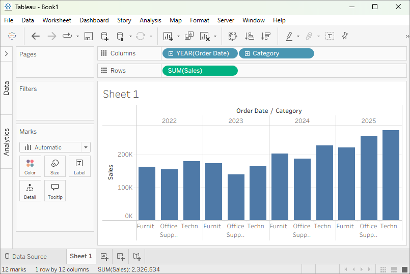
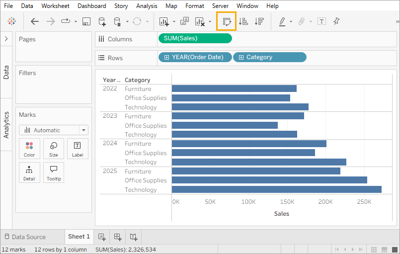
- From the Data pane, drag Category to the Columns shelf and place it to the right of YEAR(Order Date). You might need to expand the Product hierarchy to see the Category field.
Your view updates to a bar chart. By adding a second discrete dimension to the view you can categorise your data into discrete chunks instead of looking at your data continuously over time. This creates a bar chart and shows you overall sales for each product category by year.
To display the bar chart horizontally instead of vertically, click Swap Rows and Columns on the toolbar.
Note: Undo this action before continuing the Get Started tutorial.
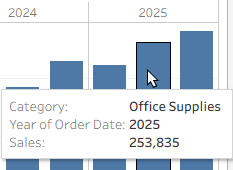
You can view or add data point information to your view. In this example, this information shows exact sales totals by category.
To view information about each data point (that is, mark) in your view, hover over one of the bars to reveal a tooltip. The tooltip displays total sales for that category. Here is the tooltip for the Office Supplies category for 2025:
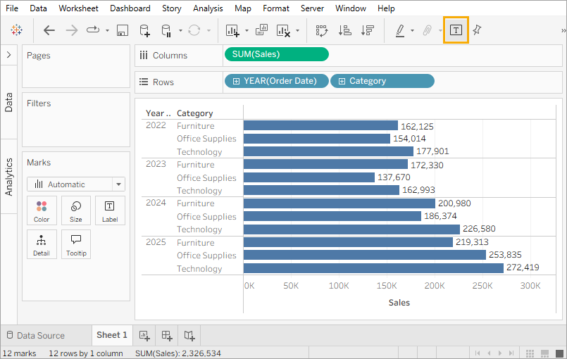
To add data point information as labels to your view, click Show Mark Labels on the toolbar. Below, we show the total sales for each category and year.
Note: Undo this action before continuing the Get Started tutorial.
Your view is doing a great job showing sales by category – furniture, office supplies and technology. An interesting insight is revealed!
From this view, you can see that sales for furniture is growing faster than sales for office supplies, even though Office Supplies had a really good year in 2025. Perhaps you can recommend that your company focus sales efforts on furniture instead of office supplies? Your company sells a lot of different products in those categories, so you'll need more information before you can make a recommendation.
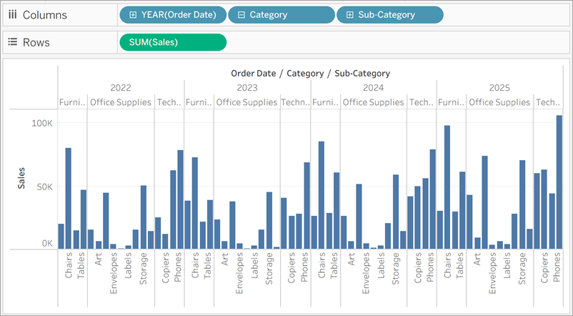
To help answer that question, you decide to look at products by sub-category to see which items are the big sellers. For example, for the Furniture category, you want to see details about bookcases, chairs, furnishings and tables. Looking at this data might help you gain insights into sales and later on, overall profitability, so add sub-categories to your bar chart.
- Double-click or drag Sub-Category to the Columns shelf.
Note: You can drag and drop or double-click a field to add it to your view, but be careful. Tableau makes assumptions about where to add that data, and it might not be placed where you expect. You can always click Undo to remove the field, or drag it off the area where Tableau placed it to start over.
Sub-Category is another discrete field. It creates another header at the bottom of the view, and shows a bar for each sub-category (68 marks) broken down by category and year.
Now you are getting somewhere, but this is a lot of data to visually sort through. In the next section, you will learn how you can add colour, filters and more to focus on specific results.
If you want to see how your products contribute to overall sales by category, Tableau gives you another option.
If you drag the Sub-Category to Colour on the Marks card, you create a stacked bar chart with additional marks for each sub-category identified by a unique colour. Tableau automatically displays a legend card to the right for the Sub-Category values.
Note: Undo this action before continuing the Get Started tutorial.
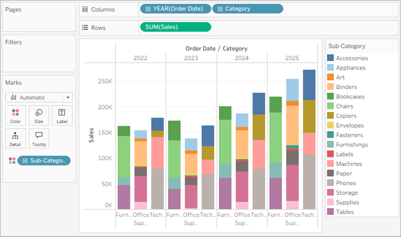
This quickly shows you the amount of sales that each product contributes to the overall total for each category and year, and it immediately shows the large and small contributors at a glance.
Sub-categories are displayed as stacked bars in the order that they are listed in the legend, not according to where they fall on the Sales axis.
For example, the above view shows Bookcases at the top of each Furniture bar because Bookcases are listed above Chairs, Furnishings and Tables in the legend. The sub-categories are displayed in the legend so that you can move them around and examine your data in a way that makes sense to you.
Depending on the kind of analysis you want to do, the stacked bar chart might or might not be the chart for you.
Click the image to replay it
Note: Details in this gif may not match exactly what's on your screen.
Step summary
This step was all about getting to know your data and starting to ask questions about your data to gain insights. You learned how to:
Create a chart in a view that works for you.
Add fields to get the right level of detail in your view.
Now you're ready to begin focusing on your results to identify more specific areas of concern. In the next section, you will learn how to use filters and colours to help you explore your data visually.