Visual Best Practices
The fonts, colors, shading, alignment, borders, and grid lines in your visualization are important parts of both your analysis and the story you're telling. Tableau products are designed so that you can create great-looking visualizations that use visual best practices by default, freeing you from the need to think about things like fonts and colors—unless you want to.
If you do want to customize, you can control the look of almost everything you see on a worksheet. This article outlines visual best practices and tips to keep in mind while you customize, from ideal workflow to how to get the most out of tooltips.
Format from largest to smallest
As you change the look and feel of your work, use a biggest to smallest workflow. Start by formatting fonts and titles at the workbook level, then move on to the worksheet level. Save formatting the individual parts of a view for last. A workbook is the largest possible container for formatting changes, and making changes at the workbook level first will save you time.
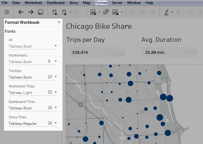
See Format at the Workbook Level, Format at the Worksheet Level, and Format Text and Numbers for details.
Change color with purpose
If you want to change the colors used by your visualization, Tableau makes it easy: just click the Color card, then Edit Colors. For example, maybe you want to emphasize a key finding. You can use neutral colors with a single, bright color to highlight what you want your viewers to pay attention to. If you want to match your company's brand, you can create a custom palette. See Create Custom Color Palettes for steps.
When you change colors, keep the following best practices in mind.
Discrete fields and categorical palettes
Discrete fields are ones where the field's values are unique. One example of this is customer names. Tableau automatically associates discrete fields with categorical palettes, which have colors that are designed to be distinct from one another yet also work well together in the visualization as a whole.
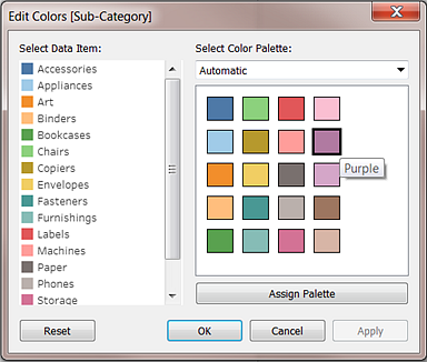
Change colors for individual fields
After you've selected a categorical palette, you can manually change the colors associated with specific fields.
-
From the Edit Colors dialog, double-click (Control-Click on Mac) any of the fields in the Select Data Item panel.
-
The color palette for your operating system opens, allowing you to define a new color for the item selected.
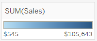
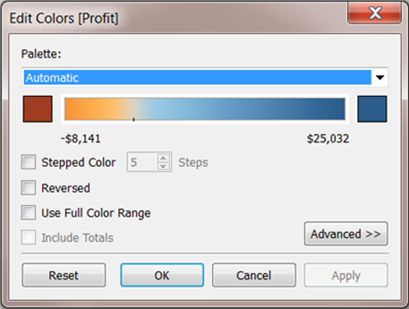
Continuous fields and quantitative palettes
With continuous fields, the field's values are part of a whole (such as sales over time). Tableau automatically associates these fields with quantitative palettes, where colors are along a continuum or range. If the field's values are positive, a single-color range is best:
If there are both positive and negative values, choose a two-color range:
Limit colors
Color used correctly can enhance analysis. Too many colors can create visual overload for your users and impede analysis. In the view below, the stacked bars represent cell phone subscriptions and the trend line is internet usage over time. In the first image, Years is on the Colors shelf. Notice how hard it is to pick out the trend line among all the other colors and how easy it is to spot the trend line in the second image, where there are only two colors.
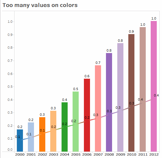
Click the image to replay it.
Use fonts that optimize online readability
The fonts in the Tableau typeface were designed to be paired with data visualizations and are optimized for legibility at small sizes. Tableau visualizations use them by default.
If you need to use a different font, choose one that optimizes readability online, such as the following:
- Arial
- Trebuchet MS
- Verdana
- Times New Roman
- Lucida sans
Reinforce your story with tooltips
People looking at your dashboard will intuitively use their mouse to explore marks, and this makes tooltips appear. Tooltips appear by default for most views, and they are a great way to reinforce your data story. You can customize your tooltips by clicking Worksheet > Tooltip.
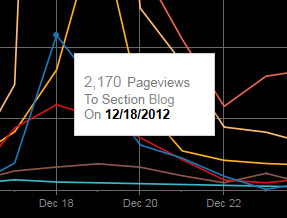
For example, here's a tooltip for a view on pageviews for a web site:
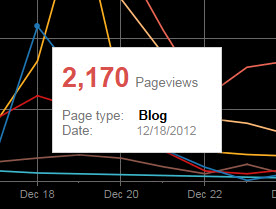
Here's an example of how the above tooltip could be rewritten and formatted to highlight what's important to the people looking at this view:
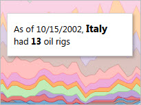
You can also rewrite your tooltips to tell a mini-story. For example, here's a tooltip about the number of oil rigs in Italy.
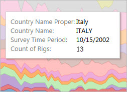
In the following example, the tooltip is rewritten as a sentence, and key elements are bolded to draw the viewer's attention.
Consider your axes
By default, an axis range in Tableau automatically adjusts based on the data in your visualization. Filtering and other actions can change the axis range. If you are trying to create a specific comparison between two views, changing axes ranges can make analysis difficult for your users. If this is the case, you can set your axes to a specific, fixed range. For steps on how to do this, see Examples: Use Different Axis Ranges (Uniform, Independent, Fixed).
If you're working with data that has a very large range, a fixed axis may not be practical. If this is the case, add grid lines to your visualization. Grid lines can help your users stay oriented when the axis automatically adjusts. See Format lines for more information.