Example – Multiple Fields on Color
If you drop one field on Color and then drop a different field on Color, the second field replaces the first field. However, depending on the chart type, for example treemaps and bullet graphs, you can put multiple fields on color. You can use one field to set the hue, and the other to show gradations within that hue.
Follow these steps, using the Sample - Superstore data source, to build a treemap with two fields on Color.
-
Drag Category and Sub-Category to Columns.
-
Drag Sales to Size on the Marks card.
-
Click Show Me in the toolbar, then select the Treemap chart type.

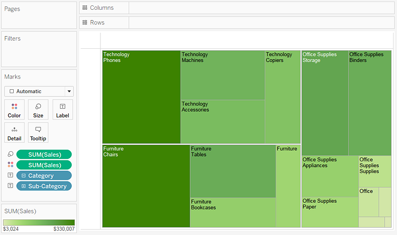
Tableau moves all fields to the Marks card, putting SUM(Sales) on both Size and Color, and Category and Sub-Category on Label:

-
Click the label icon to the left of Category on the Marks card and select Color:

Category replaces SUM(Sales) on Color. The marks are still sized by the sum of Sales, but now they are colored by Category:

-
Click the label icon to the left of Sub-Category on the Marks card and select Color.
Tableau uses distinct, categorical colors for the first field, Category, and a range of sequential shades to distinguish values for the second field, Sub-Category:

The size of the individual rectangles is still determined by Sales, per Category and Sub-Category.
The two fields on Color (Category and Sub-Category) are related within a hierarchy, so if you swap their positions on the Marks card, moving Sub-Category to be above Category, the effect is the same as if you had removed Category from the view altogether. The treemap changes to show a uniquely colored rectangle for each Sub-Category:

When the two fields on Color are not related within a hierarchy, you can switch the order of the fields on the Marks card so that the field that was used for categorical colors was used for sequential shades, and vice versa.
If you aren’t satisfied with the colors that Tableau used, you can change them. To open the Edit Colors dialog, do one of the following:
-
In Tableau Desktop, double-click the color legend.
-
In Tableau Server or Tableau Cloud, click the drop-down arrow in the top right-hand corner of the legend.
-
-
Make the view more readable by adding Category, Sub-Category, and Sales to Label. Users can hover to see tooltips for any rectangle that is too small to show text by default.

