Example - A Story That Examines a Trend
The example in this article walks you through building a story about earthquake trends over time.
The story feature in Tableau is a great way to showcase this type of analysis because it has a step-by-step format which lets you move your audience through time.
Rather than showing you how to create all the views and dashboards from scratch, this example starts from an existing workbook. What you'll do is pull the story together. To follow along and access the pre-built views and dashboards, download the following workbook from Tableau Public: An Earthquake Trend Story(Link opens in a new window).
Frame the story
A successful story is well-framed, meaning its purpose is clear. In this example, the story's purpose is to answer the following question: Are big earthquakes becoming more common?
There are several approaches you could take—see Best Practices for Telling Great Stories for a list—but the one used here as an overall approach is Change over Time, because it works especially well for answering questions about trends. As you build the story you'll notice that other data story types, such as Drill Down and Outliers, are blended in to support the overall approach.
Build the story
Create a story worksheet
-
Use Tableau Desktop to open the Earthquake Trend Story workbook that you downloaded.
If you also have Tableau Server or Tableau Cloud and you want to do your authoring on the web instead of in Tableau Desktop, publish the workbook to your Tableau server, click Workbooks, select the workbook, then under Actions choose Edit Workbook.
Once you open the workbook, you'll see that it has three dashboards. You'll be using those dashboards to build your story. The workbook also has a finished version of the story.
Tip: To see the individual views that are in a dashboard, right-click the dashboard's tab and select Unhide all Sheets.
-
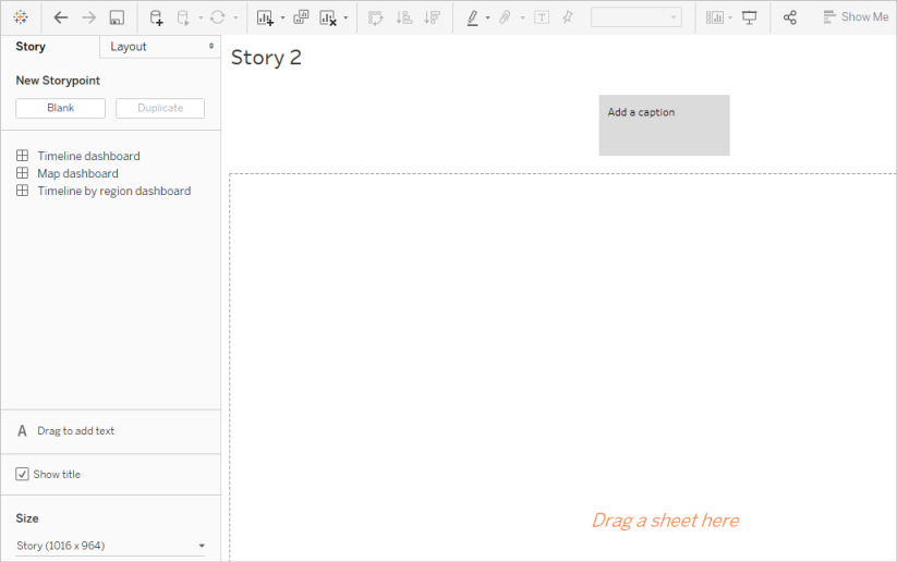
Click the New Story tab.

Tableau opens a new worksheet as your starting point.
-
Right-click the Story 2 tab, choose Rename Sheet, and type Earthquake story as the worksheet name.
State the question
Story titles are in view at all times and they're a handy way to keep your story's purpose front and center. By default, Tableau uses the worksheet name as the story title. In Tableau Desktop you can override that by doing the following:
-
Double-click the title.
-
In the Edit Title dialog box, replace <Sheet Name> with the following:
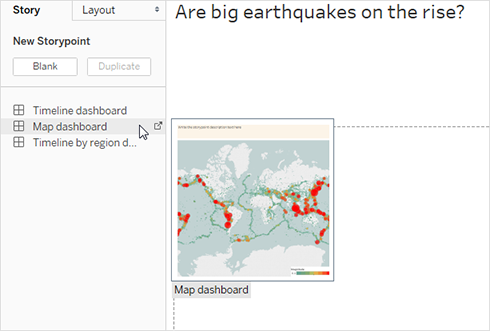
Are big earthquakes on the rise?
-
Click OK.
If you're authoring in Tableau Server or Tableau Cloud, the story tab is the only place where you can change the title.
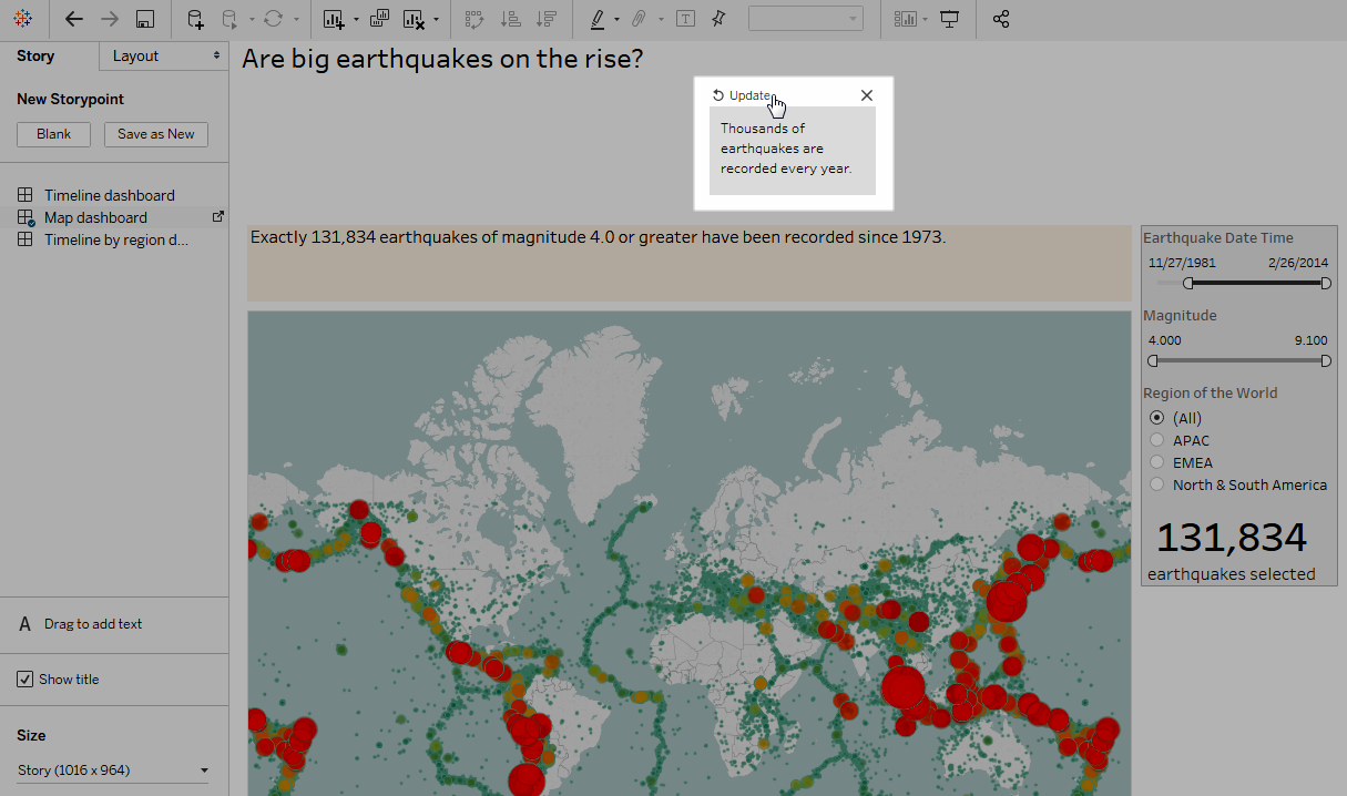
Start big
To help orient your audience, the first story point you create will show the broadest possible viewpoint—all earthquakes, across the entire planet.
-
On the Story pane, double-click Map dashboard to place it on the story sheet. If you're using Tableau Desktop, you can also use drag-and-drop to add views and dashboards to a story sheet.
Notice how there's a horizontal scroll bar and the legend isn't fully displayed.
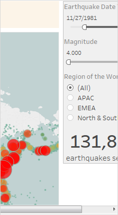
There's a special setting you can use on your dashboards to prevent this from happening.
-
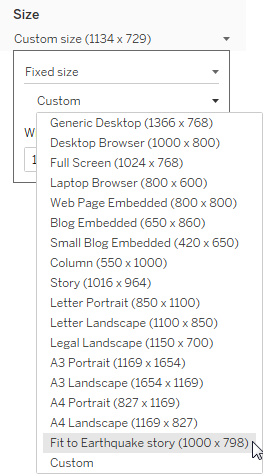
Select Map dashboard and under Size on the Dashboard pane, select Fit to Earthquake story. This setting is designed to make dashboards the perfect size for a story.
Look at the Earthquake story again. You see that its size has been adjusted and the scroll bars are gone.
-
If you're using Tableau Desktop, add a description for this story point, such as Exactly 131,834 earthquakes of magnitude 4.0 or greater have been recorded since 1973.
-
Add caption text by clicking the area that reads Write the story point description text here.
-
Click Update on the caption to save your changes to the story point.
Drill down
Just like the plot of a good novel needs to move the action along, so does a data story. Starting with your next story point, you'll use the drill-down technique in order to narrow down the scope of the story and keep the narrative moving.
-
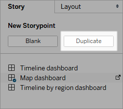
To use your first story point as a baseline for your next, click Duplicate under New Storypoint on the left.
-
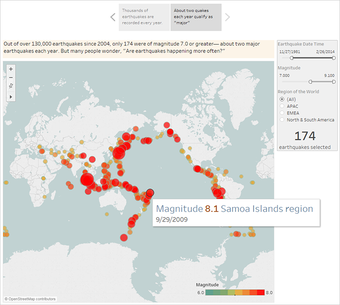
Change the Magnitude filter to 7.000 – 9.100 so that the map filters out smaller earthquakes. The map pans to show the Pacific "Ring of Fire(Link opens in a new window)," where the majority of the large earthquakes occurred.
-
Add a caption, such as About two quakes each year qualify as "major"
-
If you're using Tableau Desktop, edit the description to describe what you've done in this story point. For example: Out of over 130,000 earthquakes since 2004, only 174 were of magnitude 7.0 or greater—about two major earthquakes each year. But many people wonder, "Are earthquakes happening more often?"
-
Click Update in the story toolbar above the caption to save your changes.
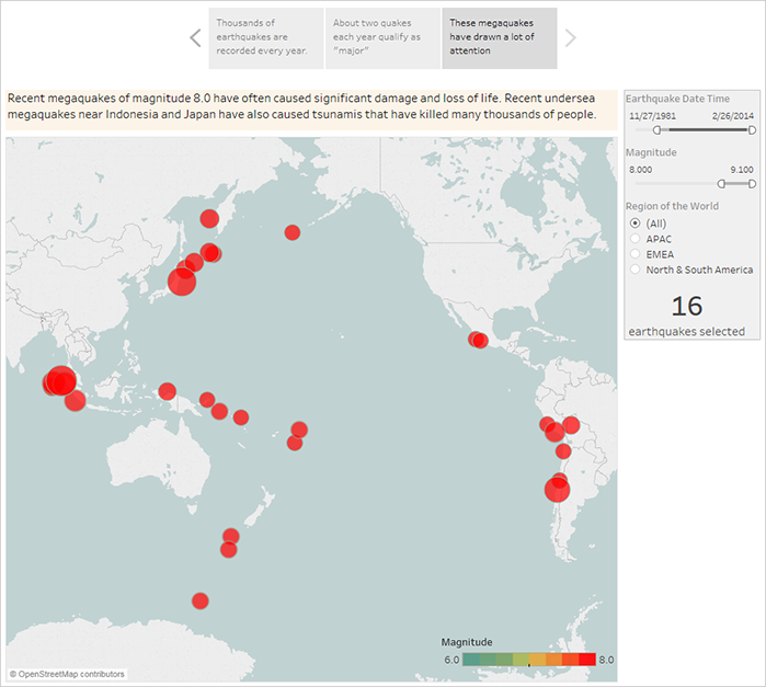
In the next story point, you're going to drill down further, narrowing the story's focus so that a specific type of earthquake—the "megaquake"—comes into view.
-
Click Duplicate in your second story point to use it as the baseline for your third story point.
-
Change the Magnitude filter to 8.000 – 9.100 so that the map filters out everything except the megaquakes.
-
Add the caption and description text.
-
Caption: These megaquakes have drawn a lot of attention
-
Description (Tableau Desktop only): Recent megaquakes of magnitude 8.0 and higher have often caused significant damage and loss of life. The undersea megaquakes near Indonesia and Japan also caused tsunamis that have killed many thousands of people.
-
-
Click Update to save your changes.
Highlight outliers
In the next two story points, you're going to further engage your audience by examining data points at the far end of the scale: the two most deadly earthquakes in recent history.
-
As you've done before, use Duplicate to create a new story point as your starting point.
-
Adjust Magnitude to 9.000–9.100 and you'll see just two data points.
-
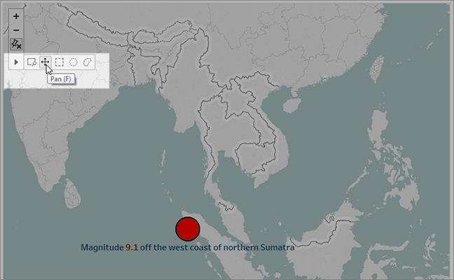
Select one of the marks, such as the Indian Ocean earthquake and tsunami of 2004 that had a magnitude of 9.1.
-
Use the pan tool on the maps menu to center it in your story point.
-
Add caption and description text. For example:
-
Caption: The Indian Ocean earthquake and tsunami of 2004
-
Description (Tableau Desktop only): The 2004 Indian Ocean earthquake was an undersea megathrust earthquake that occurred on December 26, 2004. It is the third largest earthquake ever recorded and had the longest duration of faulting ever observed, between 8.3 and 10 minutes.
-
-
Click Update to save your changes.
-
Repeat the preceding steps for the Japanese earthquake and tsunami of 2011, using the following as caption and description text.
-
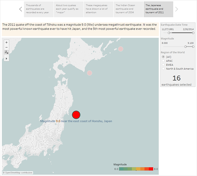
Caption: The Japanese earthquake and tsunami of 2011
-
Description (Tableau Desktop only): The 2011 quake off the coast of Tõhoku was a magnitude 9.0 undersea megathrust earthquake. It was the most powerful known earthquake ever to have hit Japan, and the 5th most powerful earthquake ever recorded.
Notice that you've already created a compelling visual story using just a single dashboard—all by filtering the data and zooming and panning the map.
We still haven't answered the key question, however: Are big earthquakes on the rise? The next story points will dig in to that angle.
-
Show a trend
In the next story point, you'll switch to a line chart (the Timeline dashboard) to show your audience a trend you spotted when you were initially creating views and dashboards.
-
Switch from the story you're building to Timeline dashboard.
-
On the Timeline dashboard, set size to Fit to Earthquake story.
-
Go back to your story and click Blank to create a fresh story point.
-
Double-click the Timeline dashboard to add it to your story sheet.
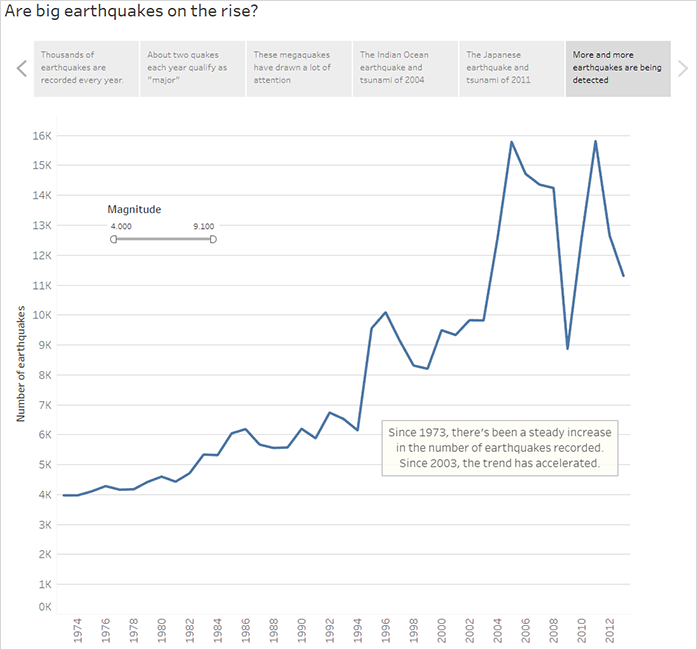
More earthquakes are being reported over time since 1973. In fact, it's increased significantly!
-
Add a caption, such as: More and more earthquakes are being detected
-
Use Drag to add text to add a description of the trend (Tableau Desktop only): Since 1973, there's been a steady increase in the number of earthquakes recorded. Since 2003, the trend has accelerated.
Offer your analysis
From your earlier work in this story with the Map dashboard you know that there are regional differences in earthquake frequency. In your next story point, you'll pull in the Timeline by region dashboard, which breaks out earthquakes by region, and adds trend lines, which help reduce the variability in the data.
-
Click Blank to create a new story sheet.
-
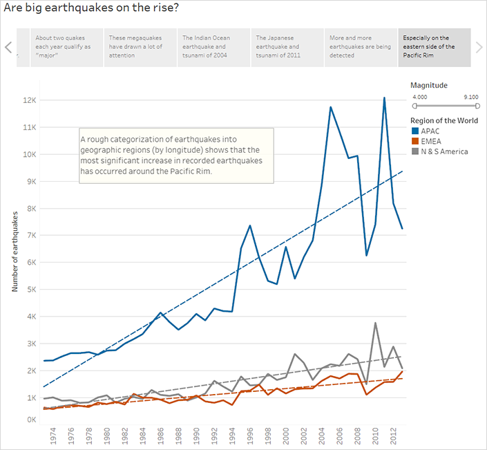
Double-click the Timeline by region dashboard to the story sheet. The APAC region clearly stands out.
-
Add a caption then use Drag to add text to add a comment that points out the large number of earthquakes in the APAC region.
-
Caption: Especially on the eastern side of the Pacific Rim
-
Description (Tableau Desktop only): A rough categorization of earthquakes into geographic regions (by longitude) shows that the most significant increase in recorded earthquakes has occurred around the Pacific Rim.
-
Answer the question
Thus far, your data story has concluded that earthquake frequency in the Pacific Rim has increased since 1973, but your original question was about whether big earthquakes are becoming more frequent.
To answer this question, in your final story point, you'll filter out weaker earthquakes and see what the resulting trend line is.
-
Click Duplicate to create a new story sheet.
-
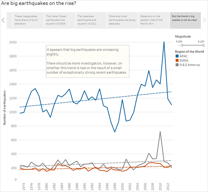
Set the Magnitude filter to 5.000–9.100. Notice how the trend lines have flattened out but there's still a slight increase.
-
Add a caption then use Drag to add text to add your answer to the story point.
Caption: But the trend in big quakes is not as clear
Description (Tableau Desktop only): It appears that big earthquakes are increasing slightly. There should be more investigation, however, on whether this trend is real or the result of a small number of exceptionally strong recent earthquakes.
As is often the case with a data story, the story ends with additional questions.
Yes, there's a trend, but it's slight. More big earthquakes (magnitude 5.000 - 9.100) have been reported in recent years, especially in the Asia-Pacific region, but could that be natural variation? That might be a good topic for another story.