Create Maps that Show Quantitative Values in Tableau
You can create maps in Tableau Desktop that show quantitative values. These types of maps are called proportional symbol maps.
Proportional symbol maps are great for showing quantitative values for individual locations. They can show one or two quantitative values per location (one value encoded with size, and, if necessary, another encoded with color). For example, you can plot earthquakes recorded between 1981 to 2014 around the world, and size them by magnitude. You can also color the data points by magnitude for additional visual detail.

This topic illustrates how to create a proportional symbol map using an example. Follow the example to learn how to set up your data source and build the view for a proportional symbol map.
Your data source
To create a proportional symbol map, your data source should include the following types of information:
- Quantitative values
- Latitude and Longitude coordinates or location names (if recognized by Tableau)
It's also recommended that your data contain a large variation of values; otherwise, your symbols will appear approximately the same size in the view.
The following table is a snippet of the Earthquake data source, which is included in the Create Proportional Symbol Maps in Tableau Example Workbook(Link opens in a new window) on Tableau Public. It contains columns for earthquake magnitude and magnitude to the power of ten, and columns for latitude and longitude vales. It also contains a column for the date and earthquake ID for added clarity and organization.
| Earthquake Date Time | ID | Magnitude | Magnitude^10 | Latitude | Longitude |
| 1/1/73 | centennial19730101114235 | 6.00000 | 17,488,747.04 | -35.570 | -15.427 |
| 1/2/73 | pde19730102005320300_66 | 5.50000 | 25,329,516.21 | -9.854 | 117.427 |
| 1/3/73 | pde19730103022942800_33 | 4.80000 | 6,492,506.21 | 1.548 | 126.305 |
| 1/4/73 | pde19730104003142000_33 | 4.50000 | 3,405,062.89 | 41.305 | -29.272 |
| 1/5/73 | pde19730105003948200_36 | 4.70000 | 5,259,913.22 | 0.683 | -80.018 |
| 1/6/73 | pde19730106061852300_83 | 4.90000 | 7,979,226.63 | -22.354 | -69.310 |
Basic map building blocks:
| Columns shelf: | Longitude (continuous measure, longitude geographic role assigned) |
| Rows shelf: | Latitude (continuous measure, latitude geographic role assigned) |
| Detail: | One or more dimension fields |
| Size: | A measure field (aggregated) |
| Mark type: | Automatic |
Build the map view
To follow along with this example, download the Create Proportional Symbol Maps in Tableau Example Workbook(Link opens in a new window) from Tableau Public, and open it in Tableau Desktop.
-
Open a new worksheet.
-
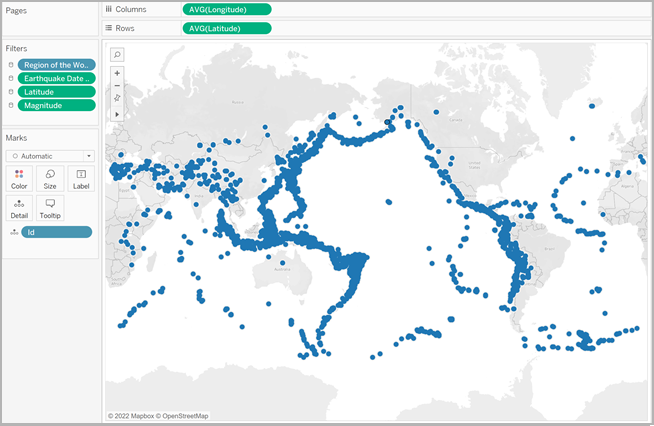
In the Data pane, double-click Latitude and Longitude.
Latitude is added to the Rows shelf, and Longitude is added to the Columns shelf. A map view with one data point is created.
-
From the Data pane, drag ID to Detail on the Marks card. If a warning dialog appears, click Add all members.
A lower level of detail is added to the view.
-
From the Data pane, drag Magnitude^10 to Size on the Marks card.
Note that the Magnitude^10 field is used to encode size instead of the Magnitude field. This is because Magnitude^10 contains a wider range of values, so the differences between values can be seen visually.
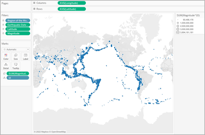
You now have a proportional symbol map. The larger data points represent earthquakes with larger magnitudes, and the smaller data points represent earthquakes with smaller magnitudes.
In most cases, this is as far as you need to go to show quantitative values for single locations. However, in this case, since there are so many data points in the view, more visual detail is needed to help you differentiate between the earthquake magnitudes and to help you spot any trends.
-
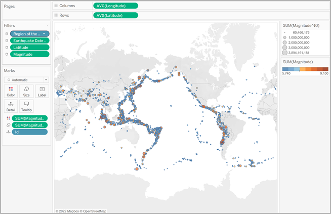
From the Data pane, drag Magnitude to Color on the Marks card.
-
On the Marks card, click Color > Edit Colors.
-
In the Edit Colors dialog box, do the following:
-
Click the color drop-down and select the Orange-Blue Diverging palette from the list.
-
Select Stepped Color, and then enter 8.
This creates eight colors: four shades of orange, and four shades of blue.
-
Select Reversed.
This reverses the palette so that orange represents a higher magnitude than blue.
-
Click Advanced, select Center, and then enter 7.
This shifts the color palette and ensures that any earthquake over 7.0 magnitude will appear orange in color, and any earthquake under 7.0 magnitude will appear blue in color.
-
Click OK.
-
On the Marks card, click Color again, and then do the following:
- For Opacity, enter 70%.
- Under Effects, click the Border drop-down menu and select a dark blue border color.
-
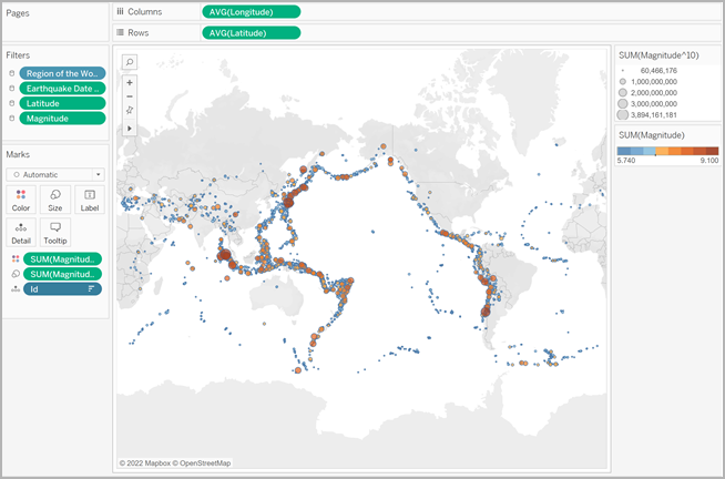
On the Marks card, right-click the ID field and select Sort.
-
In the Sort dialog box, do the following:
The map view updates with new colors. The dark orange data points represent earthquakes with higher magnitudes, while the dark blue data points represent earthquakes with lower magnitudes. The opacity of the marks is at 70% so you can see where the data points overlap.
-
For Sort By, select Field, and then click the drop-down and select Magnitude.
- For Sort Order, select Descending.
-
Click OK.
This sorts the data points in the view so that the larger magnitudes appear on top.
Your proportional symbol map is now complete.
Point location and attribute meaning
It's important to note that symbols on a map can sometimes be misinterpreted as representing actual ground area. For example, if you have a map view that plots earth impact craters across North America, and sizes each symbol by the diameter (in kilometers) of the impact area, you might get a map view that looks like this:
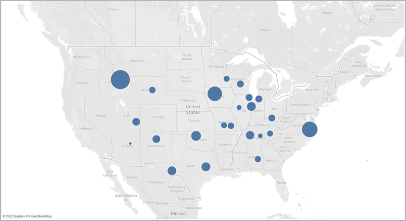
In this particular case, it could be very easy to interpret the size of these data points as representing the actual ground area of the craters. Your audience might assume that most of southwestern Montana, a state in the US, was destroyed by a crater, which is not accurate. In reality, the crater in Montana was simply one of the larger craters in the data source and has been sized accordingly.
To avoid misinterpretations, it might be helpful to include annotations or explanations of what the size actually represents. Even if it seems obvious.