Get Started with Explain Data
Use Explain Data in your flow of analysis as you are exploring the marks in a viz. Explain Data runs automatically when the Data Guide pane is open and updates based on the current selection (dashboard, sheet, or mark).
|
Use Explain Data |
Author Workbooks and Control Access |
Run Explain Data on a dashboard, sheet, or mark
These are the basic steps to run Explain Data in Tableau Desktop, Tableau Cloud, and Tableau Server:
- Open a dashboard or sheet in a workbook.
- In the view toolbar, select Data Guide
 to open the Data Guide pane.
 - If you open a dashboard, Explain Data will analyze it for outliers.

If you select a sheet in the dashboard, Explain Data analyzes the marks in that sheet for outliers.
If you select a mark in the dashboard, Explain Data specifically analyzes that mark for explanations.
The marks that are being explained are highlighted in the viz as you select corresponding explanations.
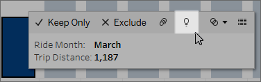
Optionally, you can select a mark in a viz, hover the cursor over the mark. In the tooltip menu, select Data Guide ![]() .
.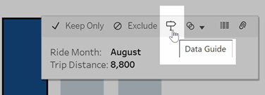
In Tableau Public, select the lightbulb in the tooltip menu to run Explain Data.
Possible explanations for the value of the analyzed mark are displayed in the Data Guide pane. Select different explanation names to expand the details and start exploring.
Explain Data permissions required for seeing explanations
If you see Detected Outliers with a note to contact the owner of the viz, it is because you need permission to see these types of explanations. Select the owner name to go to their Tableau content page with their email address. Contact the owner to ask them to give you Explain Data permissions for the workbook or view.
If you are the owner of the workbook, for more information on setting permissions, see Control who can use Explain Data and what they can see.
Tips for using Explain Data
- Multiple marks can't be selected for comparison with each other.
- The view must contain marks that are aggregated using SUM, AVG, COUNT, COUNTD, or AGG (a calculated field).
- When Explain Data cannot analyze the type of mark selected, a message is displayed to indicate why. For more information, see Situations where Explain Data is not available.
- The data you analyze must be drawn from a single, primary data source. Explain Data does not work with blended or cube data sources.
- For information on what characteristics make a data source more interesting for use with Explain Data, see Requirements and Considerations for Using Explain Data.
Drill into explanations
-
In the Data Guide pane, select an explanation name to see more details.
Select an explanation to expand or contract its details.
-
Scroll to see more explanation details.
-
Hover over charts in the explanations to see details on different data points. Select the Open
 icon to see a larger version of the visualization.
 Creators or Explorers who open the view for editing can select the Open
icon to open the visualization as a new worksheet and explore the data further.Note: Creators and Explorers who have editing permissions can also control Explain Data Settings. For more information, see Control Access to Explain Data.
- Hover over a Help icon
 to see tooltip help for an explanation. Select the Help icon to keep the tooltip open. Select a Learn More link to open the related help topic.
View analyzed fields
- Run Explain Data on a dashboard, sheet, or mark.
- In the Data Guide pane, under Explore underlying values for, select a target measure name.

- Select the number-of-fields link at the bottom of the pane.

Authors have the option to open Explain Data Settings to control which fields are included in the analysis. For more information, see Change fields used for statistical analysis(Link opens in a new window).
Terms and concepts in explanations
The following terms and concepts appear frequently in explanations. You may find it helpful to become acquainted with their meaning in the context of using Explain Data.
A mark is a selectable data point that summarizes some underlying record values in your data. A mark can be made of a single record or multiple records aggregated together. Marks in Tableau can be displayed in many different ways such as lines, shapes, bars, and cell text.
Tableau gets the records that make up the mark based on the intersection of the fields in the view.
The analyzed mark refers to a mark in a dashboard or sheet that was analyzed by Explain Data.
For more information on marks, see Marks(Link opens in a new window).
The expected value for a mark is the median value in the expected range of values in the underlying data in your viz. The expected range is the range of values between the 15th and 85th percentile that the statistical model predicts for the analyzed mark. Tableau determines the expected range each time it runs a statistical analysis on a selected mark.
If an expected value summary says the mark is lower than expected or higher than expected, it means the aggregated mark value is outside the range of values that a statistical model is predicting for the mark. If an expected value summary says the mark is slightly lower or slightly higher than expected or within the range of natural variation, it means the aggregated mark value is within the range of predicted mark values, but is lower or higher than the median.
For more information, see What is an expected range?(Link opens in a new window)
Each column name in a database is a field. For example, Product Name and Sales are each fields. In Tableau, fields like Product Name that categorize data are called dimensions; fields with quantifiable data like Sales are called measures. Tableau aggregates measures by default when you drag them into a view.
Some explanations describe how the underlying record values and the aggregations of those values may be contributing to the value of the analyzed mark. Other explanations may mention the distribution of values across a dimension for the analyzed mark.
When you run Explain Data on mark, the analysis considers dimensions and measures in the data source that aren't represented in the view. These fields are referred to as unvisualized dimensions and unvisualized measures.
For more information on dimensions and measures, see Dimensions and Measures(Link opens in a new window).
An aggregate is a value that is a summary or total. Tableau automatically applies aggregations such as SUM or AVG whenever you drag a measure onto Rows, Columns, a Marks card option, or the view. For example, measures are displayed as SUM(Sales) or AVG(Sales) to indicate how the measure is being aggregated.
To use Explain Data, your visualization must use a measure that is aggregated with SUM, AVG, COUNT, COUNTD, or AGG.
For more information about aggregation, see Data Aggregation in Tableau(Link opens in a new window).
A record is a row in a database table. A row contains values that correspond to each field. In this example, Category, Product Name, and Sales are fields (or columns). Furniture, Floor Lamp, and $96 are the values.
| Category | Product Name | Sales |
| Furniture | Floor Lamp | $96.00 |
A distribution is a list of all the possible values (or intervals) of the data. It also indicates how often each value occurs (frequency of occurrence).