Structure Data for Analysis
There are certain concepts that are fundamental to understanding data prep and how to structure data for analysis. Data can be generated, captured, and stored in a dizzying variety of formats, but when it comes to analysis, not all data formats are created equal.
Data preparation is the process of getting well formatted data into a single table or multiple related tables so it can be analyzed in Tableau. This includes both the structure, i.e. rows and columns, as well as aspects of data cleanliness, such correct data types and correct data values.
Tip: It may help to go through the following topic with a data set of your own. If you do not already have a data set you can use, see our tips for finding good data sets(Link opens in a new window).
How structure impacts analysis
The structure of your data may not be something you can control. The rest of this topic assumes you have access to the raw data and the tools needed to shape it, such as Tableau Prep Builder. However, there may be situations when you can't pivot or aggregate your data as desired. It is often still possible to perform the analysis but you may need to change your calculations or how you approach the data. For an example of how to perform the same analysis with different data structures, see Tableau Prep Day in the Life Scenarios: Analysis with the Second Date in Tableau Desktop(Link opens in a new window). But if you can optimize the data structure it will likely make your analysis much easier.
Data Structure
Tableau Desktop works best with data that is in tables formatted like a spreadsheet. That is, data stored in rows and columns, with column headers in the first row. So what should be a row or column?
What is a row?
A row, or record, can be anything from information around a transaction at a retail store, to weather measurements at a specific location, or stats about a social media post.
It's important to know what a record (row) in the data represents. This is the granularity of the data.
| Here, each record is a day | Here, each record is a month |
|
|
|

Tip:A best practice is to have a unique identifier (UID), a value that identifies each row as a unique piece of data. Think of it like the social security number or URL of each record. In Superstore, that would be Row ID. Note that not all data sets have a UID but it can't hurt to have one.
Try to make sure you can answer the question "What does a row in the data set represent?". This is the same as answering "What does the TableName(Count) field represent?". If you can't articulate that, the data might be structured poorly for analysis.
A concept related to what makes up a row is the idea of aggregation and granularity, which are opposite ends of a spectrum.
Aggregation
-
refers to how multiple data values are brought together into a single value, such as counting all the Google searches for Pumpkin Spice or taking the average of all the temperature readings around Seattle on a given day.
-
By default, measures in Tableau are always aggregated. The default aggregation is SUM. You can change the aggregation to options like Average, Median, Count Distinct, Minimum, etc.
Granularity
-
refers to how detailed the data is. What does a row or record in the data set represent? A person with malaria? A provinces' total cases of malaria for the month? That's the granularity.
-
Knowing the granularity of the data is crucial to working with level of detail (LOD) expressions.
Understanding aggregation and granularity is a critical concept for many reasons; it impacts things like finding useful data sets, building the visualization you want, relating or joining data correctly, and using LOD expressions.
Tip: For more information, see Data Aggregation in Tableau.
What is a field or column?
A column of data in a table comes into Tableau Desktop as a field in the data pane, but they are essentially interchangeable terms. (We save the term column in Tableau Desktop for use in the columns and rows shelf and to describe certain visualizations.) A field of data should contain items that can be grouped into a larger relationship. The items themselves are called values or members (only discrete dimensions contain members).
What values are allowed in a given field are determined by the domain of the field (see the note below). For example, a column for "grocery store departments" might contain the members "deli" "bakery", "produce", etc., but it wouldn't include "bread" or "salami" because those are items, not departments. Phrased another way, the domain of the department field is limited to just the possible grocery store departments.
Additionally, a well-structured data set would have a column for "Sales" and a column for "Profit", not a single column for "Money", because profit is a separate concept from sales.
-
The domain of the Sales field would be values ≥ 0, since sales cannot be negative.
-
The domain of the Profit field, however, would be all values, since profit can be negative.
Note: Domain can also mean the values present in the data. If the column "grocery store department" erroneously contained "salami", by this definition, that value would be in the domain of the column. The definitions are slightly contradictory. One is the values that could or should be there, the other is values that actually are there
Categorizing fields
Each column in the data table comes into Tableau Desktop as a field, which appears in the Data pane. Fields in Tableau Desktop must be either a dimension or measure (separated by a line within tables in the Data pane) and either discrete or continuous (color coded: blue fields are discrete and green fields are continuous).
-
Dimensions are qualitative, meaning they can't be measured but are instead described. Dimensions are often things like city or country, eye color, category, team name, etc. Dimensions are usually discrete.
-
Measures are quantitative, meaning they can be measured and recorded with numbers. Measures can be things like sales, height, clicks, etc. In Tableau Desktop, measures are automatically aggregated; the default aggregation is SUM. Measures are usually continuous.
-
Discrete means individually separate or distinct. Toyota is distinct from Mazda. In Tableau Desktop, discrete values come into the view as a label and they create panes.
-
Continuous means forming an unbroken, continuous whole. 7 is followed by 8 and then it's the same distance to 9, and 7.5 would fall midway between 7 and 8. In Tableau Desktop, continuous values come into the view as an axis.
-
Dimensions are usually discrete, and measures are usually continuous. However, this is not always the case. Dates can be either discrete or continuous.
-
Dates are dimensions and automatically come into the view as discrete (aka date parts, such as "August", which considers the month of August without considering other information like the year). A trend line applied to a timeline with discrete dates will be broken into multiple trend lines, one per pane.
-
We can chose to use continuous dates if preferred (aka date truncations, such as "August 2024", which is different than "August 2025"). A trend line applied to a timeline with continuous dates will have a single trend line for the entire date axis.
-
Tip: For more information, see Dimensions and Measures, Blue and Green.
In Tableau Prep, no distinction is made for dimensions or measures. Understanding the concepts behind discrete or continuous are important, however, for things like understanding the detail versus summary presentation of data in the profile pane.
-
Detail: the detail view shows every domain element as a discrete label and has a visual scrollbar to provide a visual overview of all the data.
-
Summary: the summary view shows the values as binned on a continuous axis as a histogram.
Binning & Histograms
A field like age or salary is considered continuous. There is a relationship between the age 34 and 35, and 34 is as far from 35 as 35 is from 36. However, once we're past age 10 or so, we usually stop saying things like we're "9 and a half" or "7 and ¾". We’re already binning our age to neat year-sized increments. Someone who is 12,850 days old is older than someone who is 12,790 days old, but we draw a line and say they're both 35. Similarly, age groupings are often used in place of actual ages. Child prices for movie tickets might be for kids 12 and under, or a survey may ask you to select your age group, such as 20-24, 25-30, etc.
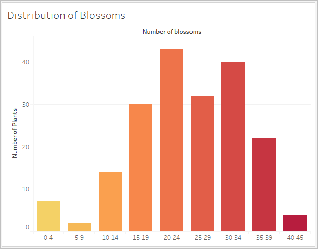
Histograms are used to visualize the distribution of numerical data using binning. A histogram is similar to a bar chart, but rather than being discrete categories per bar, the rectangles making up the histogram span a bin of a continuous axis, such as range of the number of blossoms (0-4, 5-9, 10-14, etc.). The height of the rectangles is determined by frequency or count of those values. Here, the y-axis is the count of plants that fall into each bin. Seven plants have 0-4 blossoms, two plants have 5-9 blossoms, and 43 plants have 20-24 blossoms.
In Tableau Prep, the summary view is a histogram of binned values. The detail view shows the frequency for every value and has a visual scrollbar off to the side that shows the overall distribution of the data.
| Summary view | Detail view |

|

|
Distributions and outliers
Seeing the distribution of a data set can help with outlier detection.
-
Distribution: the shape of the data in a histogram, though this depends on the size of the bins. Being able to see all your data in a histogram view can help identify if the data seems correct and complete. The shape of the distribution will only be of use if you know the data and can interpret whether or not the distribution makes sense.
-
For example, if we were to look at a data set of the number of homes with broadband internet from 1940-2017, we'd expect to see a very skewed distribution. However, if we were to look at the number of homes with broadband internet from January 2017 to December 2017 we'd expect a fairly uniform distribution.
-
If we were to look at a data set of Google searches for "Pumpkin Spice Latte", we'd expect to see a fairly sharp peak in the fall, whereas searches for “"convert Celsius to Fahrenheit" would likely be fairly stable.
-
-
Outlier: a value that is extreme compared to other values. Outliers may be correct values or they may be indicative of an error.
-
Some outliers are correct and indicate actual anomalies; these should not be removed or modified.
-
Some outliers indicate issues with data cleanliness, such as a salary of $50 instead of $50,000 because a period was typed instead of the comma.
-
If you were to see a list like this:
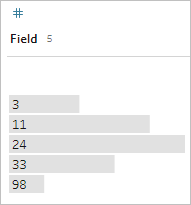
at first glance it doesn't look odd. But if, instead of a list of labels, this was plotted on a continuous binned axis, it would look like this:
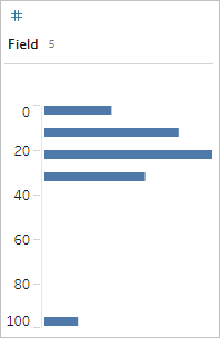
And it's much more obvious that the last observation is farther away from the first and may be an outlier due to error.
Data Types
Databases, unlike spreadsheets, usually enforce strict rules on data types. Data types classify the data in a given field and provide information about how the data should be formatted, interpreted, and what operations can be done to that data. For example, numerical fields can have mathematical operations applied to them and geographic fields can be mapped.
Tableau Desktop assigns whether a field is a dimension or measure, but fields have other characteristics that depend on their data type. These are indicated by the icon each field has (though some types share an icon). Tableau Prep uses the same data types. If data type is enforced on a column and an existing value doesn't match its assigned data type, it may be displayed as null (because "purple" doesn't mean anything as a number).
Some functions require specific data types. For example, you cannot use CONTAINS with a numerical field. Type functions are used to change the data type of a field. For example, DATEPARSE can take a text date in a specific format and make it a date, thus enabling things like automatic drill down in the view.
| Icon | Data type |
|---|---|

|
Text (string) values |

|
Date values |

|
Date & Time values |

|
Numerical values |

|
Boolean values (relational only) |

|
Geographic values (used with maps) |
Tip: For more information, refer to the Help article on Data Types.
Pivot and Unpivot Data
People-friendly data is often captured and recorded in a wide format, with many columns. Machine-readable data, like Tableau prefers, is better in a tall format, with fewer columns and more rows.
Note: Traditionally, pivoting data means going from tall to wide (rows to columns), and unpivoting means going from wide to tall (columns to rows). However, Tableau uses the word pivot to mean going from wide (people-friendly) to tall (machine-readable) by turning columns into rows. In this document, pivot will be refer to the Tableau sense of the word. For clarity, it can help to specify "pivot columns to rows" or "pivot rows to columns".
For more information, refer to the Help articles Pivot Your Data and Tips for Working with your Data.
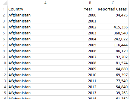
Wide data
In the WHO malaria data set, there is a column for country, then a column per year. Each cell represents the number of cases of malaria for that country and year. In this format we have 108 rows and 16 columns.
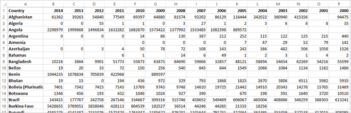
It's easy for a person to read and understand this format. However, if we were to bring this data into Tableau Desktop, we get a field per column. We have a field for 2000, a field for 2001, a field for 2002, etc.
To think of it another way, there are 15 fields that all represent the same basic thing—number of reported cases of malaria—and no single field for time. This makes it very hard to do analysis across time as the data is stored in separate fields.
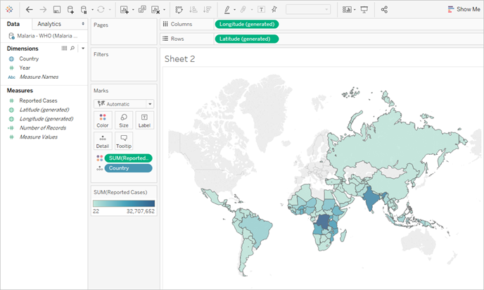
Q: How would we create a map that shows the total number of malaria cases per country from 2000 to 2014?
A: Create a calculated field to sum all the years.
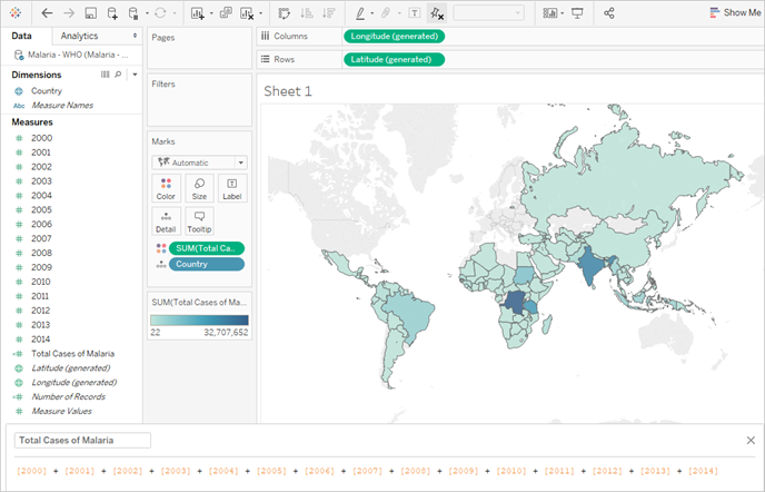
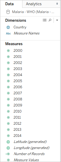
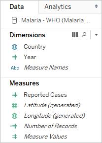
Note: this image has not been updated to reflect the most current UI. The Data pane no longer shows Dimensions and Measures as labels.
Another indication that this format isn't ideal for analysis can be seen in the fact that nowhere do we have information about what the actual values mean. For Algeria in 2012, we have the value 55. Fifty five what? It's not clear from the structure of the data.
If the name of the column isn't describing what the values are but rather conveys additional information, this is a sign the data needs to be pivoted.
Tall data
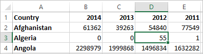
If we pivot the data, we reshape the data from wide to tall. Now, rather than having a column for each year, we have a single column, Year, and a new column, Reported Cases. In this format we have 1,606 rows and 3 columns. This data format is taller rather than wider.
Now in Tableau Desktop, we have a field for Year and a field for Reported Cases as well as the original Country field. It's much easier to do analysis because each field represents a unique quality about the data set—location, time, and value.
Note: this image has not been updated to reflect the most current UI. The Data pane no longer shows Dimensions and Measures as labels.
Q: How would we create a map that shows the total number of malaria cases per country from 2000 to 2014?
A: Use the Reported Cases field.
Note: this image has not been updated to reflect the most current UI. The Data pane no longer shows Dimensions and Measures as labels.
Now it's easy to see that for Algeria in 2012, the 55 refers to the number of reported cases (because we could label this new column).
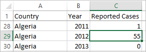
Note: In this example, the wide data consisted of a single record per country. With the tall data format, there are now 15 rows for each country (one for each of the 15 years in the data). It's important to keep in mind that there are now multiple rows per country.
If there was a column for Land Area, that value would be repeated for each of the 15 rows for each country in a tall data structure. If you created a bar chart by bringing out Country to Rows and Land Area to Columns, by default the view would sum the land area for all 15 rows per country.
For some fields it may be necessary to compensate for double counting values by aggregating with an average or minimum rather than sum or filtering.
Normalization
Relational databases are made up of multiple tables that can be related or linked together in some way. Each table contains a unique identifier, or key, per record. By relating or joining on the keys, records can be linked to provide more information than is contained in a single table. What information goes into each table is dependent on the data model used, but the general principle is around reducing duplication.
For example, consider event planning for an event like a wedding. We need to keep track of information at the level of groups (such as families or couples) as well as the level of individuals.
A table could be created that combines all the information together:
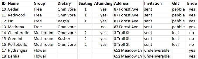
However, if an address is incorrect and needs to be fixed, it must be fixed across multiple rows, potentially leading to errors or conflicts. A better structure is to create two tables, one for information that pertains to the group (such as address and if the invitation was sent) and one for information pertaining to the individuals (for things like seating assignments and dietary restrictions).
| Group table | Individual table |

|

|
It's much easier to track and analyze group-level information in the group table and individual-level information in the individual table. For example, the number of chairs needed can be obtained from the number of Attending = Yes records in the individual table, and the number of stamps needed for thank-yous can be obtained from the number of records in the group table where Gift isn't null.
The process of breaking up all the data into multiple tables—and figuring out which table contains which columns—is called normalization. Normalization helps reduce redundant data and simplifies the organization of the database.
However, there may be times when information is needed that spans multiple tables. For example, what if we wanted to balance seating arrangements (individuals) such that groups from the bride's side are intermingled with groups from the groom's side? (The bridge or groom affiliation is tracked at the group level.) To achieve this, we need to relate the tables back together so the individuals are associated with information about their group. Proper normalization isn't just breaking up tables, it also requires the presence of a shared, related field or unique identifier than can be used to combine the data back together again. Here, that related field is Group. That field is present in both tables, so we can join on this field and return to our original, single table format. This is a denormalized structure.
So why didn't we just keep the original denormalized table? It is harder to maintain and was storing redundant information. At scale, the level of data duplication can be come massive. Storing the same information over and over isn't efficient.
Normalized tables have a few key properties:
-
Each row needs a unique identifier
-
Each table needs a column or columns that can be used to connect it back to other tables (key).
These shared (key) columns are used for relating or joining tables back together. For our data, the relationship or join clause would be on the Group field in each table.
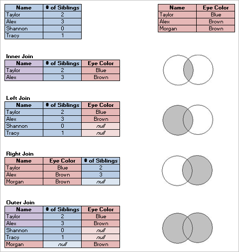
Join Types
Although the default method for combing data in Tableau Desktop is relating, there are cases when you may want to join tables in Tableau Desktop or Tableau Prep Builder. For a basic overview of joins and join types, see Join Your Data.
"Tidy" Data
Hadley Wickham published an article in 2014 in the Journal of Statistical Software called "Tidy Data" (August 2014, Volume 59, Issue 10). This article does an excellent job of laying out a framework for data that is well-structured for analysis. The article can be found here (Hadley Wickham's Academic Portfolio)(Link opens in a new window) or here (hosted by r-project.org)(Link opens in a new window).
Note: The article is hosted on external websites. Tableau cannot take responsibility for the accuracy or freshness of pages maintained by external providers. Contact the owners if you have questions regarding their content.