Colour Palettes and Effects
All marks have a default colour, even when there are no fields on Colour on the Marks card. For most marks, blue is the default colour; for text, black is the default colour. Also see Assign colours to marks and Example – Multiple Fields on Colour.
Categorical Palettes
When you drop a field with discrete values (typically a dimension) on Colour on the Marks card, Tableau uses a categorical palette and assigns a colour to each value of the field. Categorical palettes contain distinct colours that are appropriate for fields with values that have no inherent order, such as departments or shipping methods.
To change colours for values of a field, click in the upper-right corner of the colour legend. In Tableau Desktop, select Edit Colours from the context menu. In Tableau Server or Tableau Cloud, the Edit Colours dialog opens automatically.
| Tableau Desktop version | Web version |
|
|
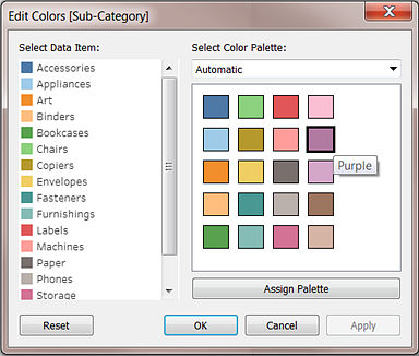

Change the colour for a value
Click on an item on the left, under Select Data Item.
Click a new colour in the palette on the right. In Tableau Desktop you can hover over a swatch to identify the colour.
Repeat for as many values that you want to change.
In Tableau Desktop, click OK to exit the Edit Colours dialog box. In Tableau Server or Tableau Cloud, simply close the dialog box.
Select a different palette
The Select Colour Palette drop-down list in the Edit Colours dialog box provides colour palettes that you can use for discrete fields. The list contains both categorical and ordinal palettes.
At the top of the list are categorical palettes, such as Tableau 10. As noted above, categorical palettes are appropriate for discrete fields with no inherent order.
At the bottom of the list are ordinal palettes such as Orange. Ordinal palettes contain a range of related colours and are appropriate for fields that have an associated order, such as dates or numbers.
After you select a palette, click Assign Palette to automatically assign the new palette colours to the members in the field.
To return to the Automatic palette and the default colour assignments, click Reset in the Edit Colours dialog box.
Quantitative Palettes
When you drop a field with continuous values on the Marks card (typically a measure), Tableau displays a quantitative legend with a continuous range of colours.
You can change the colours used in the range, the distribution of colour and other properties. To edit colours, click in the upper right of the colour legend. In Tableau Desktop, select Edit Colours from the context menu. In Tableau Server or Tableau Cloud, the Edit Colours dialog opens automatically.
When there are both negative and positive values for the field, the default range of values will use two colour ranges and the Edit Colours dialog box for the field has a square colour box on either end of the range. This is known as a diverging palette.
| Tableau Desktop version | Web version |
|
|
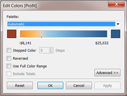

Edit Colours dialog box for a diverging palette
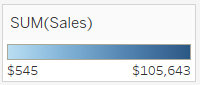
When all values are either positive or negative, the default range of values will use a single colour range and the Edit Colours dialog box for the field has a square colour box only at the right end of the range. This is known as a sequential palette.
| Tableau Desktop version | Web version |
|
|


Edit Colours dialog box for a sequential palette
You can specify whether Tableau uses a diverging or a sequential palette for a continuous field on Colour, and also configure the range of colours for the field’s values.
The Palette drop-down list provides a range of colour palettes from which you can choose. There are two types of quantitative palettes available for continuous fields:
All palettes with Diverging in the name are diverging quantitative palettes – for example, Orange-Blue Diverging. You can choose a diverging palette for any continuous field – it isn’t necessary for the range of values to contain both positive and negative numbers.
To change the colours for a diverging palette, click one of the square colour boxes at either end of the palette spectrum. Depending on whether you are authoring in Tableau Desktop or on the web, do one of the following:
In Tableau Desktop, in the colour configuration dialog box (which is part of your computer’s operating system), select a colour from the colour picker or enter custom values.
In Tableau Server or Tableau Cloud, enter a custom Hex value in the Custom Colour field. If the value isn't valid, no changes are made.
All other palettes are sequential quantitative palettes. To change the colours for a sequential palette, click on the square colour box at the right-hand end of the palette spectrum to either open the colour configuration dialog box (Tableau Desktop) or to enter a custom Hex value in the Custom Colour field (Tableau Server or Tableau Cloud).
Options for quantitative palettes
The following options are available in the Edit Colours dialog box for a continuous field.
Note: Options differ where noted for Tableau Server and Tableau Cloud.
Stepped Colour
Select Stepped Colour to group values into uniform bins, where each bin is associated with a colour. Use the spin control to specify how many steps (bins) to create. For example, for a range of values from 0 to 100 you could specify five steps to sort values into five bins (0-20, 20-40, etc.).
| Tableau Desktop version | Web version |
|
|


If a diverging colour palette is selected, the point where the palette transitions between colours is shown on the colour ramp with a small black tick mark. When the number of steps is odd, the mark is placed in the middle of the transitional step. When the number of steps is even, the mark is placed at the boundary between the steps where the colour changes.
Reversed
Select Reversed to invert the order of colours in the range. For example, if you want lower values to have a darker intensity in a sequential palette, reverse the palette. For a diverging palette, reversing the colour palette means swapping the two colours in the palette, in addition to inverting the shades within each colour range.
Use Full Colour Range
With a diverging (two-colour) palette, you can select to Use Full Colour Range. Tableau assigns both the starting number and the ending number a full intensity for both colour ranges. So if the range is from -10 to 100, the colour representing negative numbers will be adjusted to change in shade much more quickly than the colour representing positive numbers. If you don't select Use Full Colour Range, Tableau assigns the colour intensity as if the range of values was from -100 to 100, so that the change in shade is the same on both sides of zero. This means there will be much less change on the negative side, where actual values only range from -10 to 0, than on the positive side, where values range from 0 to 100.
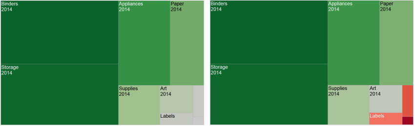
The image on the left below shows a red-green diverging colour palette for values from -858 to 72,986. Without using the full colour range, -858 (associated with the small box at the lower right of the chart) shows as grey, because -858 is only about 1% as far to the negative side as 72,986 is to the positive side. When the full colour range is used, as in the image on the right, -858 shows as a dark red, equal in intensity to the maximum positive value.
Include totals
Select Include Totals to include totals, sub-totals and grand totals in the colour encoding. This option only applies when total values are included in the view.
Limit the colour range
In Tableau Desktop, when you click Advanced in the Edit Colours dialog box, you can choose to specify the start, end and centre values for the range by selecting the check box and typing a new value into the field and the colour ramp is adjusted accordingly.
The Start value is the lower limit in the range, the End value is the upper limit, and the Centre value is where the neutral colour is located on a diverging colour palette.
Note: This option is not currently available in Tableau Server or Tableau Cloud.
Reset the colour range
To return to the Automatic palette and the default colour assignments, click Reset in the Edit Colours dialog box.
Note: If you are in web authoring mode and click Reset, the colour palette will return to the default settings. Any options that were set in the Advanced option will also be reset. To undo this action, you can click Undo in the top menu. If your changes have already been saved, you must change the Advanced options in Tableau Desktop and republish the view.
Configure Colour Effects
Click the Colour drop down on the Marks card to configure additional Colour settings not related to the actual colours shown.
| Tableau Desktop version | Web version |
|
|


Opacity
Modify the opacity of marks by moving the slider.
Adjusting opacity is especially useful in dense scatter plots or when you are looking at data overlaying a map or background image. As you slide the slider toward the left, marks become more transparent.
Mark borders
By default, Tableau displays all marks without a border. You can turn on mark borders for all mark types except text, line and shape. On the Colour drop-down control, select a mark border colour.
| Tableau Desktop version | Web version |
|
|


Borders can be useful for visually separating closely spaced marks. For example, the views below show a scatterplot with mark borders turned on (left) and turned off (right). When borders are turned on, marks are easier to distinguish in areas where they are tightly clustered.

Note: You can also use the opacity setting to show the density of marks.
When you are viewing a large number of colour-encoded small marks, it is usually better to leave mark borders off. Otherwise borders can dominate the view, making it difficult to see the colour encoding.
For example, the views below show bars that are segmented by a large number of colour-encoded dimension members. With mark borders turned on (right), some of the narrower marks are difficult to identify by colour. With borders turned off (left), the marks are easy to distinguish.

Mark halos
To make marks more visible against a background image or map, surround each mark with a solid contrasting colour called a halo. Mark halos are available when you have a background image or a background map. On the Colour drop-down control, select a mark halo colour.

Markers
In Tableau Desktop, when you are using the Line mark type, you can add a marker effect to show or hide points along the line. You can show selected points, all points or no points. On the Colour drop-down control, select a marker in the Effects section.
Note: This option is not currently available in Tableau Server or Tableau Cloud.
