Best Practices for Designing Accessible Views
You created a great view, and you want to make it more accessible so all your users can see and understand the data.
Tableau supports several controls for building accessible views. These controls align with US Section 508 requirements and the Web Content Accessibility guidelines (WCAG 2.2 AA). Make sure that content shared from Tableau Cloud or Tableau Server follows the steps in Author Views for Accessibility and aligns with these WCAG 2.2 AA principles:
Perceivable - Information and user interface components must be presented to users in a way that they can perceive. Consider including text alternatives and alternate ways to present the content.
- Operable - The user interface components and navigation must be accessible to users from the different devices or methods that they use to interact with the view.
Understandable - The information presented in the view must be understandable to your users. For example, by using clearly distinguishable names and labels for different elements shown in your view.
Follow the best practices described in this article and in Author Views for Accessibility to build views that are accessible to all of your users when published on Tableau Server or Tableau Cloud.
Keep it simple
WCAG 2.1 AA principle: Understandable
You might have a lot of information that you want to communicate with your view. However, dense views can be difficult to understand or navigate by using a screen reader or keyboard. Use the following guidelines to help you communicate everything that you want to without overwhelming your users with an over-packed view.
Aggregate your data whenever possible to help reduce the number of marks you're showing. Also, showing more than 1000 marks in the view can cause the view to be rendered by the server instead of the browser and server-rendered views aren't yet supported for WCAG alignment.
Users can also access the View Data page (enabled by default) to review the underlying data for the marks or can download the data from that page to an accessible application to view it that way.
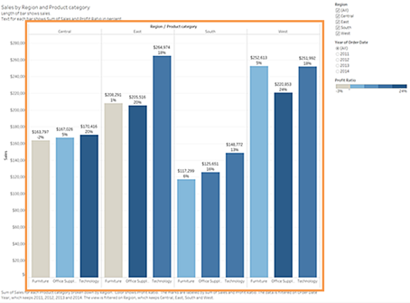
Example: This example shows two different bar chart views to illustrate the difference between a detailed and aggregated view.
Not easily accessible - Too many marks More accessible - Aggregated view 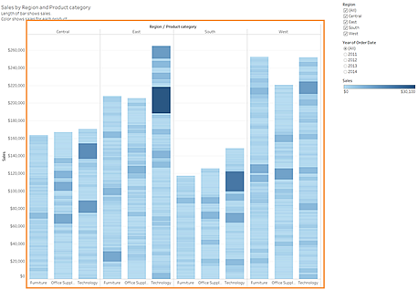
This much detail makes the view harder to understand.
The view is showing over 5000 marks and doesn't include enough text to indicate what the different marks represent.
It's too difficult to use for users who need screen readers.
This example shows the same view with the data aggregated at a higher level.
Key data points are still included, but they're now easier for users to read and understand.
The number of marks is reduced from over 5000 to about 20.
Users can still read the underlying details for the marks by placing focus on the view and then pressing Enter to open the View Data page.
Consider simple graphic elements like bar charts or line charts that allow you to use text, colour and shapes to add more context to the view.
Limit the number of marks to only those that emphasise the most important data points.
For information and examples about how to build this type of view, see Keep it simple in Author Views for Accessibility.
Titles and captions
WCAG 2.1 AA principle: Perceivable, Understandable
Providing good descriptive text in titles and captions provides context to users who use assistive technology, and can help them understand the data in your view. Use the following guidelines to adapt the visual nature of Tableau to meet the needs of all of your users.
Think about your views as a supplement to the text you use to describe it.
Use text in titles and captions to describe your visualisations and what you are showing.
Use simple, easy-to-understand language. Avoid jargon, acronyms or abbreviations.
Don't include words like ‘image of’ or ‘picture of’ in your text descriptions, because screen readers sometimes include this information.
Avoid all capital letters (for example in headings or titles), because they can be difficult to read.
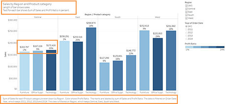
Example: This example shows two different bar charts. One with very little text and the other with titles and captions to add context
Not easily accessible - Too little text More accessible - Adding descriptive text to provide context 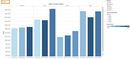
A one-word title isn't descriptive enough.
The marks are differentiated by colour and size. But without additional text, the context for these marks can be difficult to understand.
There's no caption or other explanatory text to help explain this view.
This example shows the same view, but includes additional explanatory text in both the title and the caption.
The same contrast colour scale and size differentiators are used, but labels are added to the bar marks to give additional context.
For information and examples about how to build a view that includes text for context, see Show more text and make it helpful in Author Views for Accessibility.
Additional text
WCAG 2.1 AA principle: Perceivable, Understandable
By using text beyond just titles and captions can help users understand the context of what you're showing, as well as help describe the relationship between the different controls (such as legends and filters) and your data.
Use these guidelines when adding additional text:
Use text in headings on legends or filters to describe the control and what it does. You can also use text zones on a dashboard to add context for your visualisations to further describe what you are showing.
- Add alternative text (alt text) to visualisations. Tableau started automatically generating alt text for vizzes in Tableau 23.1. In Tableau 23.2 and later, you can edit the auto-generated alt text to add context that you know is important to your audience.
Refer to controls by label whenever possible. For example, changing the label for a legend from Subcategory to Colour key for product type can help users understand the relationship between the controls and the data.
If you include link text in your view, use text that describes where the link takes the user. For example, use link text like ‘Global Warming statistics for 1990-2020’. Avoid wording like "Click here", "More" or "More information". These link text examples are too generic and can be confusing to users.
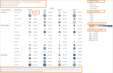
Example: The following example shows two bubble charts. One view uses only the text that shows by default when creating a view and one view has additional text that adds context throughout the view to help convey meaning.
Not easily accessible - Too little text More accessible - More descriptive text 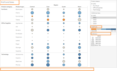
This view uses only default text for the sheet title and default labels for the filters and legend.
The marks are differentiated by size and colour only.
There's no caption or other explanatory text included in the view to help provide context.
This example shows the same view, but includes additional explanatory text.
Additional text was added to the title and caption to explain the relationship of the marks and provide additional context about what the view is showing.
Mark labels are added to show profit numbers so that users don't have to rely on the colour only to understand this information.
For information and examples about how to build a view that includes additional text for context, see Show more text and make it helpful and Author Views for Accessibility in Author Views for Accessibility.
Colour and contrast
WCAG 2.1 AA principle: Perceivable, Understandable
You can use colour to help distinguish marks in your view. However, for users with visual impairments, colour alone doesn't always provide enough of a distinction. Too many colours is especially hard when there are many marks in a view. Use these guidelines when adding colour in your views:
Tableau provides a colour-blind palette that you can use to help you select appropriate colours for your view. For any colour palette that you use, try to provide enough contrast and assign colours that differ from each other on the light-dark spectrum.
For line marks, use additional options like shapes, size and labels to help distinguish them.
Use contrast analyser(Link opens in a new window) tools to help select the best text colours and backgrounds with sufficient contrast ratios. Make sure that colour contrast for text is strong and meets the contrast ratio standards of 4.5:1 (3:1 for large text).
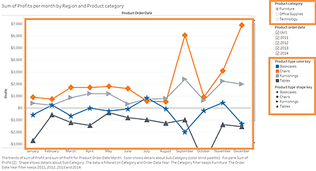
Example: This example shows two line charts. One that uses colour only to differentiate the lines and the other that uses more appropriate colours plus shapes to differentiate marks
Not easily accessible - Using only colour to differentiate marks More accessible - Using colour and shape to differentiate marks 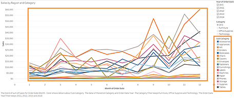
This view uses only colour to distinguish the lines from one another.
The marks in the view aren't using a colour palette that is fully accessible to users with visual impairments.
This example shows the same view, but uses both colour and shape to identify the marks.
A colour legend and a shape legend with clear titles identify what the colours and shapes represent in the view.
For information and examples about how to build a view that uses colour to help distinguish marks, see Author Views for Accessibility in Author Views for Accessibility.
Publishing your view
WCAG 2.1 AA principle: Perceivable, Operable, Understandable
To make your views available to your users, publish your view to Tableau Server or Tableau Cloud. Then in the toolbar menu, click Share. Users can interact with the view and toolbar buttons by using a screen reader or a keyboard. For more information, see Keyboard Accessibility for Tableau on the Web.
For information about how to publish and embed workbooks, find the embed code, and turn off the toolbar, see Publish and share the view in Author Views for Accessibility.
