Choose the Right Story Type for Your Tableau Data Story
Important changes for Tableau Data Stories
Tableau Data Stories were retired in Tableau Desktop, Tableau Cloud, and Tableau Server in January of 2025 (2025.1). With advances in natural language technologies, we're developing an improved interface that will make it easier to ask questions of your data and stay on top of changes. For more information, see How Tableau Pulse powered by Tableau AI is Reimagining the Data Experience(Link opens in a new window).
When you Add a Tableau Data Story to a Dashboard, it’s important to choose the right type of story for your data. Do you want your story about trends over time? Or do you want your story about two values that you’re comparing? To help you tell the right story, this topic describes the different types of stories, including an example of each story type.
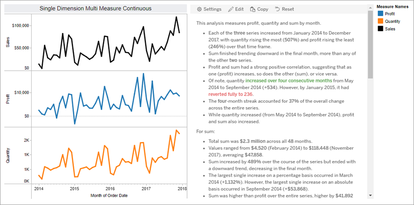
Continuous
Continuous stories are best for analyzing trends or progress over time.
When you create a continuous story, it includes content for performance, segments, volatility, and trend lines. The story also includes contribution analysis and correlation for stories that use more than one dimension. To use a continuous story, your worksheet must have:
- 1 dimension that has between 1-10 measures
- 2 dimensions and up to 3 measures
The following example is a continuous story for a line chart that has a single dimension and multiple measures:
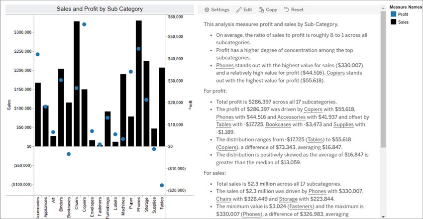
Discrete
Discrete stories are best for comparing values and understanding the distribution of data in each value. When you create a discrete story, the story includes content about the distribution and groupings or clusters across the data. And the story includes contribution analysis for worksheets that use multiple dimensions.
Consider using a discrete story when you want to:
- Understand drivers of your key performance indicators (KPIs) in sales reports.
- Identify and understand outliers quickly during data discovery.
- Identify trends that aren’t easily observable in the visual when performing an audit.
- Uncover complex utilization insights instantly for geographic analysis.
- Identify and call out key relationships, for example, between sales and profit.
To use a discrete story, your worksheet must have:
- 1 dimension that has between 1-10 measures
- 2 dimensions and up to 3 measures
The following example is a discrete story for a bar chart that has a single dimension and two measures:
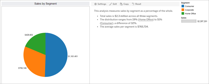
Percent of whole
Percent of whole stories are best for pie charts. To use a percent of whole story, your worksheet must have:
- 1 dimension
- 1 measure
The following example is a percent of whole story that uses a pie chart with a single dimension and a single measure:
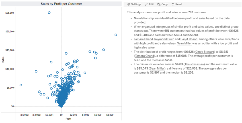
Scatter plot
Scatter plot stories are best for understanding the relationship between two measures. When you create a scatter plot story, the story includes content about the relationship (regression) between two measures. And the story includes content about groups (clusters) within the data, when they exist.
Consider using a scatter plot story when you want to:
- Call out relationships between two measures to identify impact (regression analysis).
- Identify and understand outliers that are above or below defined thresholds.
- Analyze how your data is distributed.
To use a scatter plot story, your worksheet must have:
- 1 dimension
- 2 or 3 measures
Note: When you create your scatter plot story, the first measure you select is treated as the independent variable and the second measure is the dependent variable.
The following example is a scatter plot story that uses a scatter plot that has a single dimension and two measures: