Why Visual Analytics?
This content is part of Tableau Blueprint—a maturity framework allowing you to zoom in and improve how your organization uses data to drive impact. To begin your journey, take our assessment(Link opens in a new window).
Visual analytics is a means of exploring and understanding data. It supports and accelerates the analysis process itself. You can ask a question, get the answer, and ask follow-up questions—all within a visual interface. A story unfolds from one visual summary to another. Later, you can retrace the story to rethink, explore further, and share. In short, visual analytics helps you to go in any direction with your thoughts while you view and interact directly with the data.
Pre-attentive Attributes
Visual analytics relies on pre-attentive attributes to guide you down the most useful paths. Pre-attentive attributes are information we can process visually almost immediately, before sending the information to the attention processing parts of our brain. The pre-attentive attributes are shown here:
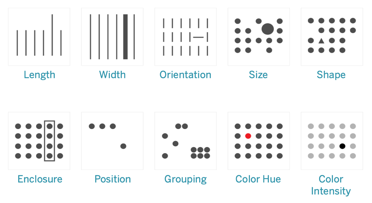
Pre-attentive Attributes
These are generally the best ways to present data, because we can see these patterns without thinking or processing. In fact, these attributes evolved in humans as ways to assess a situation quickly, discern a pattern, and decide whether to react. When authoring visualizations in Tableau, content creators will be visually encoding data to reveal new insights.
Explaining Visual Encoding
As you deploy Tableau broadly across the organization, some people will see the immediate value of visual analytics while others may hold on to traditional spreadsheets or reports in a tabular format. You’ll likely need to communicate the value of visual analytics and help those people see data differently by walking through what’s possible when data is visually encoded—namely by using color, shape, and size.
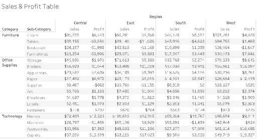
These steps are helpful in making data visualizations more familiar if you’re creating them for someone else. First, start with a familiar tabular format. Here’s an example of how someone might view sales and profit in a text table. To find the highest and lowest values, it requires a full table scan of the rows and columns.
Tabular Data, Plain
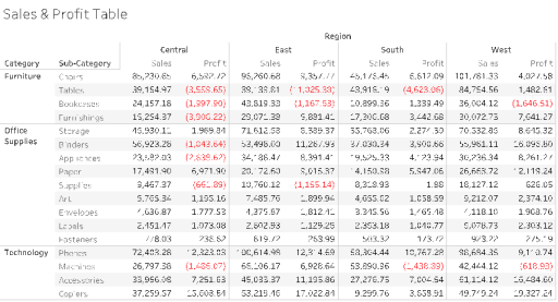
Adding color to negative numbers and formatting them with parentheses makes them stand out, but only if you’re looking for negative numbers. For everything else, a table scan is required to compare values.
Tabular Data with a Color for Negative Values
Next, as an intermediate format between a text table and a full visualization, color can be applied to show high and low values, but it still requires the viewer to reconcile ranges of color between the two measures.
Tabular Data with Sales and Profitability by Color Gradients
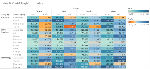
Finally, show the full visualization with sales encoded by length and profit encoded by color. Immediately, the viewer can see highest sales and lowest profit.
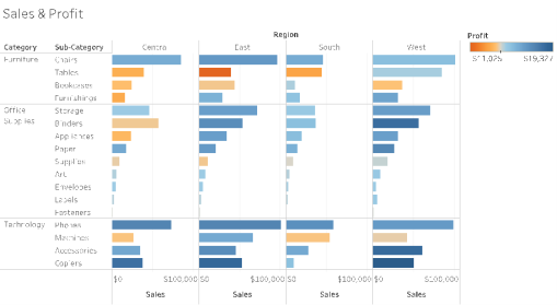
Visual Data with Sales by Bar Length, Profitability by Color
Using this approach, you’ll be able to introduce and explain the benefits of visual analysis to your organization’s Tableau users. You should record your own introduction video and post it on the enablement intranet.