Organizational Assets
This content is part of Tableau Blueprint—a maturity framework allowing you to zoom in and improve how your organization uses data to drive impact. To begin your journey, take our assessment(Link opens in a new window).
Developing organizational assets—such as a style guide, template workbooks with pre-selected fonts, colors, negative space, etc.—will help your users adopt visualization best practices. It’s important for creators and viewers to both understand what “great” looks like and have a common reference on how to best develop, deliver, and consume content. Your community leaders should work on socializing great content across the organization and share any assets on your Tableau Enablement Intranet.
By providing users with content that looks and feels familiar, you can dramatically speed up adoption. Additionally, you can build consumer confidence by producing content that is recognizable as part of a brand. The core themes to keep in mind when designing your standard are text, color and consistency.
- Text — Use of text is not limited to custom fonts; it is also about the use of text and lettering to enhance your analytics and storytelling to improve cognitive recognition of analytics.
- Color — Use custom color palettes, and capitalize on pre-existing associations to increase speed to insight. In addition, keep in mind best practices regarding color-blindness and limit the amount of discrete colors on a dashboard. If your brand has bright colors, use a neutral color palette and use your brand’s colors to call out specific items on a dashboard instead of using them for main colors.
- Consistency — Consistency doesn’t mean having to have a set of identical visualizations or dashboards. Think about how to convey the same look and feel while allow room for design and creativity.
Before creating your corporate-branded standard, remember that you should never compromise efficient analytics for design or stylistic elements. While some design elements can actually increase analytic value, you should never make something that looks good at the expense of performance or functionality.
Visual Style Guide
Do your users know what a great dashboard looks like? By publishing a Visual Style Guide, you will give your users a start on design, as well as guidance on how to differentiate between ad-hoc and certified content, which fonts and brand colors to use, and formatting options. This style guide can be a document or a Tableau workbook.
Dashboard Layout Template
Dashboard layout templates help creators to assemble polished dashboards by adding their individual sheets into predefined layout containers. You can download sample dashboard layouts from Tableau Public and customize it with your own logo and colors.
Dashboard Layout
Dashboard Review Checklist
You would not distribute documents to stakeholders without the proper review, revision, and release processes, and dashboards are no different. Dashboards need to be reviewed and validated before they are promoted and certified.
The first person to validate content should be its author. Authors should solicit feedback from the target audience as well. This can be done in an informal feedback group or by sharing a link to the workbook and encouraging comments. No dashboard is right the first time. Time and collaboration are ideal ways to hone in on the best representation of your data. Other people’s opinions will bring fresh perspectives. Consider the following:
- What type of formal or informal means do we need to gather feedback?
- How can we encourage a constructive conversation?
- Has there been time spent on gathering feedback, improvement, and iteration?
Create a dashboard checklist to help users apply visual best practices and a consistent design with a style guide. Every content creator should apply the checklist of your organizational standards to their work before sharing it with others.
Data Stewards should also play a role to ensure correctness and review an embedded data source as a potential candidate for publishing and certifying. Beyond data and calculation correctness, content validation should also include a review of the branding, layout, formatting, performance, filters, dashboard actions, and edge case behaviors by the Site Administrator or Project Leader site roles.
Metadata Checklist
The metadata checklist below shows best practices for curating a Published Data Source as outlined in Tableau Governance. By establishing data standards using the checklist, you’ll enable the business with governed self-service data access that is user-friendly and easy to understand. Prior to creating an extract or Published Data Source in Tableau, review and apply the following checklist to the metadata model:
- Validate the data model
- Filter and size to the analysis at hand
- Use standard, user-friendly naming conventions
- Add field synonyms and custom suggestions for Ask Data
- Create hierarchies (drill paths)
- Set data types
- Apply formatting (dates, numbers)
- Set fiscal year start date, if applicable
- Add new calculations
- Remove duplicate or test calculations
- Enter field descriptions as comments
- Aggregate to highest level
- Hide unused fields
Presentation Guidelines
The last mile of analyzing data is taking insight and communicating it to others. Regardless of the data skill level, people should be able to show a dashboard and clearly articulate a data-driven message in a meeting or a presentation. Designing charts for presentation requires special considerations because a complex chart that works for you on your laptop screen won’t work in a presentation.
When sharing some insight, consider the key purpose of the chart. What is the main message? In the example below, the charts shows malaria cases in Zambia following work by global non-profit organization, PATH. The key message is the 93% reduction in cases; notice how that is stamped on the slide very clearly.
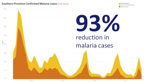
Stated Conclusion with Visualization
Think about how long the chart will be on the screen for. While you might intimately understand the chart, your audience will be seeing it for the first time. If you want to show a complex chart, you must spend the time explaining it. The malaria example above can be understood in moments because of the visual and stated conclusion. A good rule of thumb is that a chart should be understandable by your audience in less than half the time it is on the screen.
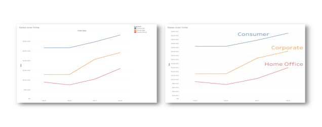
Your audience needs to be able to read the relevant parts of your chart. The font defaults to very small fonts because they are designed for consumption on a laptop/monitor. These font sizes don’t work on big screens. Two version of the same chart are shown below. The chart on the right has fonts large enough to be read by everyone in the room.
Legend Incorporated into Visualization
You should use color very wisely to highlight your message. Imagine you are tracking customers by day of the week, and you want to highlight that weekends have far fewer customers than weekdays. The chart on the left (below) most effectively convey that message. It uses a simple color scheme to convey an insight much more clearly than the one on the right.
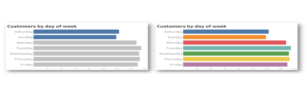
Color used for emphasis vs. too much color
Before you present your insights in charts, consider the following:
- Have you added state conclusions to tell the story in the data?
- Can the fonts be read from the back of the room you will be presenting in?
- Is color used for highlighting your message rather than decoration?
- Is the chart simple enough to be understood during the time it will be on the screen?
The main takeaway is an appreciation that a dashboard or complex analytical chart, designed for desktop screens are almost never the appropriate choice when sharing insights in meetings or presentations.