Predictive Modeling Functions in Time Series Visualizations
This document describes the steps required to extend a time axis into the future, so that you can make predictions for future dates using predictive modeling functions.
To see how, follow along with the below example.
Step 1: Create a visualization
-
In Tableau Desktop, connect to the Sample - Superstore saved data source, which comes with Tableau.
-
Navigate to the Sheet 1 worksheet.
-
From the Data pane, drag the Order Date dimension to the Columns shelf.
-
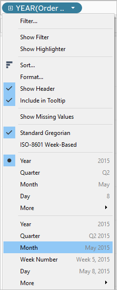
Open the measure’s context menu to change its list level to Month and Year:
- Drag Profit to the Rows shelf.
Step 2: Create a prediction calculation
-
Click to open the Analysis menu at the top, and then select Create Calculated Field.
-
In the Calculation Editor, do the following:
-
Name the calculation: Quantile Predict Median Profit.
-
Enter the following formula:
MODEL_QUANTILE(0.5, SUM([Profit]),ATTR(DATETRUNC('month', [Order Date])))The MODEL_QUANTILE function takes a given quantile and predicts values based on the predictors you input. In this case, the quantile = 0.5, which predicts the median. We want to predict profit, so the target expression is SUM([Profit]). And since we want to base the prediction on past performance, we need to include date as a predictor.
Note: With Predictive Modeling functions, you cannot mix aggregate and non-aggregate arguments. Since the target expression must be an aggregate, so must the predictor. In this case, we used ATTR(DATETRUNC('month', [Order Date])). For more information about the use of ATTR functions, see When to Use the Attribute (ATTR) Function. -
-
When finished, click OK.
The prediction calculation is now added as a calculated field in the Data pane.
Step 3: Add the prediction calculation to the view
-
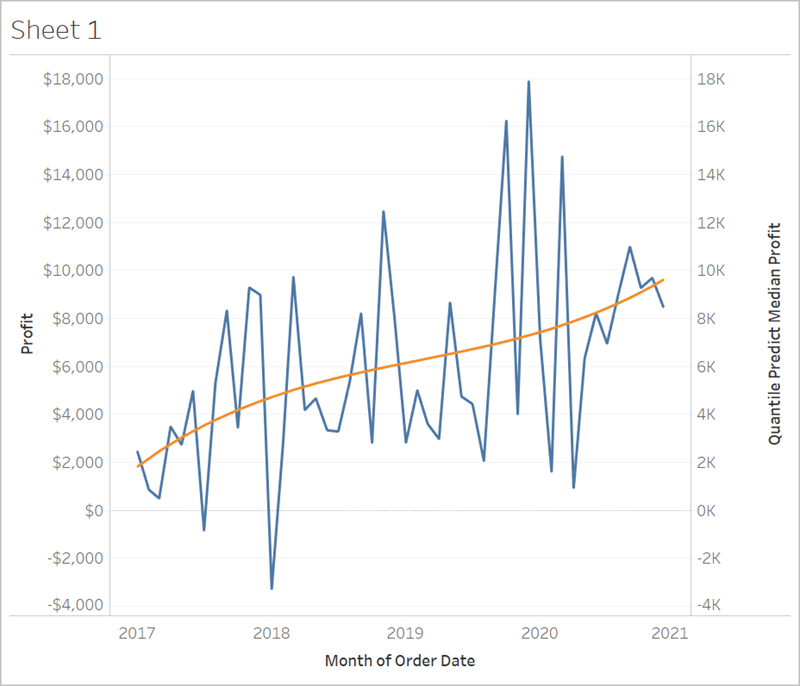
Drag the prediction calculation to the Rows shelf, to the right of SUM(Profit).
-
Right-click (Control-click on Mac) the measure and select Dual Axis.
-
To align the two axes in a dual axes chart to use the same scale, right-click (Control-click on Mac) the secondary axis, in this case Quantile Predict Median Profit, and select Synchronize Axis. This aligns the scale of the two axes.
Step 4: Extend the date range and densify the data
The final step is to extend the horizontal axis into the future so that you can add marks beyond the current date range.
-
To do this, open the context menu of the MONTH(Order Date) pill, and select Extend Date Range.
-
In the Extend Date Range dialog, let’s extend the axis by 16 months:
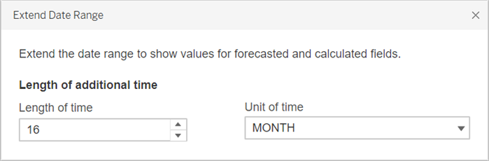
Tableau has automatically updated the view by extending the horizontal axis and includes predictions on these future dates:
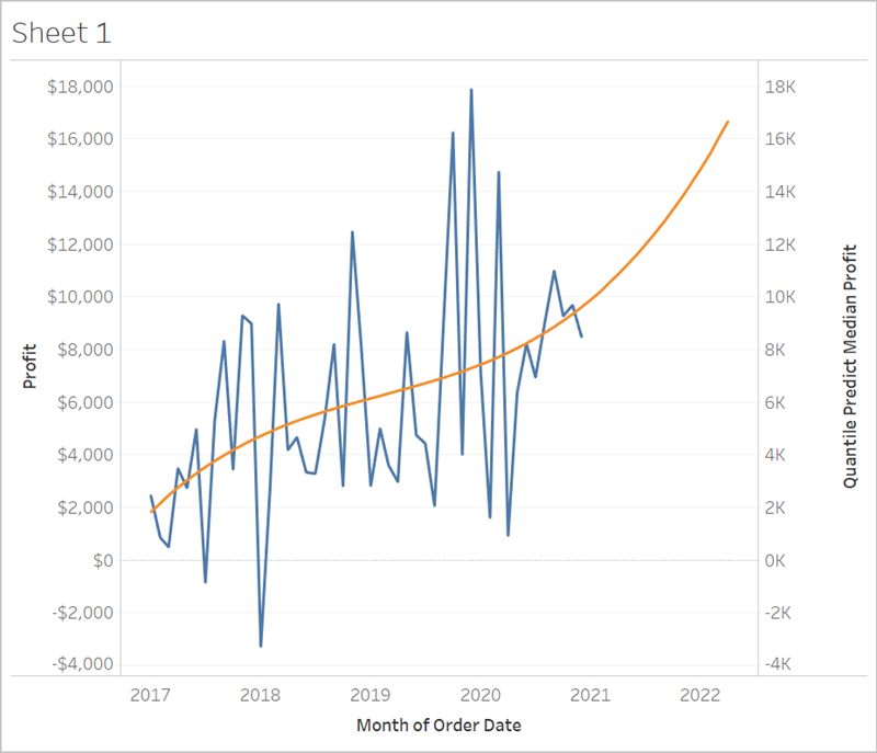
Notice that the blue Profit line doesn’t extend to the end of the graph. However, the orange line representing the prediction calculation, Quantile Predict Median Profit, does extend to the end of the graph. Computing the predicted profit on future dates is an example of data densification, which occurs when Tableau creates additional marks in the view to compensate for missing values. Data is not added to the underlying data source; marks are simply generated and added to the view.
For more information on data densification, see this data densification post(Link opens in a new window) from Data Plus Science(Link opens in a new window).