Build a Box Plot
Use box plots, also known as box-and-whisker plots, to show the distribution of values along an axis.
Boxes indicate the middle 50 percent of the data (that is, the middle two quartiles of the data's distribution). You can configure lines, called whiskers, to display all points within 1.5 times the interquartile range (in other words, all points within 1.5 times the width of the adjoining box), or all points at the maximum extent of the data, as shown in the following image:
The basic building blocks for a box and whisker plot are as follows:
- Mark type: Circle
- Columns shelf: Dimension
- Rows shelf: Measure
- Detail: Dimension
- Reference Line: Box Plot. For information on how to add a reference line, see Reference Lines, Bands, Distributions and Boxes(Link opens in a new window).
To create a box plot that shows discounts by region and customer segment, follow these steps:
- Connect to the Sample - Superstore data source (if necessary, you can download it from the Tableau Public sample data page(Link opens in a new window)).
- Drag the Segment dimension to Columns.
- Drag the Discount measure to Rows. Tableau creates a vertical axis and builds a bar chart – the default chart type when there’s a dimension on the Columns shelf and a measure on the Rows shelf.
- Click the Discount field on the Rows shelf and hover over Measure (Sum), then change the aggregation to Average.
- Drag the Region dimension to Columns, and drop it to the right of Segment. Now you have a two-level hierarchy of dimensions from left to right in the view, with regions (listed along the bottom) nested within segments (listed across the top).
- Click Show Me in the toolbar, then select the box-and-whisker plot chart type.

Tableau shows the box plot:

Notice that there are only a few marks in each box plot. Also, Tableau reassigned Region from the Columns shelf to the Marks card. When you changed the chart type to a box plot, Tableau determined what the individual marks in the plot should represent. It determined that the marks should represent regions. We'll change that.
Drag Region from the Marks card back to Columns, to the right of Segment.

The horizontal lines are flattened box plots, which is what happens when box plots are based on a single mark. Box plots are intended to show a distribution of data, and that can be difficult when data is aggregated, as in the current view.
To disaggregate data, select Analysis > Aggregate Measures. This turns aggregation on or off. Because data is aggregated by default in Tableau, the first time you select this command it disaggregates the data. For more information, see How to Disaggregate Data.
Now, instead of a single mark for each column in the view, you see a range of marks, one for each row in your data source.

The view now shows the information we want to see. The remaining steps make the view more readable and appealing.
Click the Swap
 button to swap the axes. The box plots now flow from left-to-right:
Right-click (control-click on Mac) the bottom axis and select Edit Reference Line.
In Edit Reference Line, Band, or Box dialog box, in the Fill drop-down list, select an interesting colour scheme.

For more on these options, see Add a Box Plot in the Reference Lines, Bands, Distributions and Boxes article.
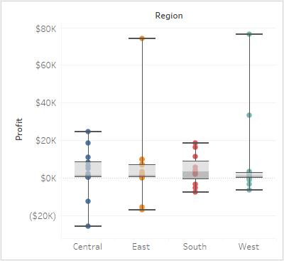
Now your view is complete:

For more information about box plots, see Reference Lines, Bands, Distributions and Boxes.